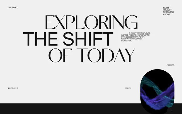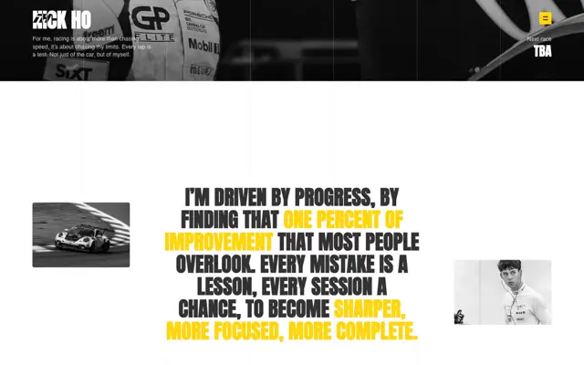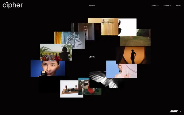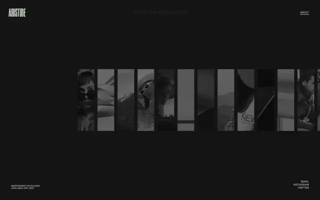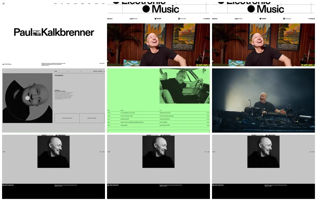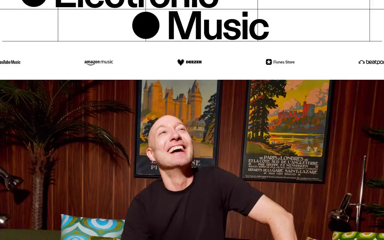
Embed a small documentary image directly into an oversized name or headline, leaving generous space above and below while anchoring utility information to the viewport edges. Carry hairline rules and compact labels into a two-column feature and a wide schedule table, then alternate these dense information sections with large photographic pauses. For a new subject, replace the portraits, release artwork, and dates with relevant material, and choose a single accent color that can also tint a featured image.
No creator prompt published. This brief was written by Reference.
Paul Kalkbrenner artist website
An artist website presenting music releases, tour dates, portraits, live-performance imagery, and a video archive through oversized typography, spacious grids, and alternating white, gray, green, and black sections.
Source and credit
Authorship not stated by the source
Look notesby Reference
Minimalist, editorial presentation for Paul Kalkbrenner, combining bold typography, monochrome portraits, and colorful media stills.
- Color
- Mostly white, black, and light gray, with vivid lime green, deep blue, and occasional warm red and orange imagery.
- Type
- Large, bold sans-serif lettering for the artist name and headings; small, restrained sans-serif text for navigation and details.
- Framing
- A spacious, wide layout with a small navigation header, oversized artist branding, and broad image and content panels. Several sections appear repeated side by side in the displayed frames.
- Structure
- Navigation and artist title at the top, followed by large media panels, gray and green information or feature sections, portrait imagery, and a black footer.