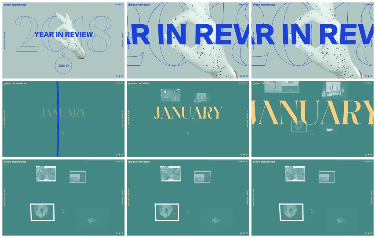
Layer thin outlined numerals behind a dimensional subject and place a heavy solid headline across both to establish three distinct visual depths. Contrast a pale opening field with a deeper background and warm serif chapter titles, keeping small navigation anchored around the perimeter. For a new subject, replace the hand, year, month names, and project imagery with relevant objects and chapters while retaining the scale contrast and asymmetric spacing; increase image contrast where inspection matters.
No creator prompt published. This brief was written by Reference.
A sculptural year in review
A year-review microsite opens with outlined 2018 numerals and a speckled hand sculpture, then presents January through monumental serif lettering and loosely arranged project imagery on a teal field.
Source and credit
Authorship not stated by the source
Look notesby Reference
A minimalist editorial year-in-review page branded “green chameleon,” featuring oversized typography and pale photographic imagery.
- Color
- Muted teal and mint backgrounds, vivid blue lettering, and warm yellow-gold accents.
- Type
- Large bold uppercase sans-serif for the title, paired with oversized elegant serif month lettering and small interface labels.
- Framing
- The opening title sits over thin outlined numerals and a cutout hand image; other frames center large month names above or alongside small image and layout previews.
- Structure
- A full-screen sequence of clean, mostly single-color panels with slim edge navigation and small corner labels; the visible content progresses from a 2018 title card to a January section and thumbnail previews.