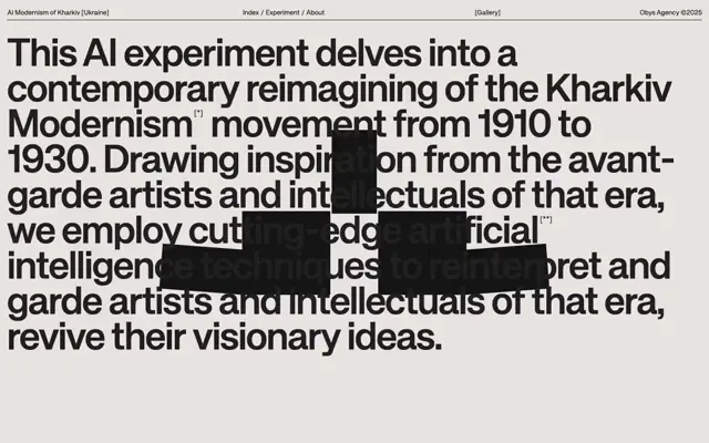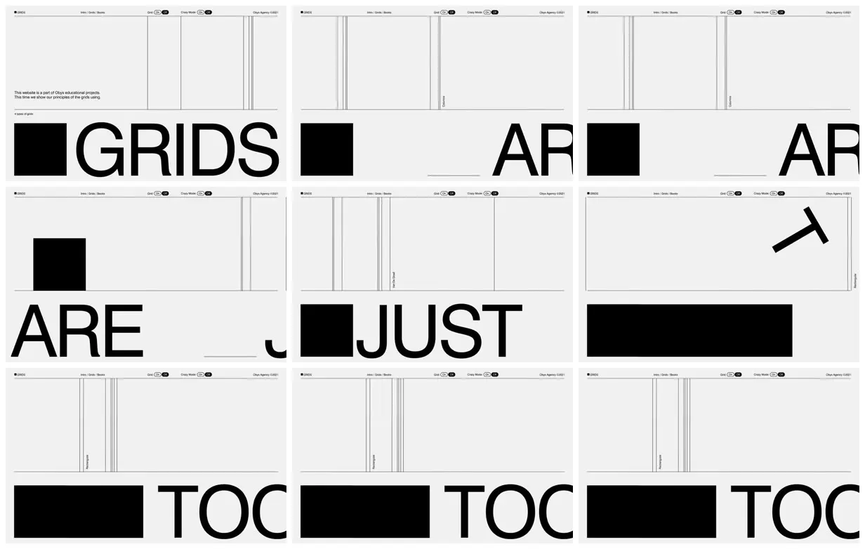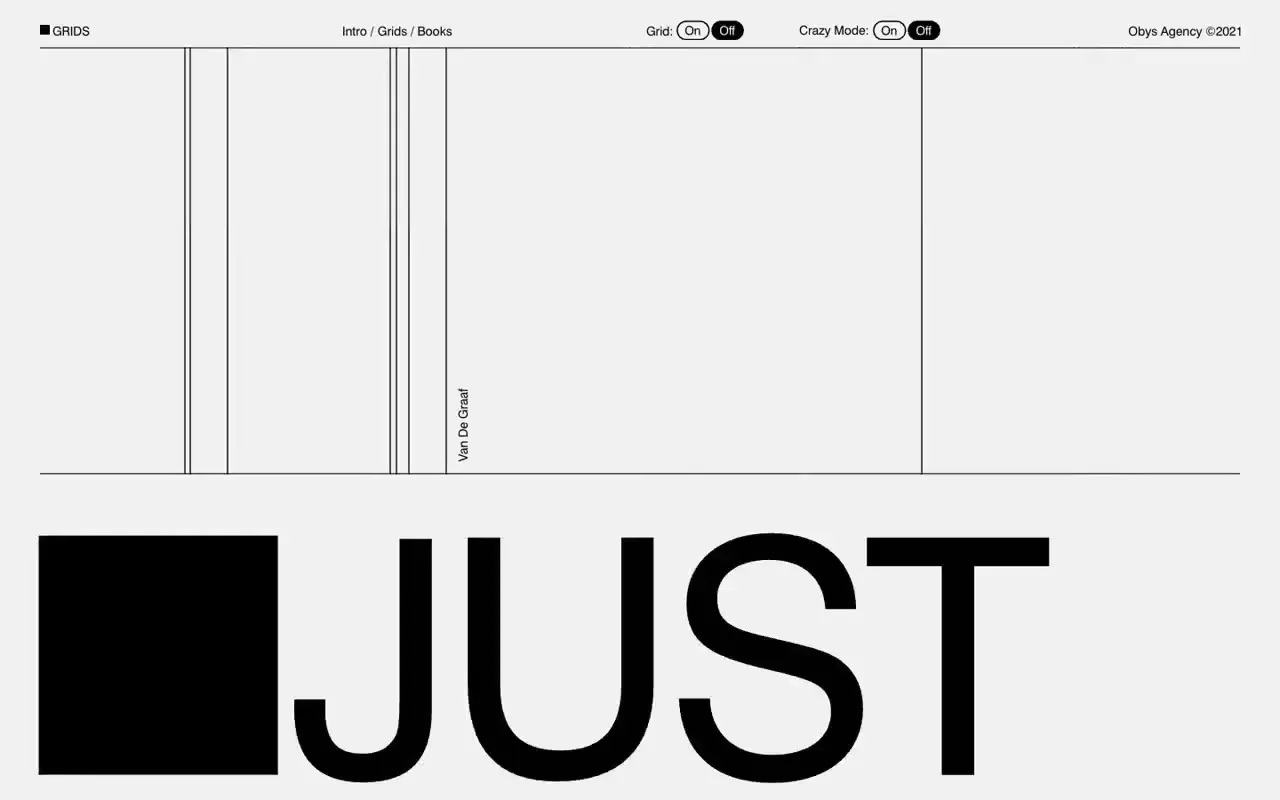
Use a fine-lined upper diagram field and a heavy lower typographic band to create tension between structure and expression. Repeat a simple solid shape as an anchor while changing letter placement, cropping, and guide spacing across successive compositions. For a new subject, replace the grid terminology and word fragments with its own concise vocabulary, and make the guides illustrate that subject's organizing principles.
No creator prompt published. This brief was written by Reference.
Grids as a typographic playground
An educational grid microsite introduction pairs monumental word fragments and black geometric blocks with thin vertical guides, rotated grid labels, a short explanatory paragraph, and compact navigation with mode toggles.
Source and credit
Authorship not stated by the source
Look notesby Reference
Minimal, monochrome graphic design with grid demonstrations and oversized cropped lettering.
- Color
- Off-white and light gray backgrounds with black text, rules, and solid rectangular blocks.
- Type
- Small, fine sans-serif labels in the headers; very large, bold, uppercase sans-serif display text, often cropped by the panel edges.
- Framing
- A three-column by three-row arrangement of page panels. Each has a narrow header and a large grid diagram above a bold typographic or geometric element.
- Structure
- Repeated panels show thin vertical and horizontal grid lines, small labels, and changing column widths. Visible oversized text fragments include “GRIDS,” “ARE,” “JUST,” and “TOC,” alongside black rectangles and a simple arrow-like mark.