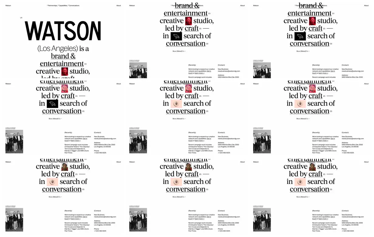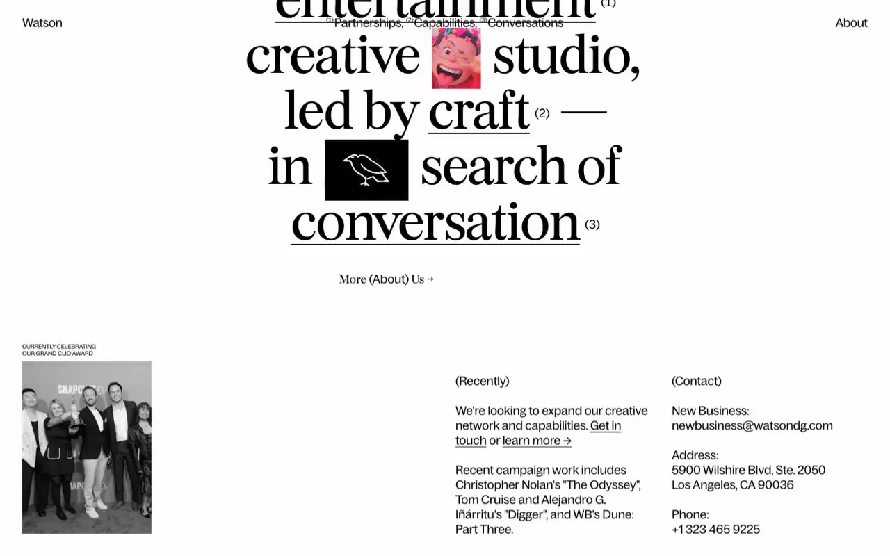
Use a monumental sans-serif identity above a deliberately line-broken serif introduction, with small rectangular images occupying word-sized gaps. Connect selected underlined phrases to navigation through raised numeric markers, and contrast the centered introduction with an asymmetric, widely spaced information footer. For a new subject, replace the identity, statement, and image inserts with relevant material while preserving the scale contrast; keep persistent navigation clear of scrolling display text.
No creator prompt published. This brief was written by Reference.
Watson’s typographic studio introduction
A white studio homepage with a monumental wordmark, a centered mixed-type introduction punctuated by small image inserts, numbered navigation, and a sparse lower section containing a grayscale photograph, recent updates, and contact details.
Source and credit
Authorship not stated by the source
Look notesby Reference
Minimal editorial website for Watson, a brand and entertainment creative studio.
- Color
- Mostly white with black and gray text; small red, pink, and muted photographic accents.
- Type
- Oversized bold sans-serif for “WATSON,” paired with large, high-contrast serif headline text and tiny sans-serif navigation and details.
- Framing
- Large areas of whitespace frame a centered, stacked headline. Small navigation sits near the top, with compact information blocks and a grayscale photo lower on the page.
- Structure
- Introductory Watson branding leads into a centered studio statement with small images embedded in the text; lower sections present recent work and contact information.