BUILD: KUROGANE - Japanese carbon steel wok, US direct-to-consumer site
Build a complete, production-quality website. Deliver working code, not a plan. Do not ask
clarifying questions. Where this brief is silent, use your judgement and note it in
DECISIONS.md.
The site is built around ONE 20-second video that plays as a single continuous
scroll-scrubbed sequence. The video is the spine. Everything else supports it.
1. THE PRODUCT
KUROGANE (Japanese 黒鉄, "black iron"). A hand-forged Japanese carbon steel wok, flat
bottom, 12 inch, sold direct to consumers in the United States.
One product. One size. One price: [price]. No variants, no size selector, no options, no
cart. A single Order button.
At [price] the price is an asset, not an obstacle. This costs roughly what a nonstick pan
costs and it is the last one the buyer ever needs. Never apologise for the price. The
three real objections, answered before the buy button and not in the FAQ: will it work on
my stove, will it rust or be a hassle, why not just buy a cheap one.
Every other commercial value (weight, gauge, warranty, shipping times) is invented. Write
plausible, specific copy so the page reads finished, then list every invented value in
PLACEHOLDERS.md. No lorem ipsum, no "TBD", no empty strings.
2. STACK
Astro (static output), Tailwind, GSAP with ScrollTrigger, Lenis for smooth scroll,
SplitType for headline masks. No React or Vue. npm, Node 20+.
No hosting platform has been chosen. Do not add an adapter or platform config.
3. THE VIDEO - READ THIS BEFORE ANYTHING ELSE
Supplied in /public/video/:
wok-original.mp4 20.04s, 854x480, 24fps, no audio, the source
wok-scrub-allkeyframe.mp4 the same 20.04s, re-encoded with every frame a keyframe
so currentTime seeking is instant
frames-desktop/f_001..241.jpg the same 20.04s as 241 frames at 12fps
frames-mobile/f_001..120.jpg the same 20.04s as 120 frames at 6fps, 640px wide
poster.jpg fallback still
The video is ONE continuous piece and must never be cut, split, or played as separate
clips. Its internal transitions are the section transitions. A chef in a professional
kitchen dissolves into a black studio product pass, which resolves into a warm home
kitchen. Those two dissolves are what make the first three screens feel seamless, and
splitting the file destroys the effect.
Full-bleed everywhere. The video fills the viewport edge to edge, 100vw by 100vh,
object-fit: cover. Source resolution is currently 854x480 and will be upscaled later, so
do not add any layout that depends on the current resolution. Do not put the video in a
panel, card, frame, or container with margin.
Implementation. Use the frame sequence, not the video element, for scrubbing.
Preload the sequence into an array of Image objects, draw the active frame to a full-bleed
canvas, and index by scroll progress. Video currentTime scrubbing stutters badly on iOS
Safari and this is the whole page, so it cannot be allowed to fail there. Load
frames-desktop above 1024px and frames-mobile at or below it. Show poster.jpg behind
the canvas until the sequence has fully decoded, and do not let the pin engage before then.
Document in README.md that once the video is re-exported at higher resolution, the frame
sequence will get too heavy and the build should switch to scrubbing
wok-scrub-allkeyframe.mp4 via currentTime. Structure the scrub module so that swap
touches one file.
4. THE SCROLL SEQUENCE - SECTIONS 1 TO 3
Sections 1, 2 and 3 are not three sections in markup. They are one pinned stage
containing one video, with content appearing and disappearing over it at fixed points in
the video's timeline. The reader experiences three screens; the DOM contains one.
Pin the stage for 600vh of scroll at desktop, 400vh at or below 1024px, mapping scroll
progress linearly to video time 0 to 20.04s.
All timings below are given as video seconds and as scroll progress. Use them exactly.
They are measured against the actual footage.
VIDEO TIME PROGRESS WHAT IS ON SCREEN
0.00 - 5.60s 0% - 28% Professional kitchen. Chef tossing over flames.
5.60 - 6.00s 28% - 30% Dissolve into the studio. Screen goes near-black.
6.00 - 14.60s 30% - 73% Studio product pass. Black, lighting up, pulling back.
14.60 - 15.50s 73% - 77% Dissolve into the home kitchen.
15.50 - 20.04s 77% - 100% Home kitchen. A man cooking with the wok.
Screen 1 content - the hero (0% to 28%)
Copy is bottom-anchored, left-aligned, not right. This is measured: the chef occupies
the left of frame and the food arcs through the centre, and by 4.5s the flying food has
spread well into the right third. The bottom of frame stays dark and stable across the
whole segment, so that is where type is safe.
Scrim: a linear gradient from --char-900 at 92% opacity at the bottom edge to fully
transparent at 58% height, across the full width. Nothing else.
Content, sitting above the bottom edge in the left 55%: eyebrow, two-line display headline
ending in a full stop, one-line subhead, primary button "Order a wok", secondary
"See the detail". Beneath the buttons a thin trust strip: made in Japan, carbon steel,
flat bottom fits any range, [price].
Vertical 黒鐵 runs down the far left edge at 6% opacity across this whole screen.
Motion: the headline reveals line by line behind masks on load. All hero content fades and
lifts out between 24% and 28%, clearing the frame before the dissolve.
The header sits over this, transparent, and the page title uses the site's single h1 here.
Screen 2 content - the detail (30% to 73%)
The video goes almost pure black at 30% to 37% and then slowly lights up. Use that
darkness: a large centred display line fades in at 31% to 37% naming the section, then
fades out. It is the calmest, darkest moment in the whole video and it should feel like
the page holding its breath.
Then five feature callouts, alternating right and left, each fading and sliding in
from its own side, holding, and leaving before the next arrives. Positions are measured
against the footage and all five sit on flat dark steel or empty background:
VIDEO TIME PROGRESS WHAT IS VISIBLE ON SCREEN SIDE
1 7.6 - 8.8s 38% - 44% Wooden handle enters top, steel RIGHT
collar and two rivets clearly visible
2 9.4 - 10.4s 47% - 52% Broad curved body, light raking LEFT
across the steel surface
3 10.9 - 12.0s 54% - 60% The steel helper loop appears on RIGHT
the far rim
4 12.2 - 13.2s 61% - 66% Camera pulls back, the flared wall LEFT
profile reads clearly
5 13.4 - 14.5s 67% - 72% Full three-quarter view, whole form RIGHT
and flat base
Each callout is a small block, vertically centred, inset 4% from its side edge and no
wider than 30% of the viewport: an uppercase tracked label, a thin --ember-500 rule that
draws left to right on entry, and one short line of body copy. Write the copy to describe
what is actually visible in that frame range, not generic features.
Callout 5 must be inset slightly further, no wider than 28%, because the helper loop
enters the right of frame at that point.
No scrim in this screen. The footage is already dark enough and a scrim would flatten it.
Add only a subtle radial vignette at 20% strength to hold the edges.
A thin vertical progress rail with five ticks runs up the far left, filling as the screen
advances. The rail is the only persistent element across screen 2.
One large 黒鐵 character sits behind the video at 4% opacity, fading in across 30% to 45%
and out by 70%.
Screen 3 content - at home (77% to 100%)
The composition inverts: the frame is warm and bright, and the right third is a plain
cream wall, flat and clean. This is the single best text zone in the whole video.
Copy is right-aligned in the right 38%, in dark ink, not light. This inversion from
screen 1 is deliberate and should feel like stepping out of the studio into a kitchen.
Scrim: a very light --cream-100 wash at 25% opacity behind the copy block only, not the
full frame.
Content: eyebrow, heading, two short lines, then the range compatibility row as five
items with thin-stroke inline SVG icons and one-word verdicts for gas, induction, electric
coil, glass ceramic and outdoor burner, plus one line stating the flat bottom means no wok
ring is needed. This is the objection most likely to end the visit, so it lives here in
plain sight rather than in the FAQ.
Content fades in at 80% and holds to 100%. The pin releases into section 4.
Mobile behaviour for the pinned stage
Keep the pin and keep the scrub. Seamlessness is the point of this page and stacking it
into static blocks would lose it. Reduce the pin to 400vh, load frames-mobile, and:
Screen 1 copy stays bottom-anchored, full width, with a taller scrim.
Screen 2 callouts alternate top and bottom instead of right and left, since there is no
horizontal room at 390px. Same timings.
Screen 3 copy moves to the bottom with a light scrim, since the cream wall is cropped
out by object-fit: cover at portrait aspect.
If the frame sequence has not decoded within 3 seconds, fall back to the poster with
content revealed by normal scroll, and do not pin.
5. SECTIONS 4 TO 6 - AFTER THE VIDEO
The pin releases and the page becomes conventional. These sections are static, calm, and
deliberately quiet after the video. Ground is --cream-100.
Section 4 - Order
The only section that takes money. One product, so keep it almost bare.
A single centred card on --cream-200. Left: poster.jpg as a still product image on a
--greige-300 field. Right: the product name, the size as a plain statement (12 inch,
30 cm), the price at display scale but restrained, one line of cost framing against
replacing a nonstick pan every eighteen months, then what is in the box as four short
items with line icons, then the primary button "Order a wok - [price]", then one muted line:
free US shipping, 30-day returns, lifetime guarantee, secure checkout by Stripe.
No selector, no quantity stepper, no options. Resist adding any.
Section 5 - Questions
Two columns. Left 4: eyebrow, heading, one line pointing at support. Right 8: six
accordion items in the menu row pattern with a plus glyph rotating to a cross. Cover rust
and neglect, first use out of the box, soap and dishwasher, oven use, shipping and
delivery, guarantee and returns.
Real buttons with aria-expanded and aria-controls, height animated over 320ms, one open at
a time, first open by default.
Section 6 - Contact and footer
Hard cut back to --char-900. Warm and human, not a link dump. Left: a short line inviting
questions, a real email address, a response-time expectation. Right: a compact contact
form with name, email and message using zero-radius --char-800 fields and an attached
--ember-500 square submit chip. Validates on the client, shows an inline success state,
makes no network call; leave one clearly commented function where a real endpoint attaches.
Beneath, a thin footer bar: wordmark, short anchor list, links to /shipping, /returns,
/privacy, /terms. The horizontal 黒鐵 sits cropped at the bottom edge behind it.
6. DESIGN SYSTEM
Colour, sampled from the footage itself. The video runs warm dark, then cool graphite,
then warm cream. The page follows that arc, so the interface never fights the frame behind
it. This is what makes it cinematic rather than a dark template. There is no crimson
anywhere.
Screen 1, warm charcoal
--char-900 #1A1614 scrims, footer base
--char-800 #231D1C raised surface
--char-700 #332B27 hairlines
Screen 2, cool graphite
--slate-900 #11151A vignette, rail track
--slate-700 #2A2F38 callout rules
--slate-500 #4C515D muted hairlines
Screens 3 to 5, warm cream
--cream-100 #F2ECE4 page base after the pin
--cream-200 #E3D9CE raised surface
--greige-300 #C7B5A8 hairlines, muted fills
--wood-600 #8A5A33 warm accent
--wood-800 #4A2E18 deep warm accent
Accents and ink
--ember-500 #F5821F interactive, button chip
--ember-600 #D96A15 hover
--copper-400 #AF8365 warm neutral accent
--bone-100 #F4F1EC text on dark
--ink-900 #14100E text on light
--steel-400 #8A8F98 muted text on dark
Typography. Self-hosted via @fontsource. Plus Jakarta Sans 800 for display, tight
tracking, sentence case, headlines ending in a full stop. Plus Jakarta Sans 700 uppercase
at 0.16em tracking for nav, eyebrows and feature labels. Inter 400/500 for body. Fluid with
clamp; the hero headline reaches about 6.5rem at desktop. One h1 on the page, in screen 1.
Kanji. 黒鐵 (traditional form) in exactly three places: vertical down the left edge in
screen 1, one large character behind the video in screen 2, and cropped at the bottom edge
in the footer. Never white at low alpha, which reads as haze; use the act's surface colour.
All instances aria-hidden.
CRITICAL: convert the glyphs to SVG paths. Do not load a CJK webfont; that is several
megabytes for two characters.
Shape. Zero border radius everywhere. Hairlines 1px. Elevation from value contrast,
never shadow.
Buttons, unchanged from the existing system. Primary: a solid light block (--bone-100
on dark, --ink-900 on light) with uppercase text and an attached 60px --ember-500 square
chip on the right holding an arrow. On hover the block shifts, the chip widens 8px, the
arrow slides 4px. Secondary: transparent with a 1px --ember-500 border; on hover the fill
sweeps in from the left.
7. MOTION
One module, src/scripts/motion.ts, exporting init(). All animation goes through it,
including the scrub. Do not scatter GSAP calls across components.
Lenis drives ScrollTrigger updates. Reusable attributes: data-reveal,
data-reveal-group, data-reveal-headline, data-parallax, data-rule.
Content over the video fades and translates 20px on its own axis, over 400ms, ease
power2.out. Nothing over the video should move far; the video is already moving.
Reduced motion is mandatory: when prefers-reduced-motion matches, do not pin, do not
scrub, do not initialise Lenis. Render the poster as a static full-bleed image and lay all
three screens' content out as three normal stacked sections beneath it. The page must
carry the full argument in that state.
8. COPY
You write all of it. It lives in one file, src/content/site.json, structured by screen
and section. No user-facing string is hardcoded in a component.
Readers skim, and here they are also watching. This is the tightest constraint.
Total body copy across the whole page: under 500 words. Count it and report the number.
Never describe what the video already shows. If a line restates the frame behind it,
cut the line.
Feature callout labels under 24 characters, callout body lines under 80.
No paragraph over two sentences. No sentence over eighteen words.
Voice: concrete and confident. Heat, steel, hands, time. Assume the reader can cook.
Banned: exclamation marks, urgency, scarcity, discount language, "revolutionary",
"game-changing", "elevate your cooking".
9. CHECKOUT
src/config/commerce.ts holds the driver and the single product: name, priceCents, sku,
paymentLinkUrl (empty), stripePriceId (empty). The price lives here and nowhere else; no
price string is hardcoded anywhere, including the button label.
demo (default). The button goes to /order/review, a styled summary with a Place order
button leading to /order/success with a generated order number. /order/review must
carry a clear, non-dismissible notice: "Demo checkout. No payment is taken and no order
is placed." Render no card fields and collect no real address.
stripe-link. The button goes to the Payment Link URL from config; falls back to demo.
stripe-session. The button posts to a handler at server/checkout.ts, written as a
single (request: Request) => Promise<Response> with no framework or platform imports,
creating a Stripe Checkout Session with US shipping and automatic tax. Leave it unwired.
Never put a secret key in client code.
Routes: /, /order/review, /order/success, /order/cancelled, /shipping,
/returns, /privacy, /terms. Policy pages get plausible US placeholder text with a
visible line reading "Draft policy. Review with counsel before launch."
10. QUALITY BAR
WCAG 2.1 AA contrast for every piece of text over video, checked against the actual frames
behind it, not against a flat swatch. The scrims exist to make this pass; tune their
opacity until it does.
Full keyboard operability. Visible focus states. A skip link that jumps past the pinned
stage to section 4, since 600vh of pinned scroll is hostile to keyboard users otherwise.
Decorative SVG aria-hidden.
The site works with JavaScript disabled: the poster renders as a static full-bleed image,
all three screens' content appears as normal stacked sections, accordions fall back to
details/summary, and the order button links to /order/review.
Performance: reserve the canvas box so the pin causes no layout shift, preload the first
10 frames and the poster, lazy-decode the rest during idle time, under 130KB of JavaScript
gzipped importing only gsap and ScrollTrigger. Meta and Open Graph, Product and FAQPage
JSON-LD, sitemap, robots, favicon, noindex on the order routes.
11. VERIFY BEFORE YOU FINISH

npm install, npm run dev and npm run build all succeed
The video is full-bleed 100vw by 100vh with object-fit cover, never in a container
The video is treated as one continuous 20.04s piece, never split into clips
Screens 1 to 3 are one pinned stage in the DOM, not three sections
Every content beat fires at its specified progress value from section 4
The scrub is smooth after preload and shows the poster until ready
Callouts alternate right and left at desktop, top and bottom at mobile
No text ever overlaps the wok, the chef, or the flying food
Text over video passes AA against the real frames behind it
prefers-reduced-motion renders the poster and three stacked sections, no pin
Body copy under 500 words, count reported in DECISIONS.md
No price string exists outside src/config/commerce.ts
Zero border radius in the compiled CSS, and no CJK webfont loaded

12. DO NOT
Do not cut, split, trim or re-time the video. It is one continuous piece.
Do not put the video in a panel, card, frame, or any container with margin.
Do not add a size selector, quantity stepper, variants, or a cart.
Do not add sections beyond the six specified.
Do not exceed the word budget. Cut copy rather than shrink type.
Do not add rounded corners, drop shadows, text gradients, or glassmorphism.
Do not put a secret key in client code or name a hosting platform.
Do not use an icon library; draw the small icon set as inline SVG.
Do not use an em dash or en dash in user-facing strings; use a hyphen, colon or arrow.
Make it yours. Keep the structure and swap the product ("KUROGANE - Japanese carbon steel wok") and its copy, then retime the scroll table to your own film's seconds. Put your price where it says [price].
Scroll-scrubbed film site for a steel wok
A one-product store for KUROGANE, an invented Japanese carbon steel wok, where one 20-second take from a restaurant line to a studio to a home kitchen scrubs past as you scroll. Codex built it in one pass from an 18,000-character brief timed to the film.
“Codex wrote the site from this and nothing else.”
You'll need
- The 20-second film, made first from the Seedance shot prompt on the same page, exported as the video and frame folders the prompt lists
- Your own price in place of [price]
How it was made
Run in ChatGPT Codex in one pass, with no follow-up questions asked or answered. The 20-second film came first, from a separate Seedance prompt on the same page and two reference photos made in ChatGPT, and the site prompt is written against the film's timeline to the second. The page reproduces the prompt as it was run with one edit: the wok's price is now [price], in four places. The model isn't named.
Codex · Astro · Tailwind CSS · GSAP · Lenis · Seedance · ChatGPT (reference photos)
Source and credit
Website · Aug 18, 2026
Authorship not stated by the source
Published instructions: "02 The site" on the prompt page
Look notesby Reference
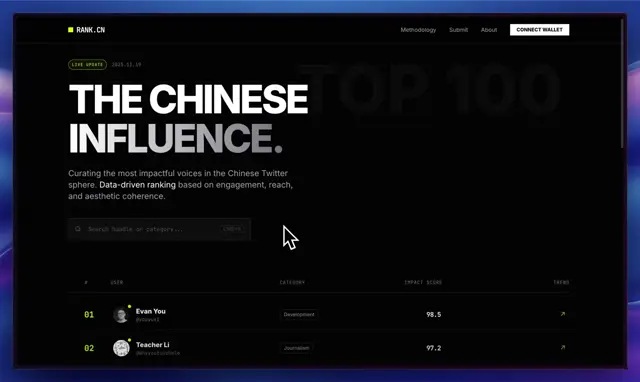
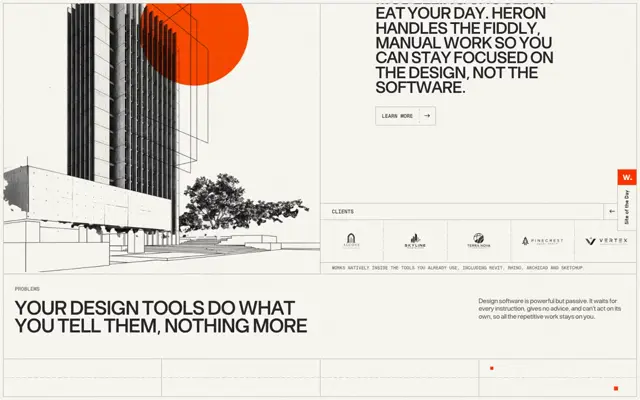
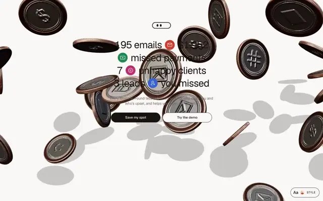
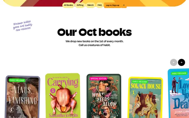
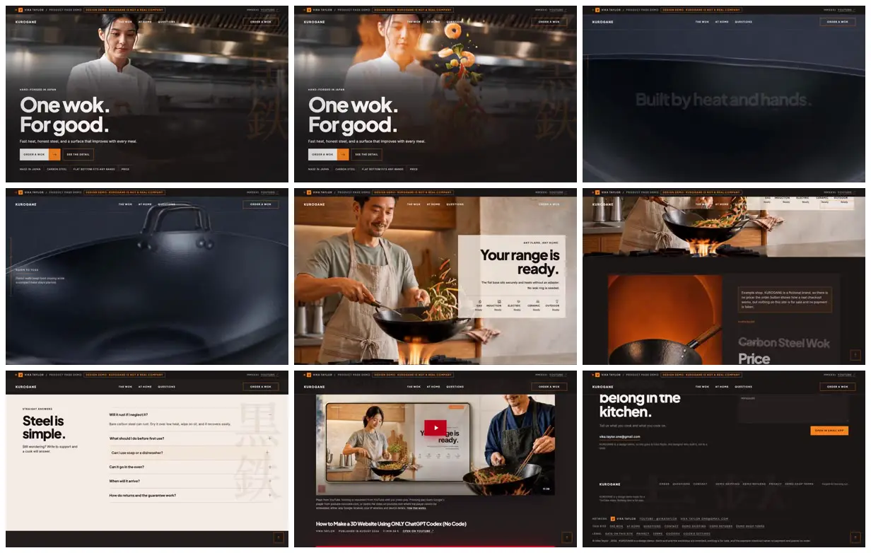
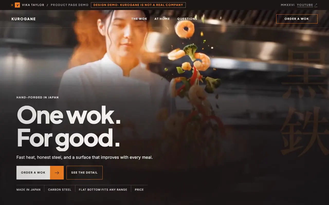
A dark product page built over one film: a chef tossing food in a restaurant kitchen, the black wok alone in a studio, and a man cooking at home, then shop, FAQ, build-video, and contact sections.
- Color
- Charcoal and black with warm kitchen photography, one orange accent for buttons and outlines, and a cream FAQ panel.
- Type
- Tight, heavy grotesque headlines ("One wok. For good.", "Built by heat and hands.", "Your range is ready.", "Steel is simple."), small uppercase labels, and large faint 黒鉄 characters in the background.
- Framing
- 16:10. A thin top bar marks it as a design demo. Headlines sit lower left over the full-bleed film, the home-kitchen screen puts its copy in a white card at right, and later sections use split layouts.
- Structure
- Hero over the chef, food flying from the wok, the studio pass along the wok's rim and handle, the home cook with a row of stove icons, the product card with a Price placeholder, the FAQ, an embedded build video, and the contact form and footer.