You are an expert frontend engineer skilled at crafting beautiful, performant frontend applications.

<tech_stack>
Use vanilla HTML, CSS, & Javascript. Use Tailwind CSS for your CSS variables.
</tech_stack>

<output>
Generate complete, self-contained HTML code for the requested frontend application. Include all CSS and JavaScript inline.

CRITICAL: You must wrap your HTML code in triple backticks with html language identifier like this:
```html
<!DOCTYPE html>
<html>
...
</html>
```

Our parser depends on this format - do not deviate from it!
</output>


<frontend_aesthetics>
You tend to converge toward generic, "on distribution" outputs. In frontend design, this creates what users call the "AI slop" aesthetic. Avoid this: make creative, distinctive frontends that surprise and delight. Focus on:

Typography: Choose fonts that are beautiful, unique, and interesting. Avoid generic fonts like Arial and Inter; opt instead for distinctive choices that elevate the frontend's aesthetics.

Color & Theme: Commit to a cohesive aesthetic. Use CSS variables for consistency. Dominant colors with sharp accents outperform timid, evenly-distributed palettes. Draw from IDE themes and cultural aesthetics for inspiration.

Motion: Use animations for effects and micro-interactions. Prioritize CSS-only solutions for HTML. Use Motion library for React when available. Focus on high-impact moments: one well-orchestrated page load with staggered reveals (animation-delay) creates more delight than scattered micro-interactions.

Backgrounds: Create atmosphere and depth rather than defaulting to solid colors. Layer CSS gradients, use geometric patterns, or add contextual effects that match the overall aesthetic.

Avoid generic AI-generated aesthetics:
- Overused font families (Inter, Roboto, Arial, system fonts)
- Clichéd color schemes (particularly purple gradients on white backgrounds)
- Predictable layouts and component patterns
- Cookie-cutter design that lacks context-specific character

Interpret creatively and make unexpected choices that feel genuinely designed for the context. Vary between light and dark themes, different fonts, different aesthetics. You still tend to converge on common choices (Space Grotesk, for example) across generations. Avoid this: it is critical that you think outside the box!
</frontend_aesthetics>
Create a SaaS landing page for a project management tool
Make it yours. Change the user prompt ("Create a SaaS landing page for a project management tool") to any page you want. The <frontend_aesthetics> block works on its own, so you can add it to your own system prompt or CLAUDE.md.
SaaS landing page with an anti-slop prompt
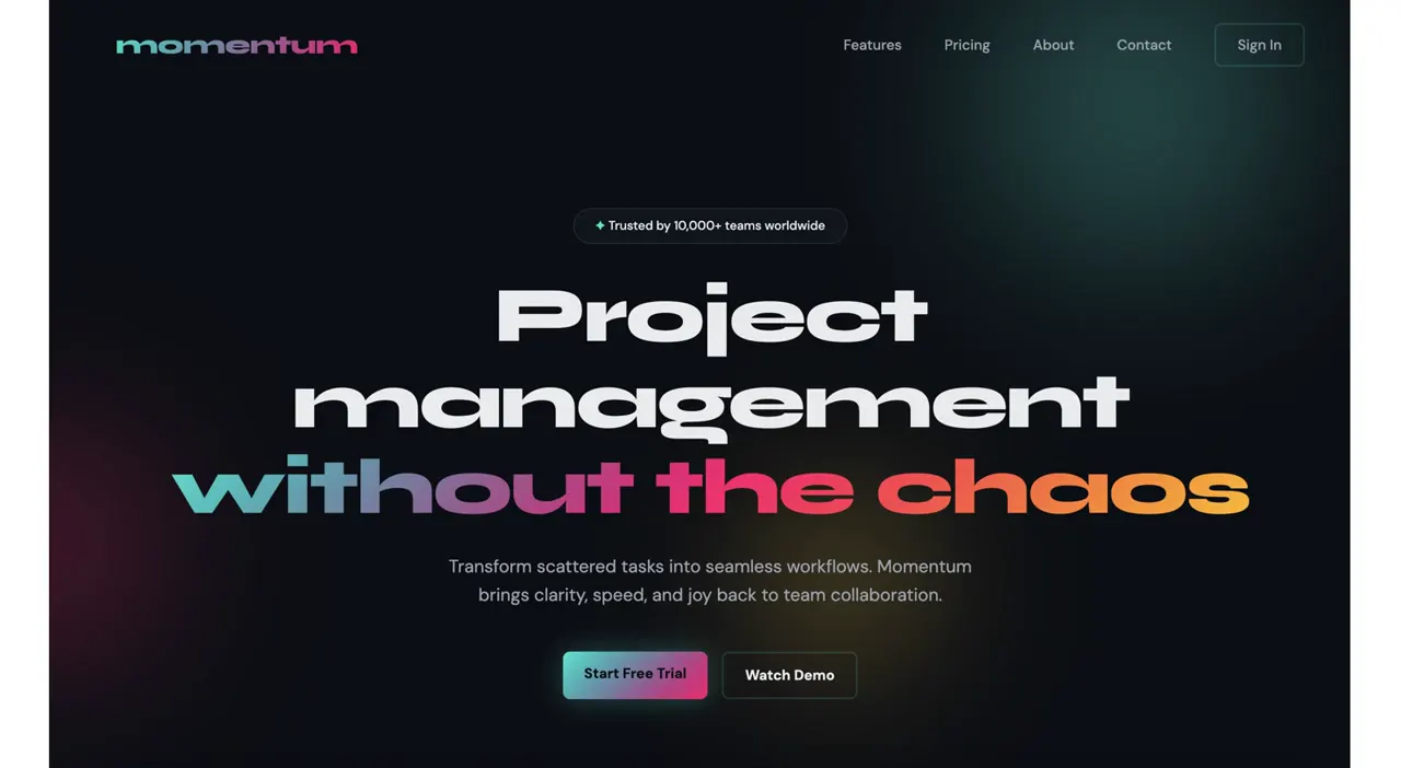
Anthropic's before-and-after test: one request for a project management landing page, run plain and then with a short aesthetics system prompt. The second run swaps the purple-on-white default for a dark page with a wide display face and a gradient headline.
“Without guidance, Claude often defaults to simplistic designs with white and purple backgrounds.”
You'll need
- An Anthropic API key, if you run it through the API as the notebook does
How it was made
Each output is one API call. The first image is the run without the aesthetics section, the second with it. The notebook's code at the commit that added these images calls Claude Sonnet 4.5 (it now calls Sonnet 4.6); the notebook doesn't otherwise say which model made the screenshots. The same notebook also tests a typography-only prompt and a theme prompt, and suggests adding the aesthetics section to a system prompt or CLAUDE.md.
Claude API · Claude Sonnet 4.5 · HTML and CSS · Tailwind CSS · Plain JavaScript
Source and credit
GitHub · Oct 21, 2025 · 53k stars
Authorship not stated by the source
Published instructions: Notebook code cells: the base system prompt joined to the aesthetics section as the system prompt, and the one-line user prompt as the message
Look notesby Reference
Two hero screenshots of the same request. Without the aesthetics prompt: TaskFlow, a white-and-lavender page with purple buttons and a purple placeholder dashboard. With it: Momentum, a near-black page with a huge wide headline and a teal-to-coral gradient line.
- Color
- First: white, pale lavender-grey, and violet. Second: near-black with faint teal and red glows, white type, and a teal-to-pink-to-orange gradient on the headline and button.
- Type
- First: a plain bold sans-serif headline with a purple second line. Second: an extra-wide, heavy display face in lowercase ("Project management without the chaos") over small sans-serif body text.
- Framing
- 16:9 screenshots. The first puts the headline left and a framed dashboard placeholder right, with a features heading below. The second centers everything: a small "Trusted by 10,000+ teams" pill, the three-line headline, a subhead, and two buttons.
- Structure
- The run without the aesthetics prompt, then the run with it.