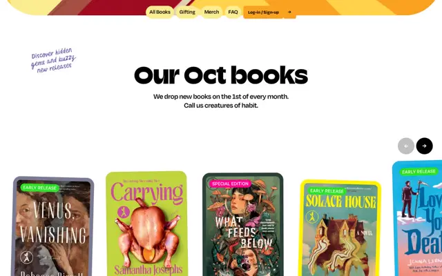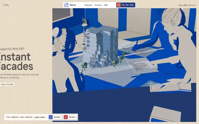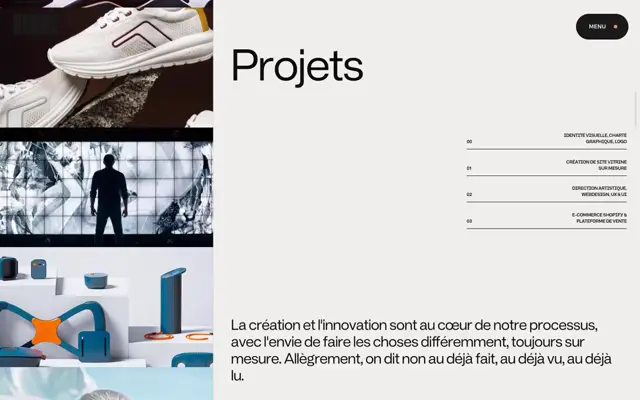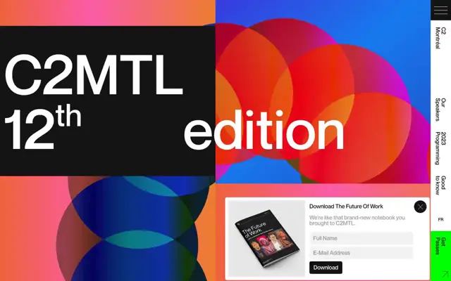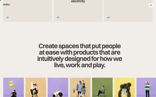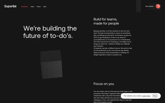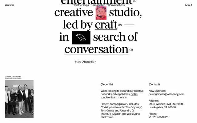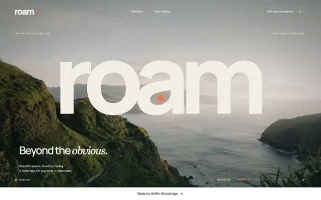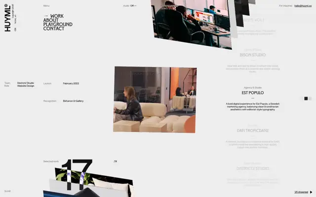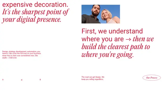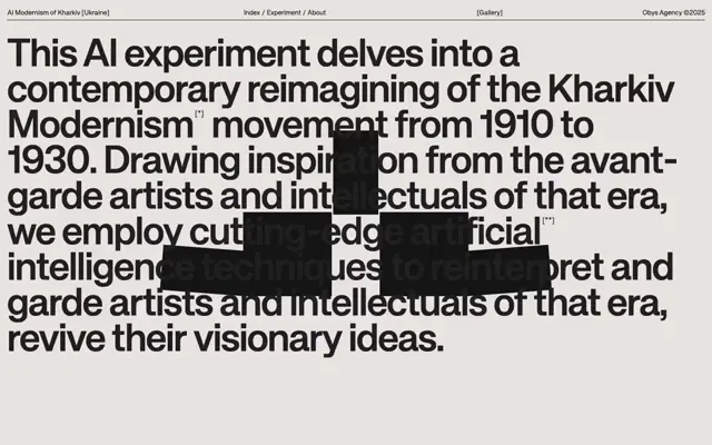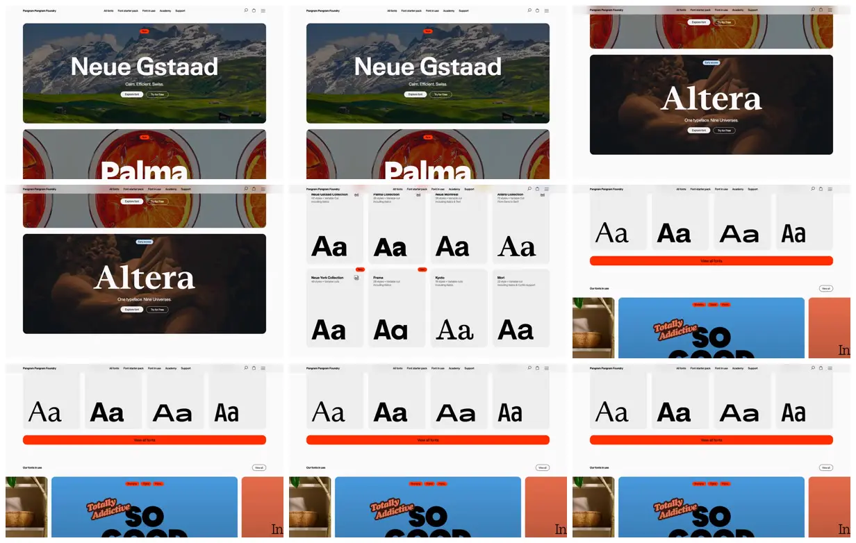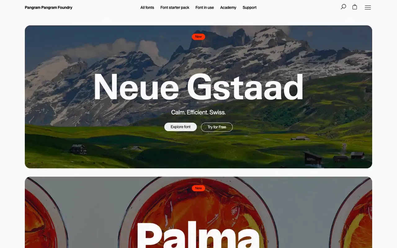
Use a fixed specimen string at a consistent scale and position across pale cards so product differences can be compared directly. Contrast this systematic catalog with large photographic panels carrying oversized titles, small status pills, and paired filled and outlined actions. For a new subject, replace the letterform specimens with an equally standardized product detail and choose photographs that express each collection’s character; retain the spacing and restrained accent system.
No creator prompt published. This brief was written by Reference.
Pangram Pangram font showcase
A type foundry storefront featuring large photographic font promotions, a four-column specimen catalog, and a colorful fonts-in-use gallery beneath restrained navigation.
Source and credit
Authorship not stated by the source
Look notesby Reference
Polished editorial-style type foundry site combining scenic and graphic font showcases with a browsable font catalog.
- Color
- White and light gray page surfaces, black text, vivid orange-red accents, and specimen imagery in deep blue, green, and warm brown.
- Type
- Large, bold sans-serif display lettering alongside refined serif specimens; smaller, restrained navigation and interface text.
- Framing
- A slim top navigation sits above wide feature panels and evenly spaced font-preview cards. The collage shows different page sections, including large hero specimens, a multi-column type grid, and a featured-font area.
- Structure
- Header navigation followed by oversized font showcase panels, then rows of individual font cards with Aa previews and a prominent orange-red “View all fonts” bar; lower sections contain larger promotional specimens.