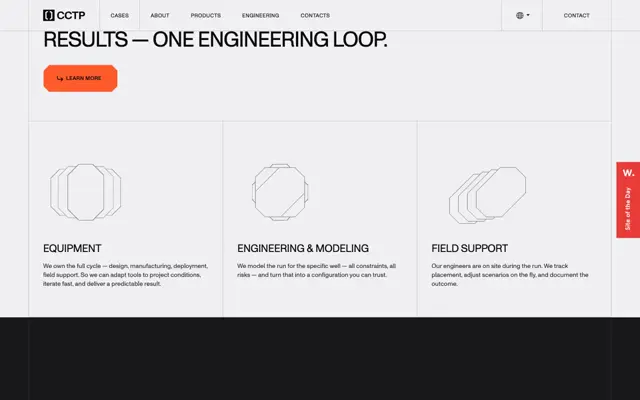
Use a strict half-width grid with hairline dividers, then vary panel heights and subdivide selected halves to create an asymmetric rhythm. Pair oversized sans-serif headings with small monospaced labels, and reserve one pale accent color for emphasis and list markers. Adapt the dotted abstract imagery and fine geometric diagrams to forms relevant to the new subject, replacing the recruitment copy, metrics, and client marks while retaining the contrast between spacious statements and dense explanatory rows.
No creator prompt published. This brief was written by Reference.
Aspen Search
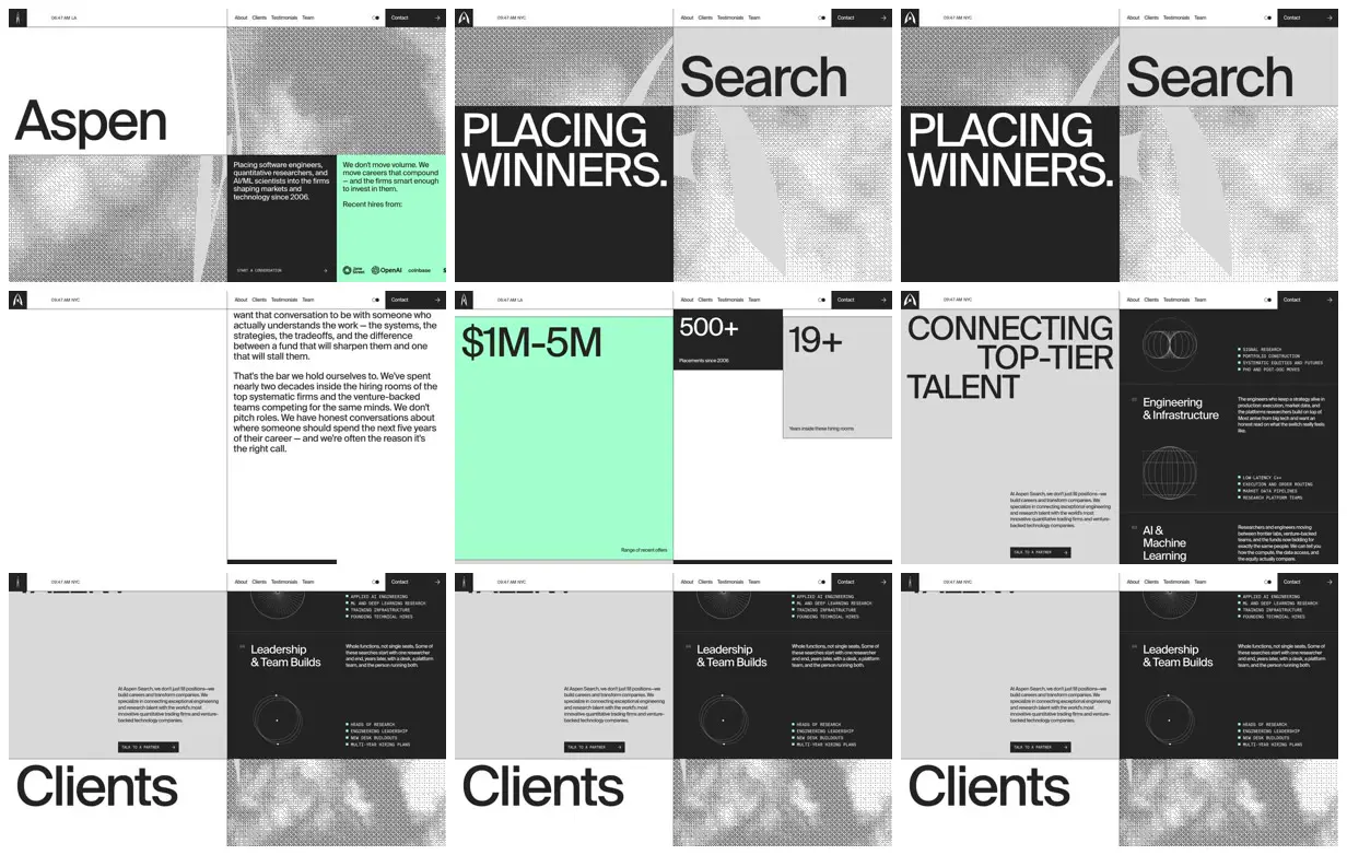
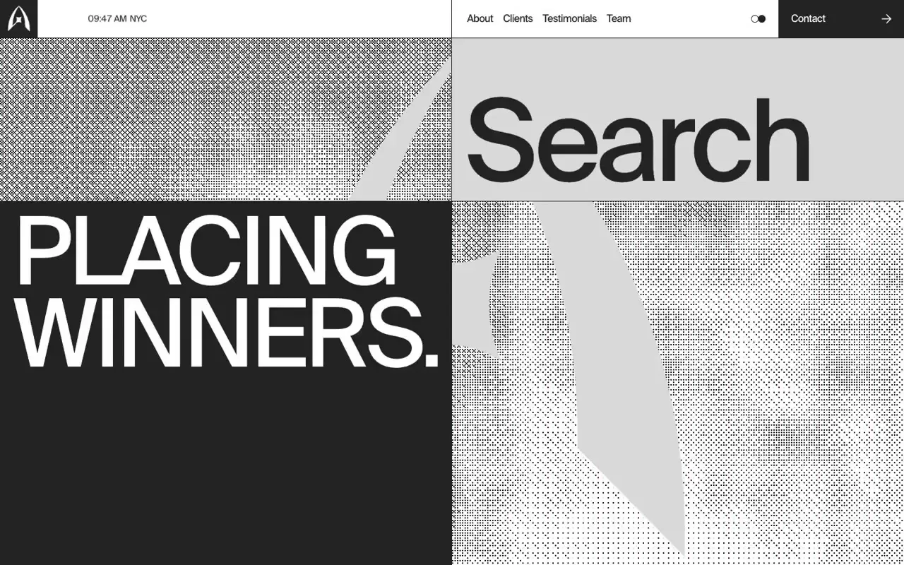
An executive-search website pairing enormous typography with dotted abstract graphics, mint and charcoal information panels, staggered statistics, and a split-screen service directory illustrated with fine geometric linework.
Source and credit
Authorship not stated by the source
Look notesby Reference
Minimal, editorial-style recruiting and search firm website with oversized headlines and compact informational sections.
- Color
- Mostly black, white, and light gray, with vivid mint-green accent panels and small teal details.
- Type
- Large, clean sans-serif display text paired with smaller sans-serif navigation and body copy.
- Framing
- A tightly structured grid of rectangular panels, with oversized titles, metrics, text blocks, and circular line graphics. A slim navigation bar runs across the top.
- Structure
- The visible sections include an Aspen Search introduction, a “Placing Winners” headline, company description and metrics, a “Connecting Top-Tier Talent” section, service listings, and a large “Clients” heading.