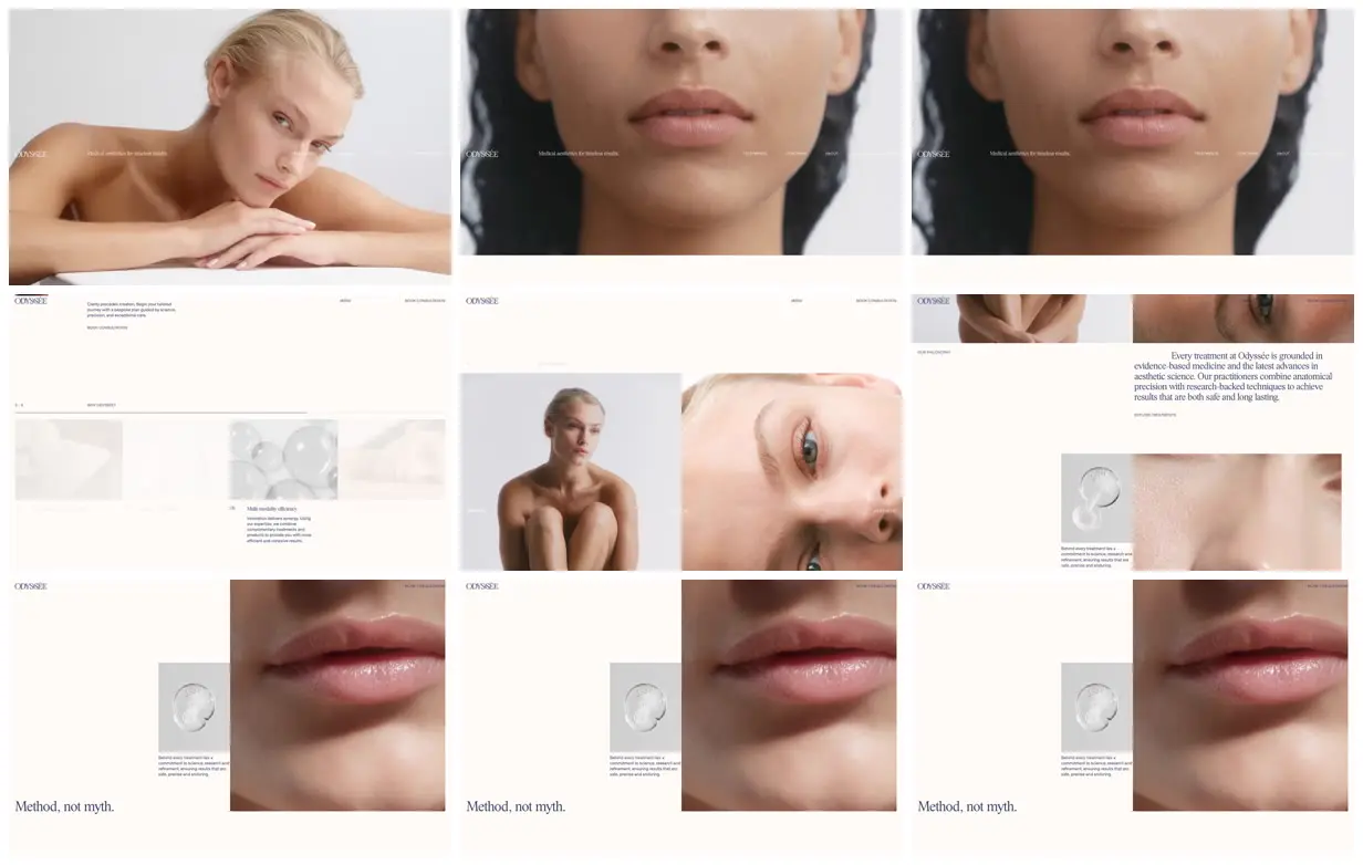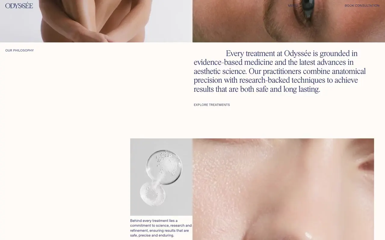
Adapt the contrast between full-width portraits and extreme detail crops, keeping interface text sparse and aligned to a consistent column grid. Pair a large right-column serif statement with a small section label on the far left, then offset a compact supporting image beside a much larger photograph. For a new subject, replace the faces and skin details with relevant wide and macro imagery, rewrite the numbered benefits, and improve navigation contrast over light image areas.
No creator prompt published. This brief was written by Reference.
Odyssée
An aesthetic clinic website pairing expansive portrait photography and close-up skin imagery with ivory backgrounds, navy editorial typography, a four-part benefits strip, and an asymmetric philosophy section.
Source and credit
Authorship not stated by the source
Look notesby Reference
Minimal, editorial skincare presentation centered on close-up beauty photography and treatment imagery.
- Color
- Warm ivory and cream, soft beige and blush skin tones, muted gray, and occasional dark charcoal.
- Type
- Small, restrained sans-serif navigation and body text paired with refined serif headlines, including “Method, not myth.”
- Framing
- Wide, airy layouts with generous whitespace, aligned header elements, and asymmetrical image-and-text panels. Large edge-to-edge portraits contrast with smaller editorial details.
- Structure
- A slim branded header repeats across the page, followed by a large photographic hero and a sequence of spacious sections combining model imagery, close-up details, explanatory copy, and treatment-related visuals.