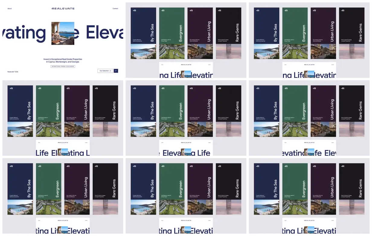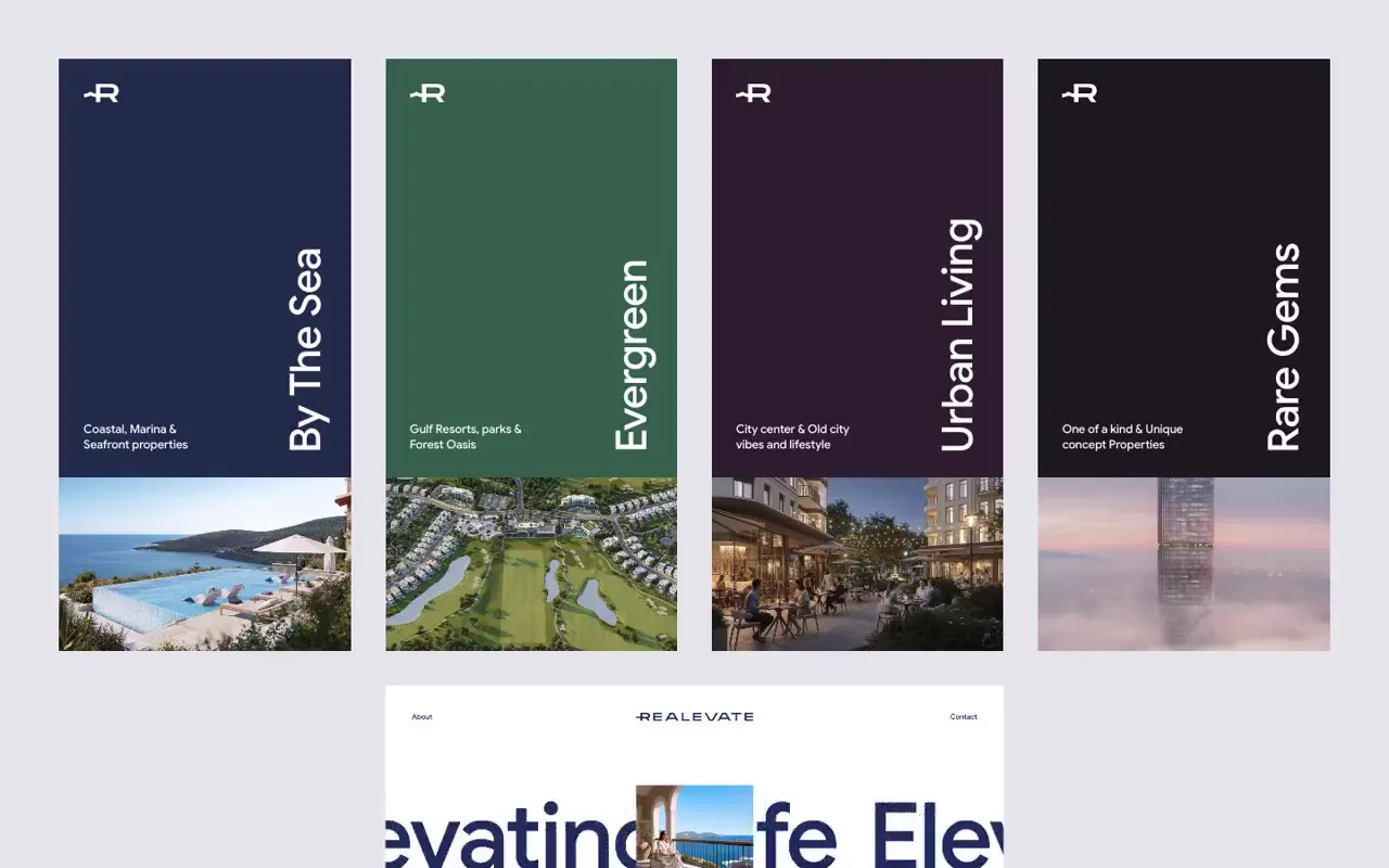
Use extreme scale contrast by placing a compact portrait image over oversized lettering that extends beyond the viewport, while keeping supporting information small and orderly. Build category navigation as equal-width vertical panels with restrained color coding, rotated titles, and consistently aligned image bases. For a new subject, replace the property themes, photographs, headline, and brand marks while preserving the panel proportions and spacing discipline.
No creator prompt published. This brief was written by Reference.
Realevate property selection
A real estate landing page pairs oversized navy lettering and a centered seaside photograph with investment information. A selection view presents four property themes as tall, color-coded panels with vertical titles and landscape imagery.
Source and credit
Authorship not stated by the source
Look notesby Reference
A polished, minimalist real-estate investment site presenting curated property collections.
- Color
- Pale gray and white backgrounds with deep navy, forest green, plum, and near-black cards; property photos add muted blue, green, and warm tones.
- Type
- Clean sans-serif typography. Large, bold navy headline text contrasts with small, restrained navigation and card details; collection names are set vertically on the cards.
- Framing
- A spacious, grid-based layout. The opening view pairs oversized headline text on the left with a row of tall collection cards on the right. Other frames show the cards centered above large headline text.
- Structure
- Compact header with About, REALEvate branding, and Contact; a hero area with investment-focused messaging and a call-to-action; four property collection cards labeled “By the Sea,” “Evergreen,” “Urban Living,” and “Rare Gems,” each with a photo and brief details.