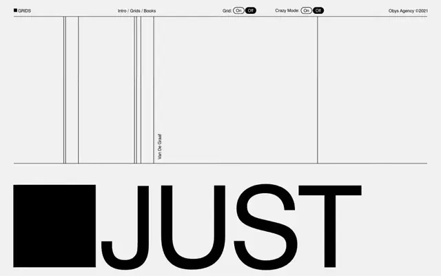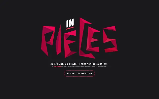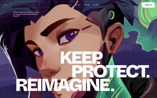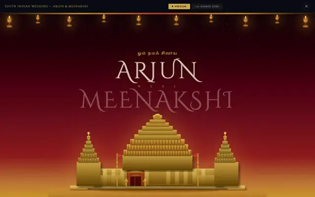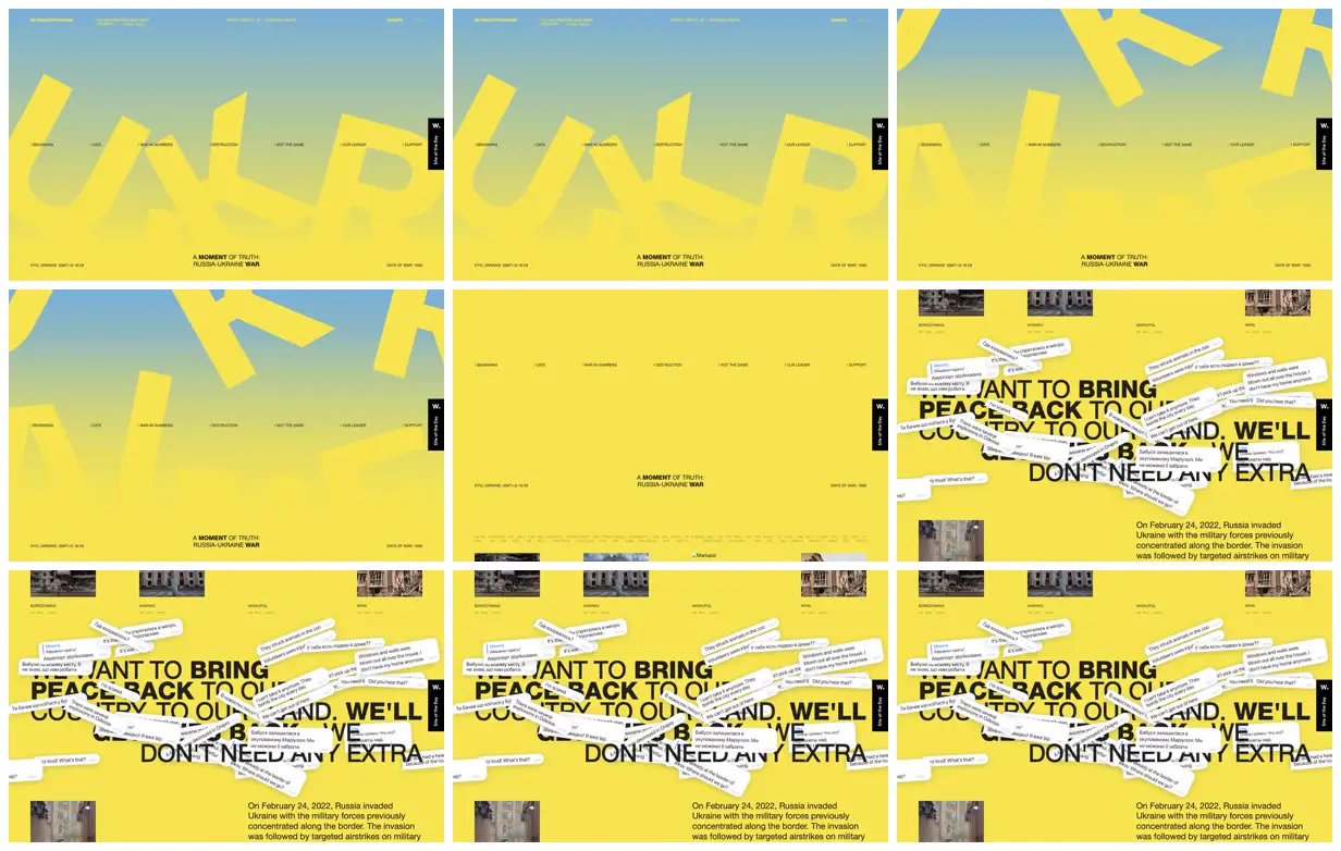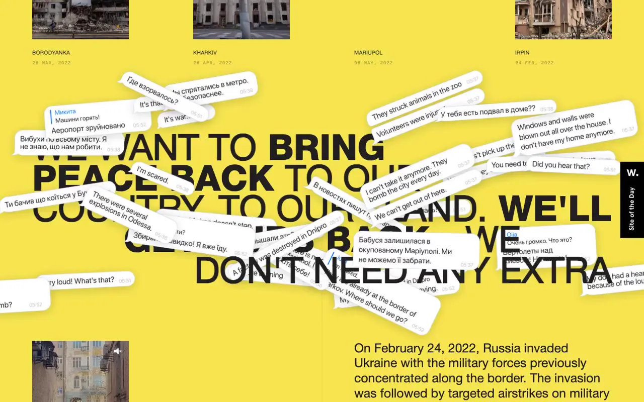
Use oversized, rotated letterforms as graphic shapes, cropping them at the viewport edges while keeping chapter navigation on a stable horizontal axis. Contrast that spacious opening with a dense collage of rounded message cards, varied angles, subtle shadows, and small timestamps over a large typographic statement. For a new subject, replace the lettering, documentary imagery, messages, and metadata with subject-specific material, and improve contrast on small labels while ensuring every image loads.
No creator prompt published. This brief was written by Reference.
The other side of truth
A Ukraine-war awareness microsite with monumental yellow lettering, a seven-part chapter index, time and day counters, dated destruction photographs, and overlapping bilingual message bubbles above historical context.
Source and credit
Authorship not stated by the source
Look notesby Reference
Bold, minimalist editorial design with a bright yellow field, oversized abstract shapes, and a story about Russia and Ukraine.
- Color
- Vivid yellow dominates, paired with pale blue gradients, black text, and small photographic images.
- Type
- Large, heavy, uppercase sans-serif headlines contrast with tiny navigation labels and compact body text.
- Framing
- Wide layouts with generous open space in the introductory section; later frames layer headline text and message-like cards over the yellow background, with small images near the top and edges.
- Structure
- A slim navigation runs across the page. The opening section features oversized graphics and a centered title; subsequent sections use image thumbnails, large editorial headlines, overlapping text cards, and explanatory copy.