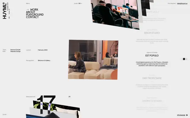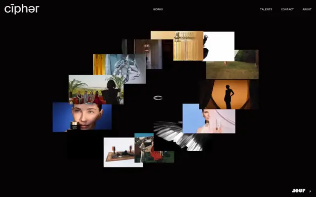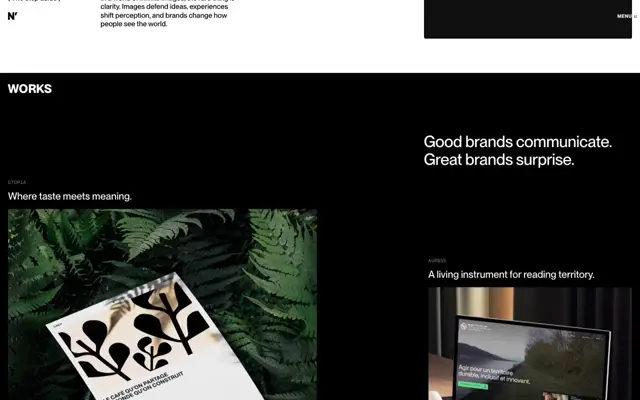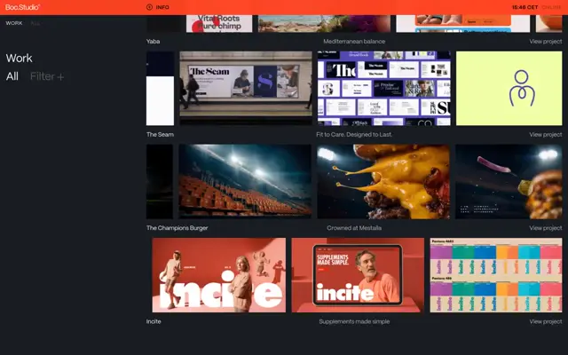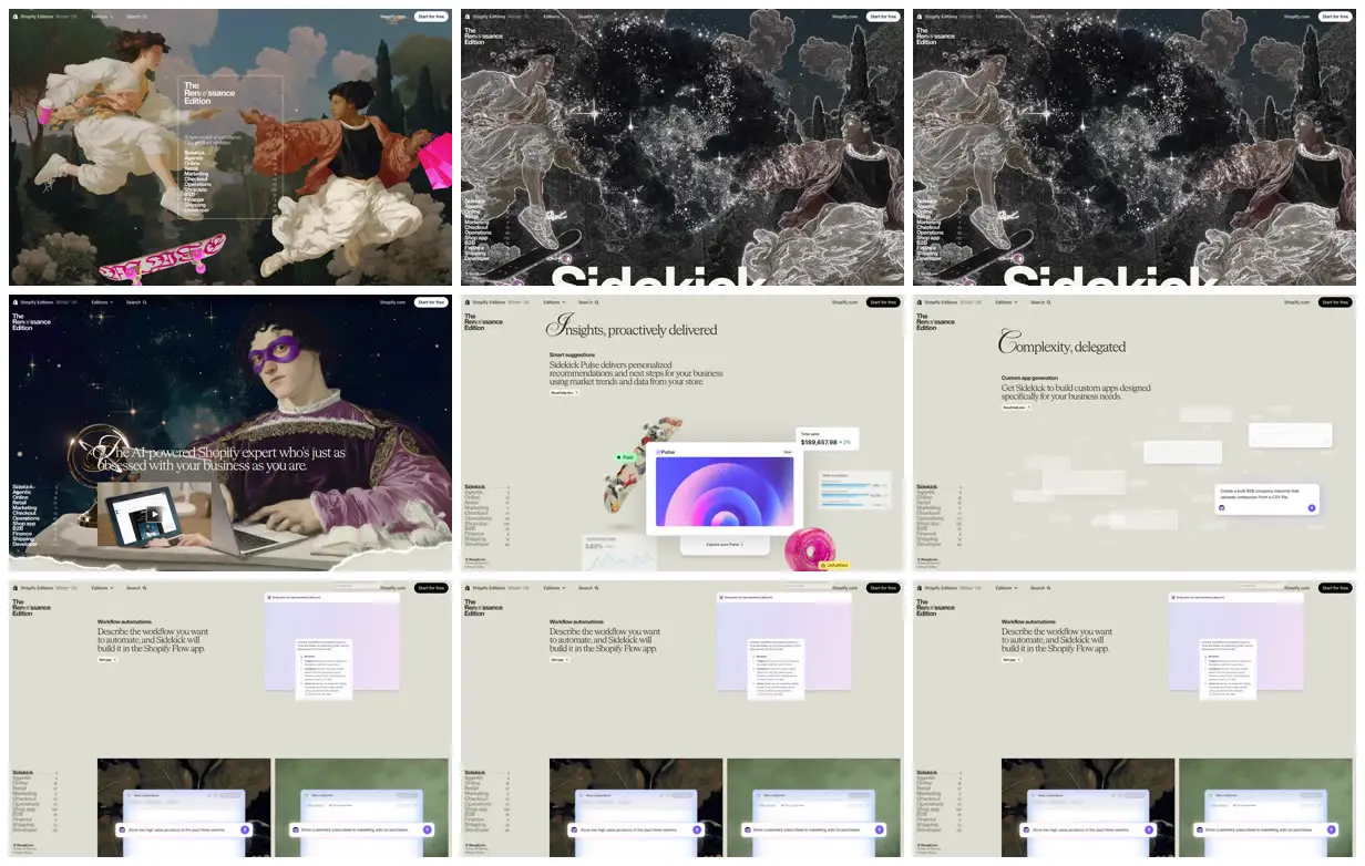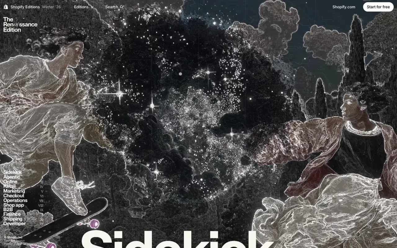
Frame a compact chapter index inside a thin translucent border over a full-bleed artwork, using the surrounding figures to direct attention inward. Contrast those dense scenes with cream sections that pair oversized calligraphic initials, serif explanations, and small bold utility labels. Layer interface panels at different scales with selective blur, soft shadows, and saturated accent objects to create depth. For a new subject, replace the historical figures, commerce props, chapter names, and interface examples with imagery and demonstrations specific to that subject while retaining the contrast between spectacle and editorial clarity.
No creator prompt published. This brief was written by Reference.
The renaissance edition
A commerce product-update microsite pairing Renaissance-style tableaux with skateboards, shopping bags, and laptops. A persistent chapter index leads into cream editorial sections featuring ornate initials, floating interface cards, and product demonstrations.
Source and credit
Authorship not stated by the source
Look notesby Reference
An editorial Shopify showcase blending Renaissance-inspired imagery with clean product and workflow interface examples.
- Color
- Muted sage, cream, charcoal, and deep navy, with vivid pink, purple, and blue accents.
- Type
- Elegant serif display headings paired with restrained sans-serif interface text.
- Framing
- A collage of page sections: dramatic illustrated hero panels alongside spacious, pale layouts with floating interface cards and ample whitespace.
- Structure
- A slim preview header sits above branded page content. The visible sections include an illustrated hero, feature headings and descriptions, UI mockups, and lower workflow cards.