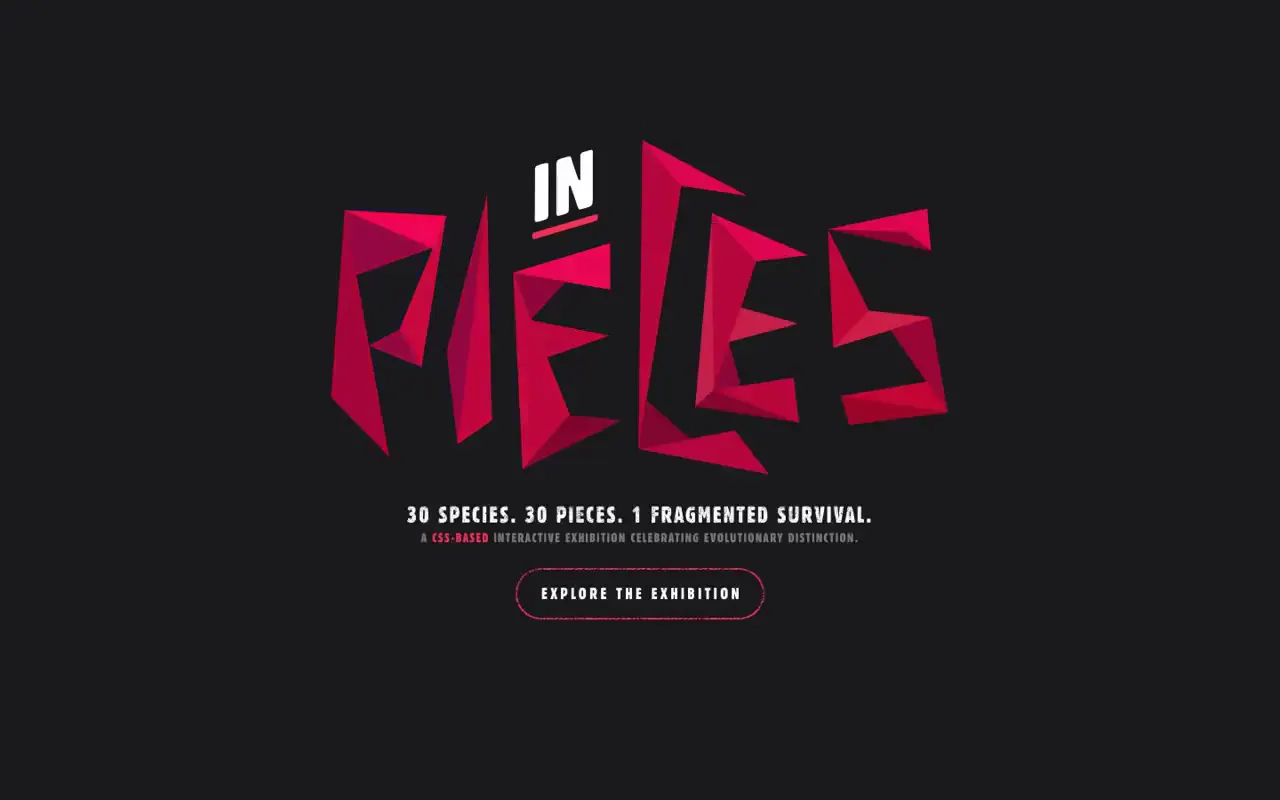
Build a recognizable subject and oversized title from a shared vocabulary of sharp triangular facets, using several adjacent shades to suggest folded surfaces. Reserve the strongest color for the final focal graphic and primary action, keeping supporting typography compact within generous negative space. For a new subject, redraw both the silhouette and letterforms around its own visual identity, and increase contrast on introductory imagery and secondary copy.
No creator prompt published. This brief was written by Reference.
In pieces exhibition entrance
A dark exhibition introduction pairs short centered statements with scattered triangular fragments and a faceted aquatic animal silhouette, ending in a large crimson geometric wordmark and an outlined exploration button.
Source and credit
Authorship not stated by the source
Look notesby Reference
Minimal, dark landing page for “In Pieces,” featuring a bold fragmented geometric wordmark and concise exhibition messaging.
- Color
- Near-black charcoal background with vivid magenta and red-pink shapes, white text, and subtle dark-gray accents.
- Type
- Small, condensed uppercase sans-serif text; the main “IN PIECES” lettering is oversized, angular, and assembled from separated geometric fragments.
- Framing
- Centered content with generous negative space. The opening frames use small centered text and faint abstract forms; later frames prominently center the colorful wordmark, tagline, and outlined call-to-action button.
- Structure
- A sparse introductory area gives way to a central hero section: logo, short descriptive copy, and an “Explore the exhibition” button.