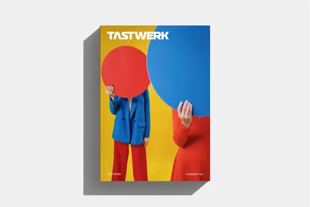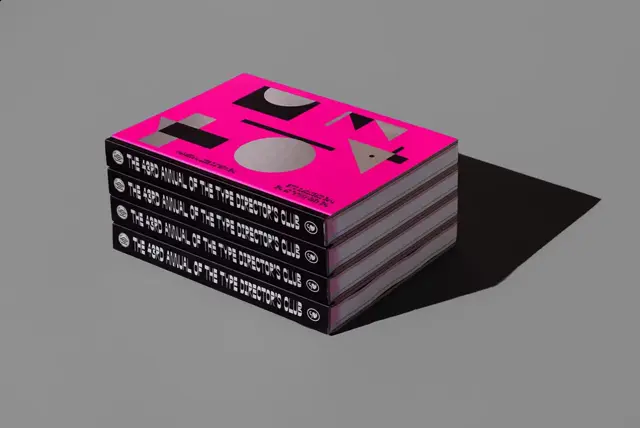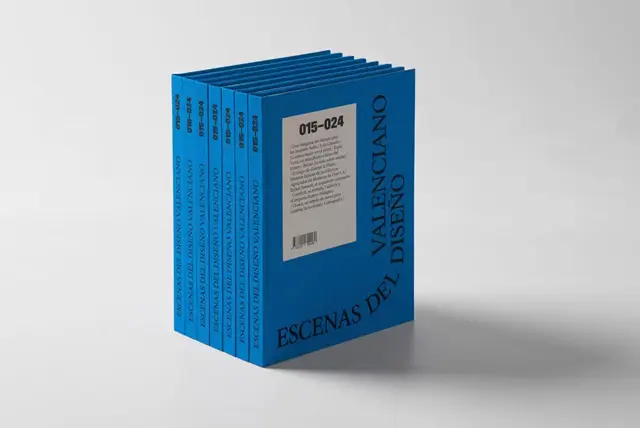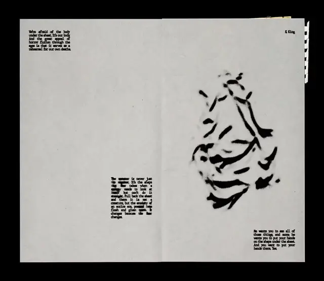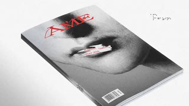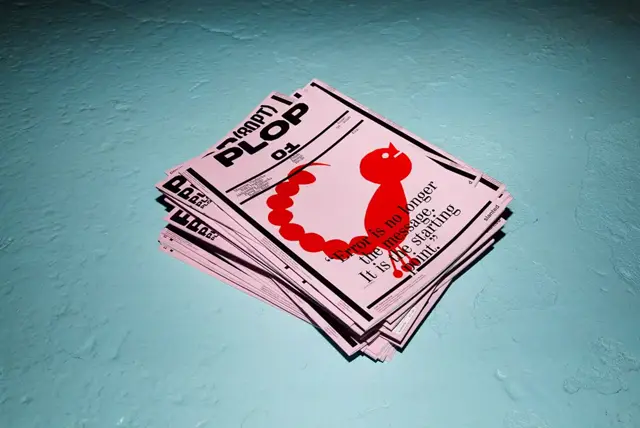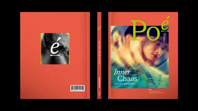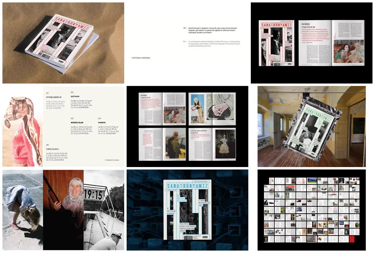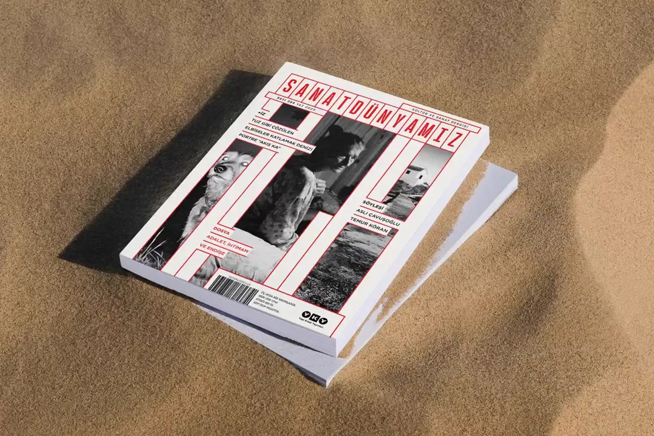
Build a cover grid from narrow masthead cells, then extend selected cell boundaries into stepped white bands that interrupt a monochrome image. Place short cover lines on horizontal tabs and use one accent color for rules, masthead and selected labels. Inside, contrast serif headings and narrow body columns with colored uppercase decks and large artwork reproductions. For a new subject, replace the masthead, photographs and artwork, adjusting the window widths and tab positions to preserve the focal subjects rather than copying the exact cuts.
No creator prompt published. Reference wrote this brief. Copy for agent includes the brief, visual reference links, and setup guidance.
Art magazine with stepped cover grids
An art magazine design presented through red, green and cyan cover variants, contextual mockups, a typography specimen, an enlarged article spread and a full-issue overview of text-and-art layouts.
Source and credit
Website · May 29, 2026 · 4.6k views · 31 comments
Authorship not stated by the source
Look notesby Reference
A polished editorial-design presentation for Sanat Dünyamız, combining magazine mockups, page layouts, and art-focused photography.
- Color
- Warm cream and beige, black and charcoal, with red accents and occasional teal or blue.
- Type
- A tall, condensed sans-serif masthead with clean, small editorial headings and body text; Turkish and English text appear in places.
- Framing
- The cover identity is prominent on angled magazine mockups; interior pages use restrained margins, columns, and photographs balanced with text.
- Structure
- The presentation develops the magazine identity through cover and type treatments, then shows interior spreads and editorial imagery, ending with a broader view of the publication’s layouts.