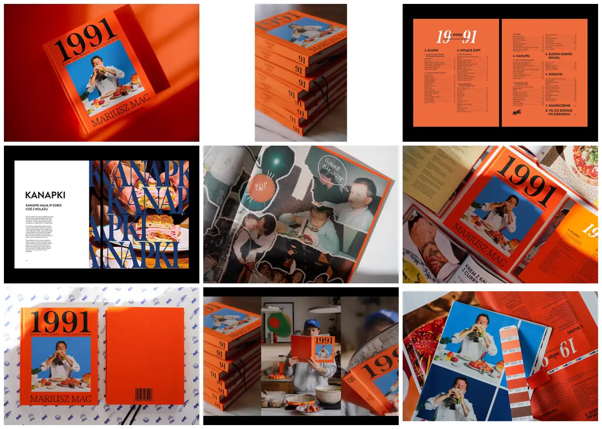
Build a publication identity around a saturated material color, oversized high-contrast numerals, and a photograph with a contrasting solid background. Alternate densely organized index pages with spacious chapter introductions, then repeat enormous serif chapter lettering across full-bleed images, allowing the letters to crop at the edges. For a new subject, replace the date, portrait, chapter words, and food imagery while retaining the contrast between orderly reading layouts and expressive image pages.
No creator prompt published. Reference wrote this brief. Copy for agent includes the brief, visual reference links, and setup guidance.
Orange and blue cooking album
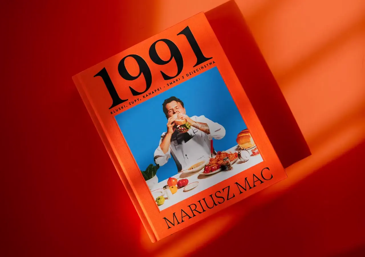
A clothbound cooking album with oversized 1991 numerals, a food portrait, orange contents pages, and a sandwich chapter opener pairing restrained text with repeated blue lettering over photography. Additional views show binding and print details.
Source and credit
Website · May 16, 2026 · 5.8k views · 48 comments
Authorship not stated by the source
Look notesby Reference
Bold retro-inspired cookbook design centered on Polish home cooking and the year 1991.
- Color
- Vivid orange and red, cobalt blue, black, and warm cream.
- Type
- Oversized black serif numerals and author name contrast with clean sans-serif Polish headings and small text.
- Framing
- The cover pairs large “1991” lettering with a blue-framed photograph of a chef and food; interior layouts use strong blocks, oversized lettering, and compact text columns.
- Structure
- A coordinated book design: front and back cover, spine and stacked-book views, contents and recipe layouts, and photographed open-book spreads.