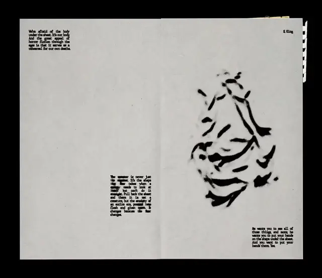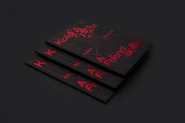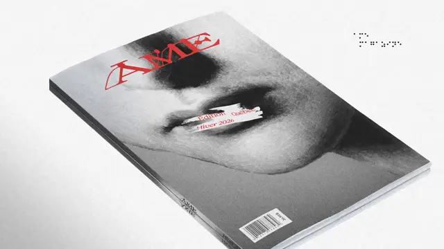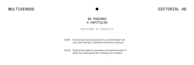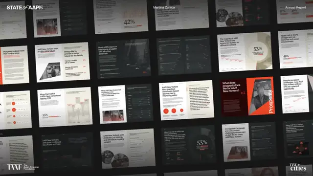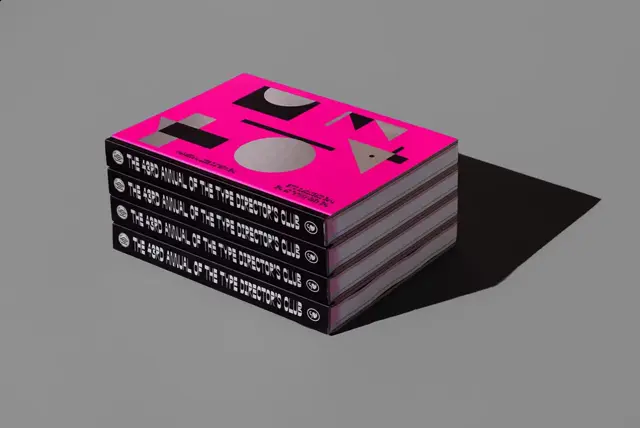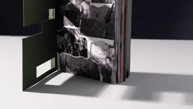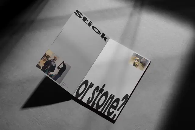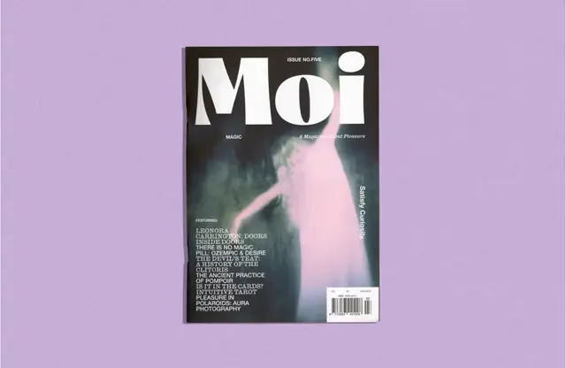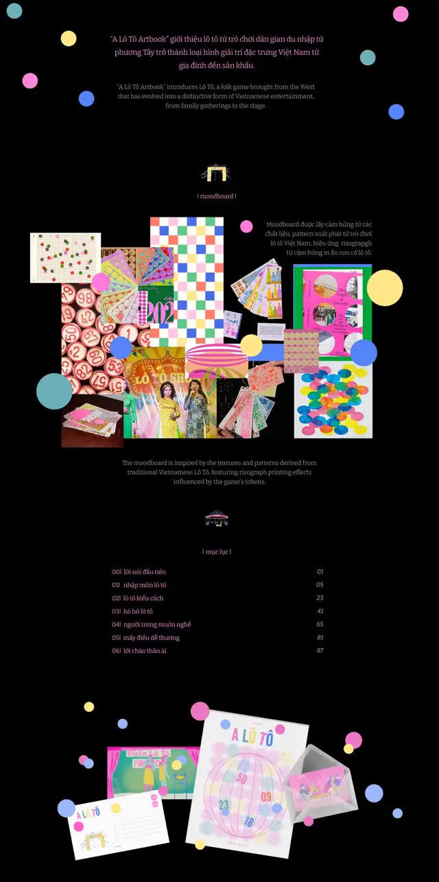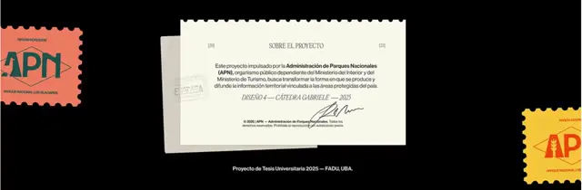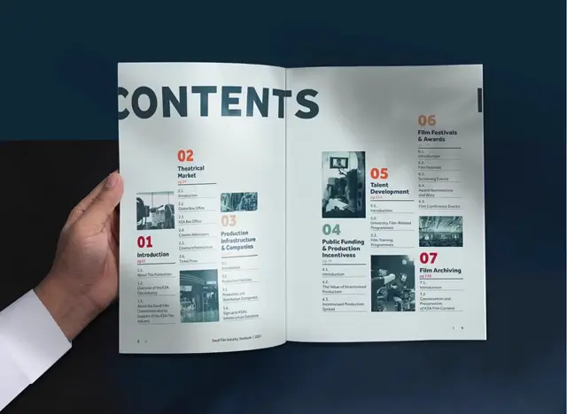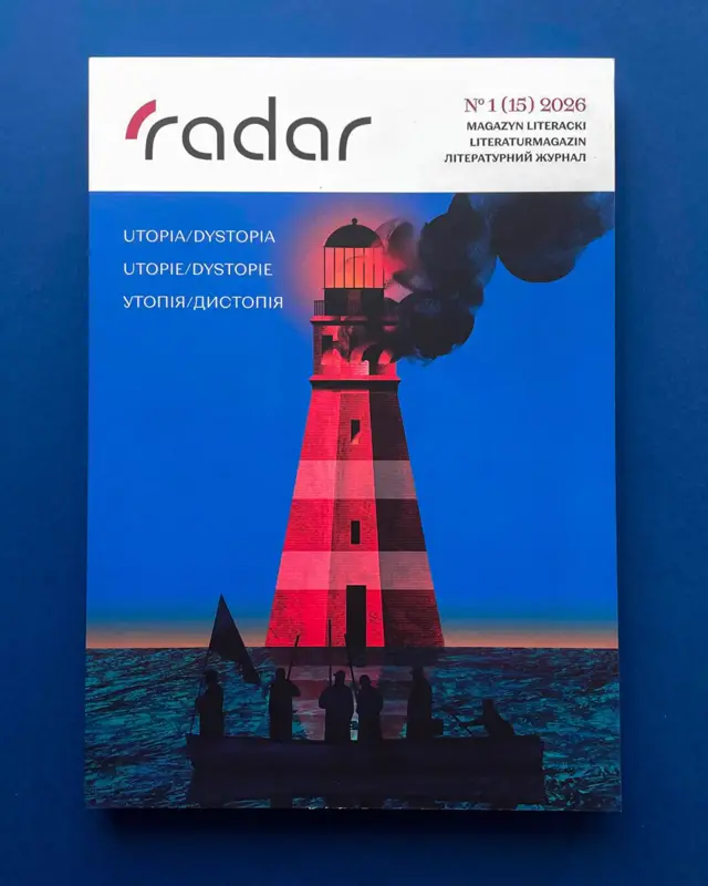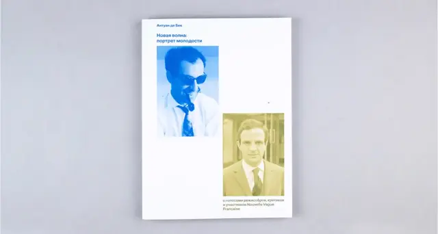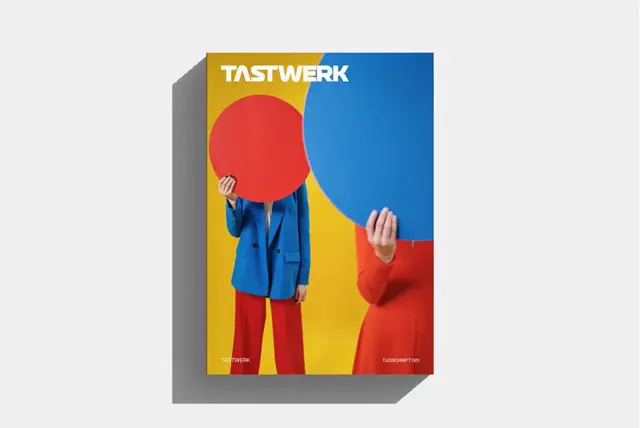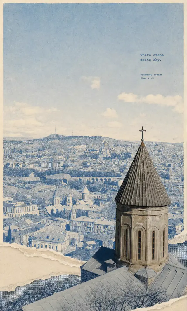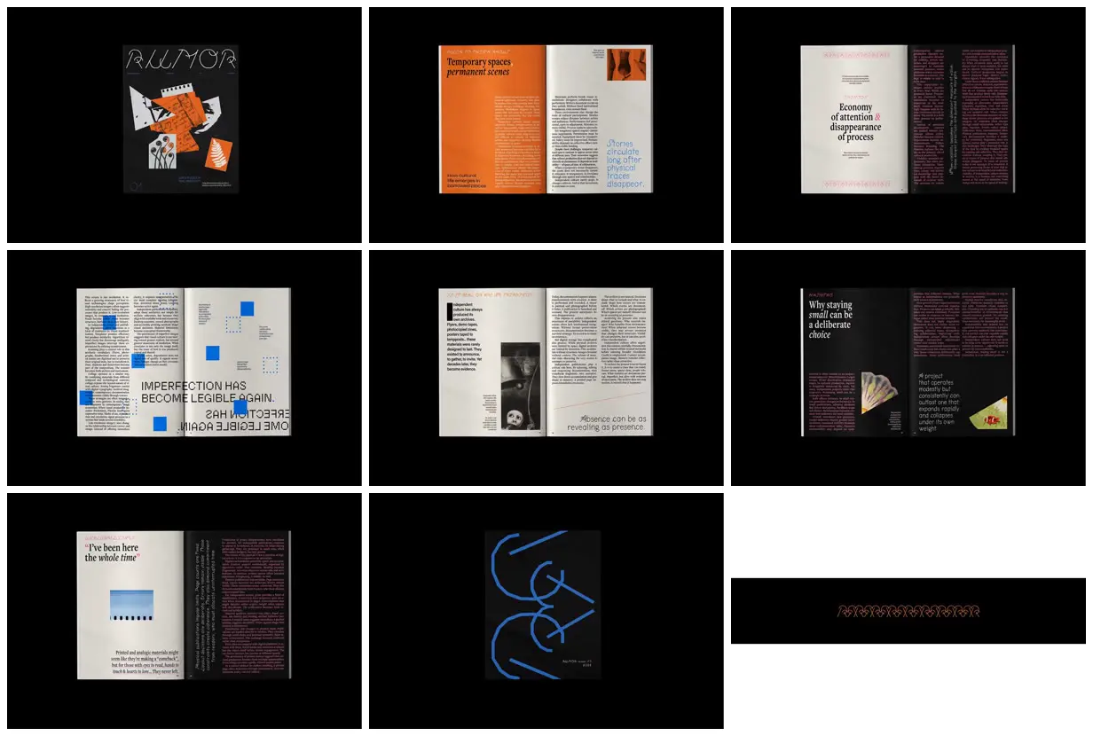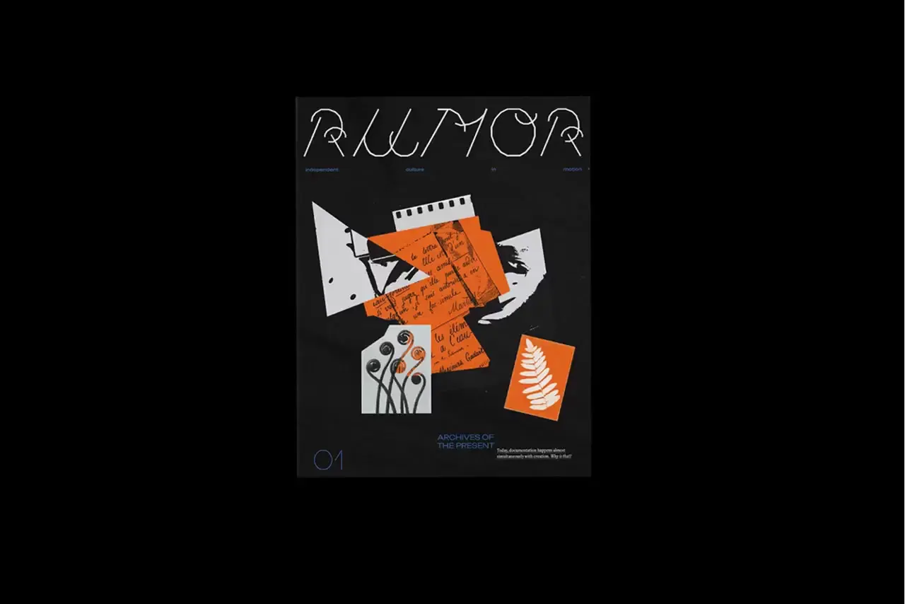
Alternate dense narrow-column reading pages with spacious title fields, using cream, black, and one saturated page color to establish editorial rhythm. Pair restrained serif typography with a recurring angular line ornament, then enlarge that ornament into a cropped back-cover graphic. Use a few scanned-looking cutouts and solid or dotted squares as interruptions rather than filling every gap. For a new subject, replace the archival fragments and article content with relevant material while preserving the contrast between orderly text and irregular graphic traces.
No creator prompt published. Reference wrote this brief. Copy for agent includes the brief, visual reference links, and setup guidance.
Archival magazine with graphic contrasts
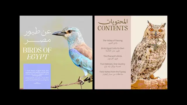
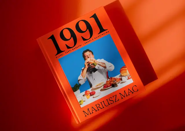
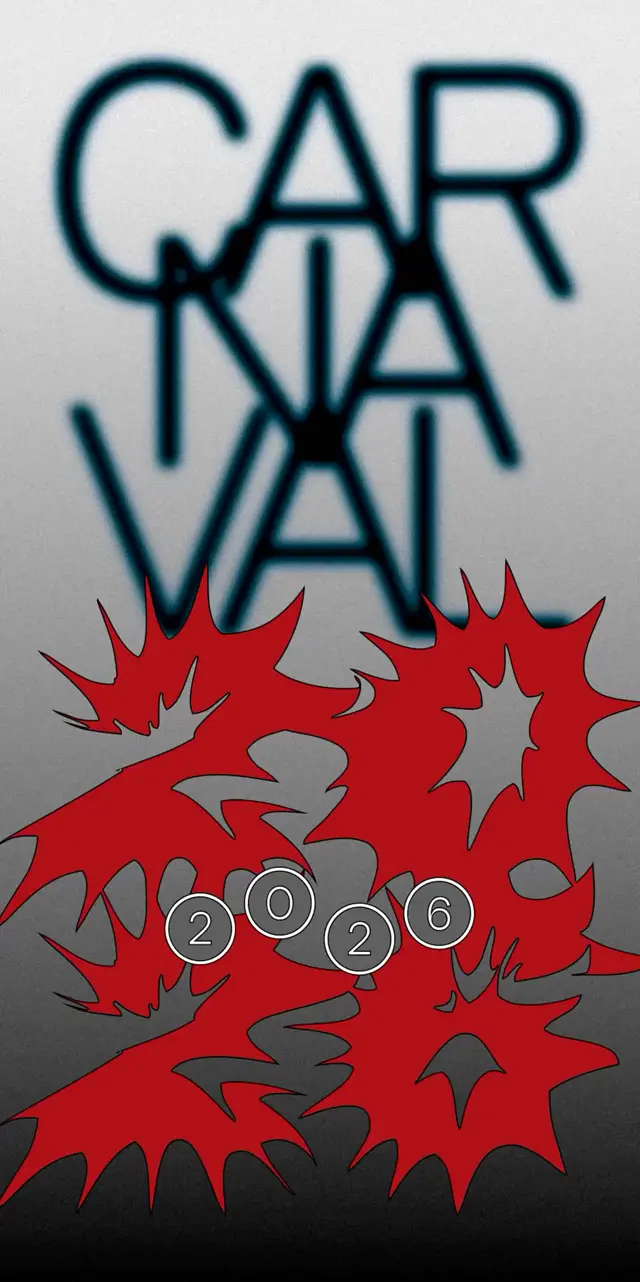
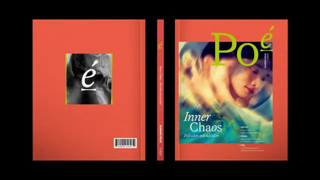
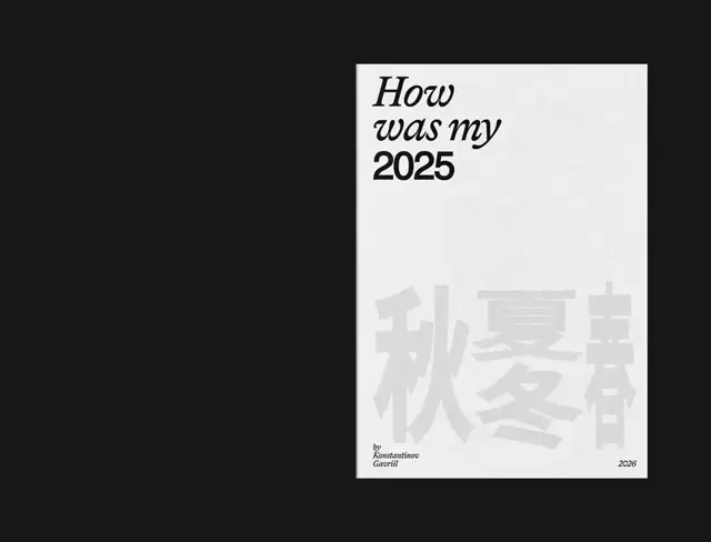
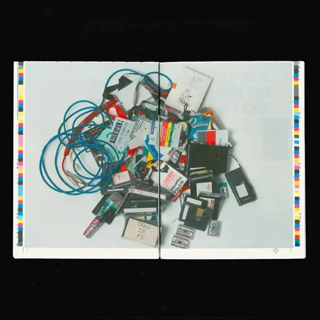
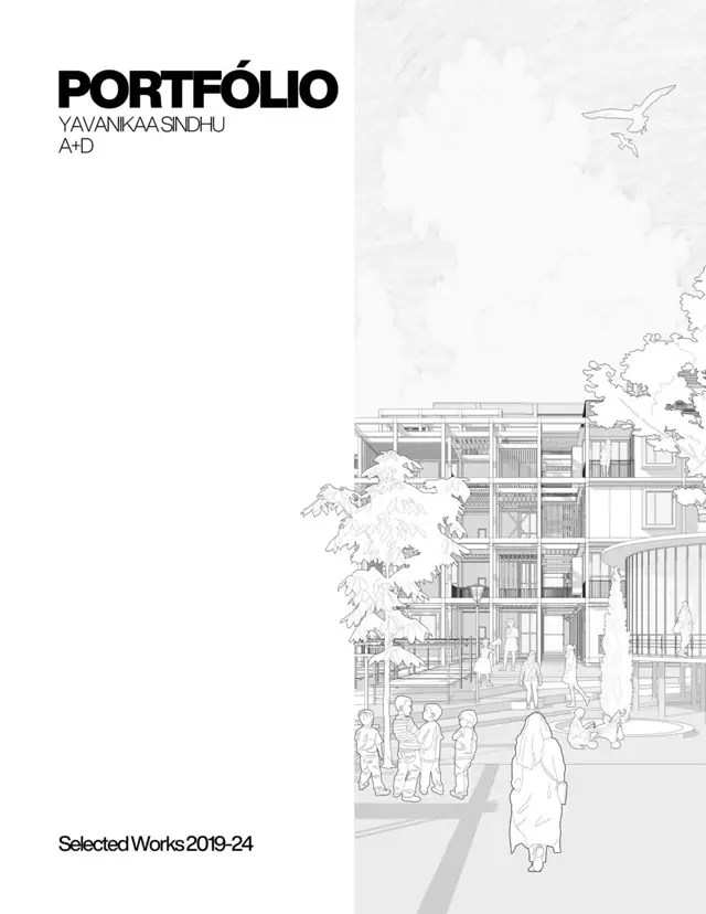
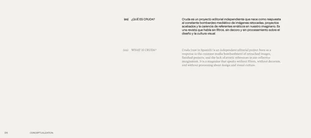
A cultural magazine shown through its collage cover, five editorial spreads, and graphic back cover. Cream, orange, and black pages combine serif essays, angular lettering, archival fragments, pink accents, and blue pixel-like interventions.
Source and credit
Website · Feb 26, 2026 · 10k views · 20 comments
Authorship not stated by the source
Look notesby Reference
Archival, experimental culture-magazine design combining collage, editorial typography, text-heavy layouts, and abstract diagrams.
- Color
- Orange is prominent in the collage and one spread; the broader palette pairs charcoal and black with warm white, gray, muted pink, and occasional blue or green accents.
- Type
- Mixes oversized geometric sans-serif headlines, refined serif display text, small editorial body copy, and sparse labels.
- Framing
- Asymmetric, modular pages use strong color blocks, narrow text columns, generous blank areas, and occasional collage or diagram elements.
- Structure
- A cover-like collage leads into contrasting editorial spreads, followed by text-and-diagram feature pages and a sparse graphic closing page.