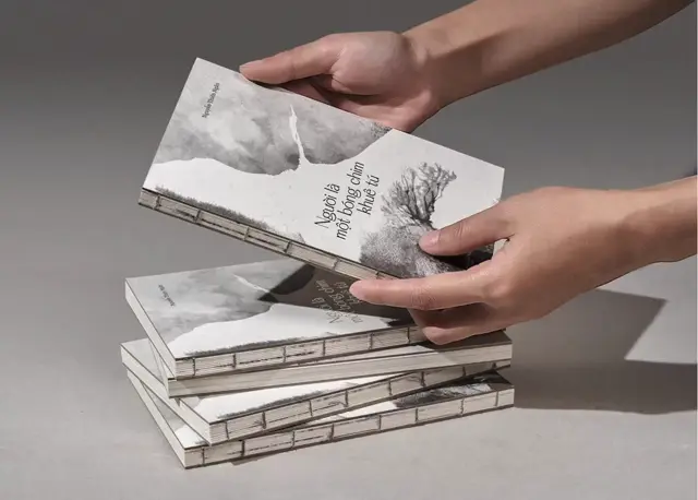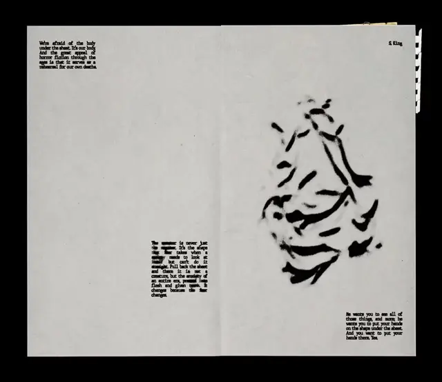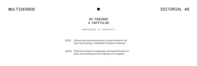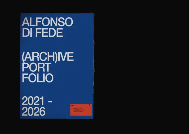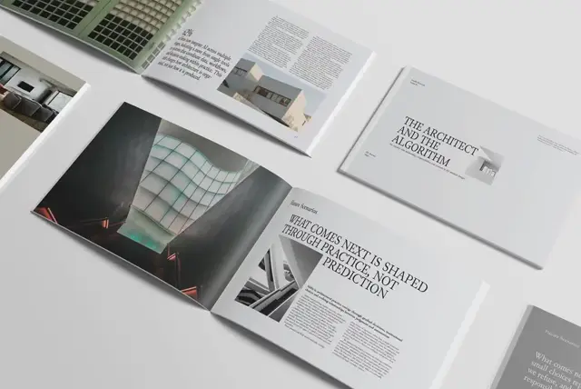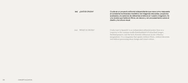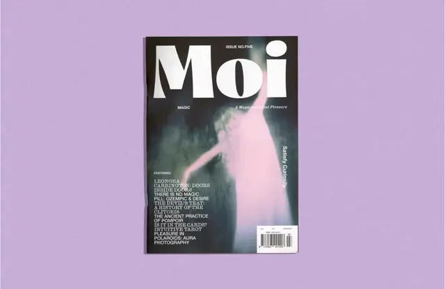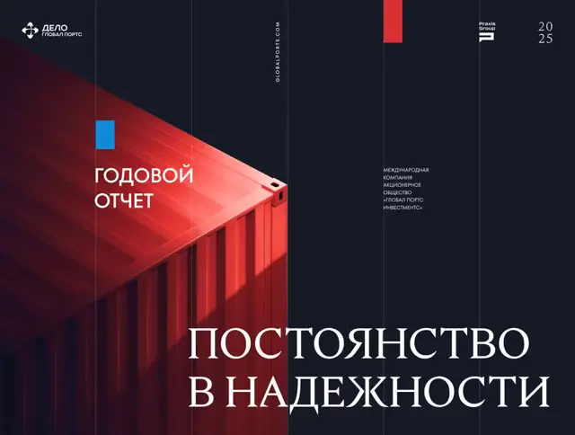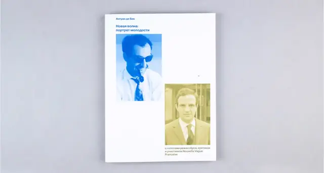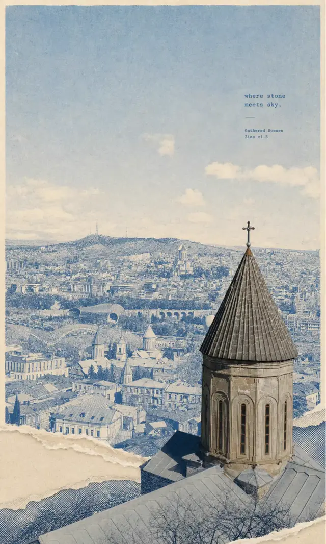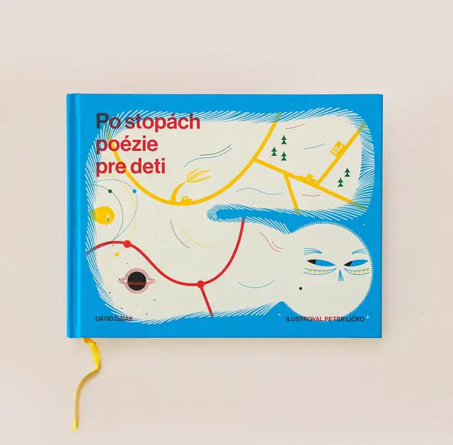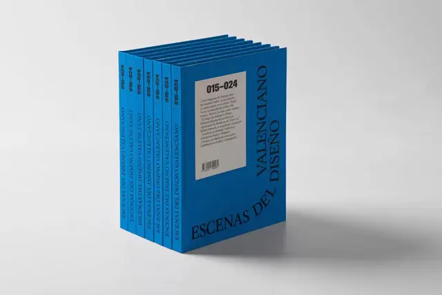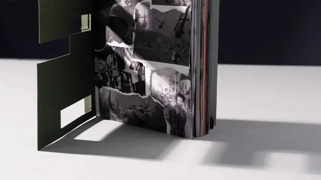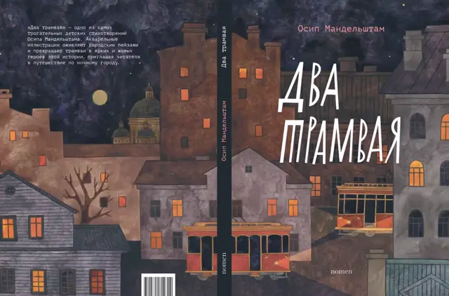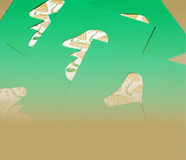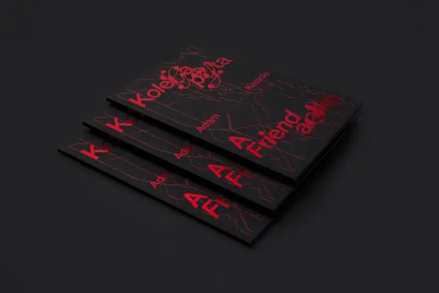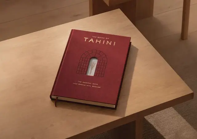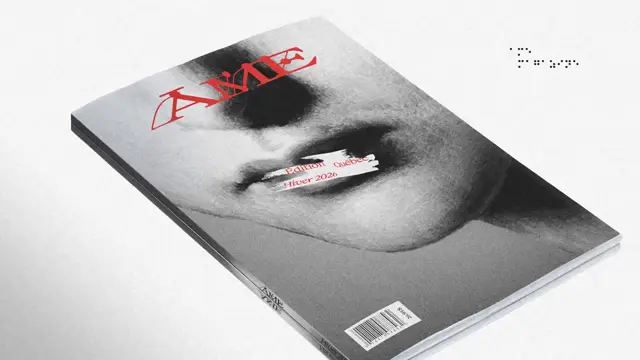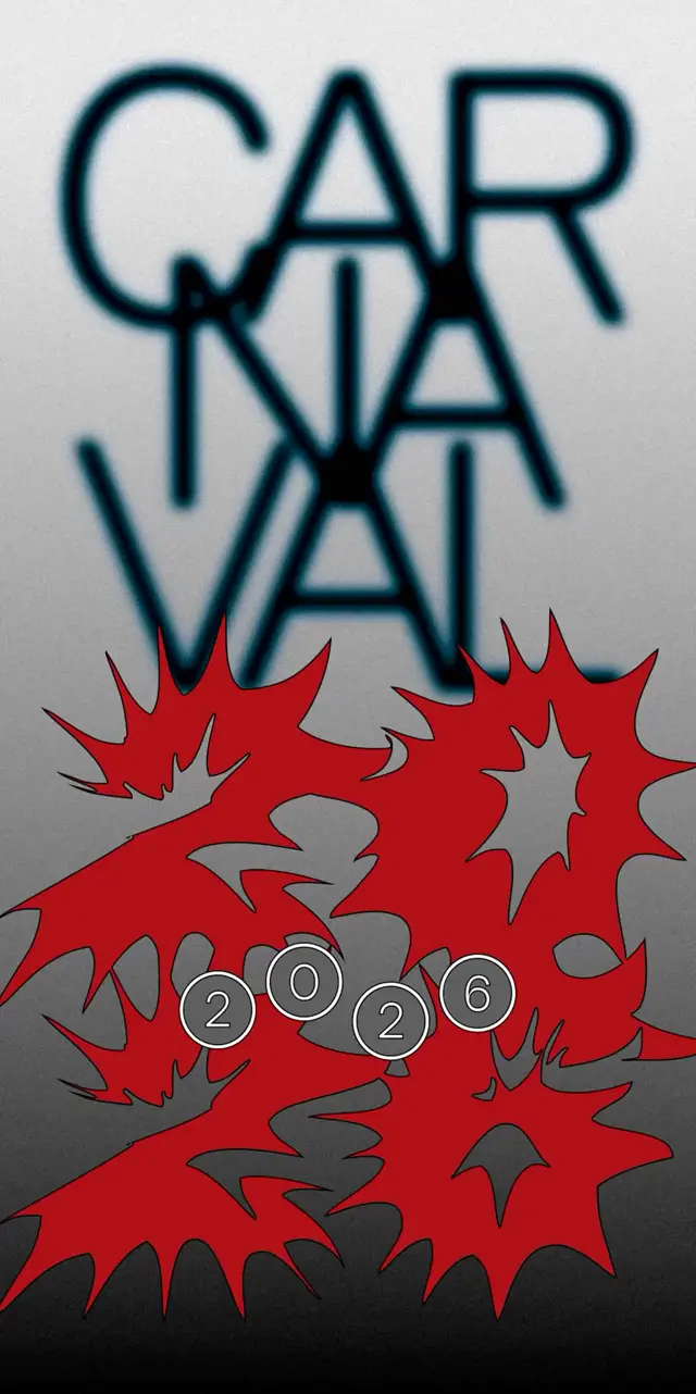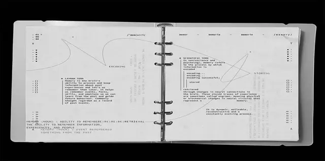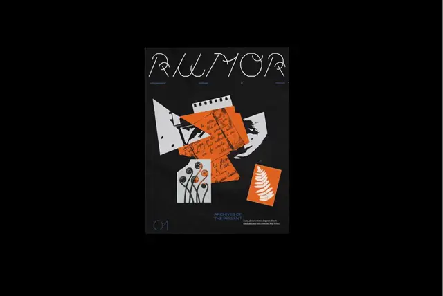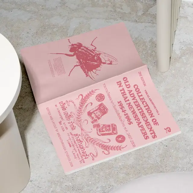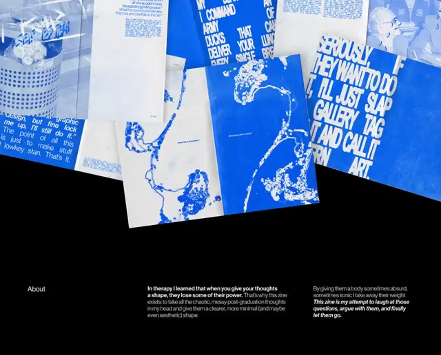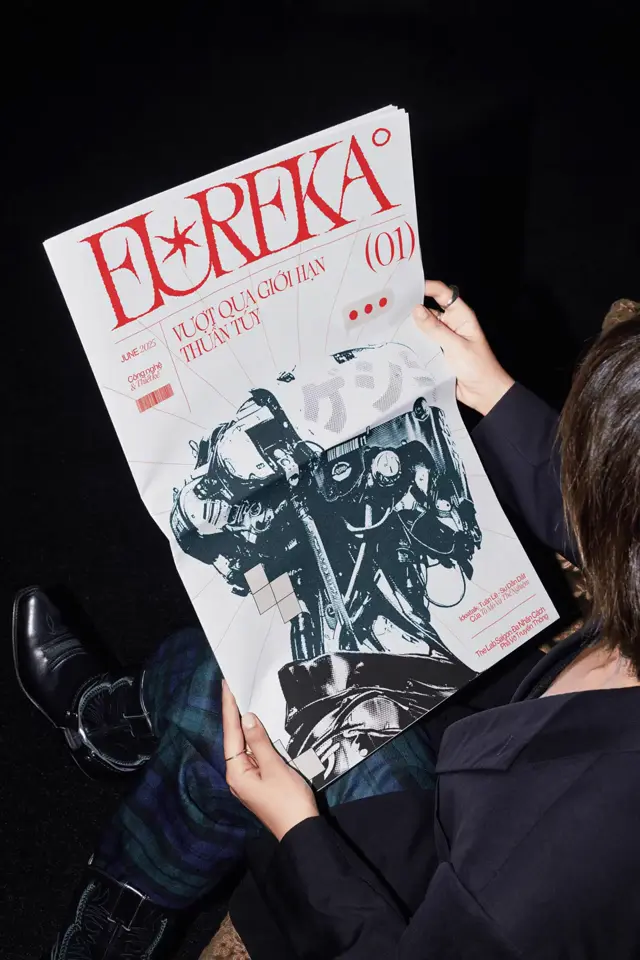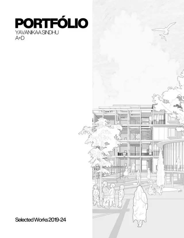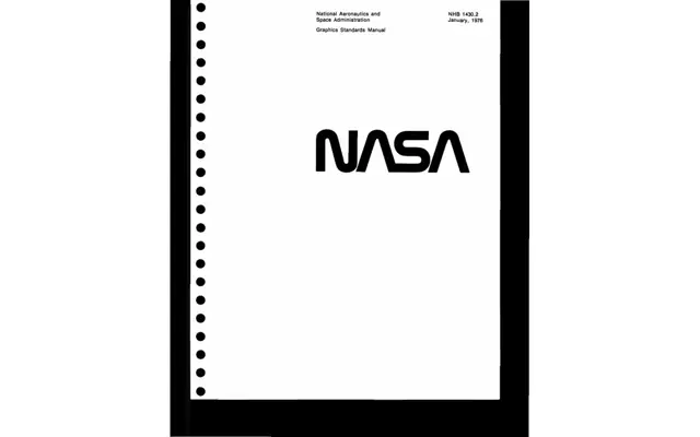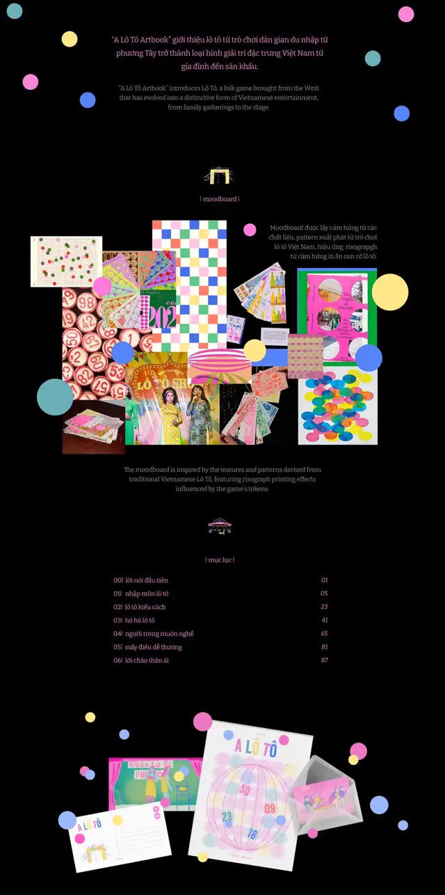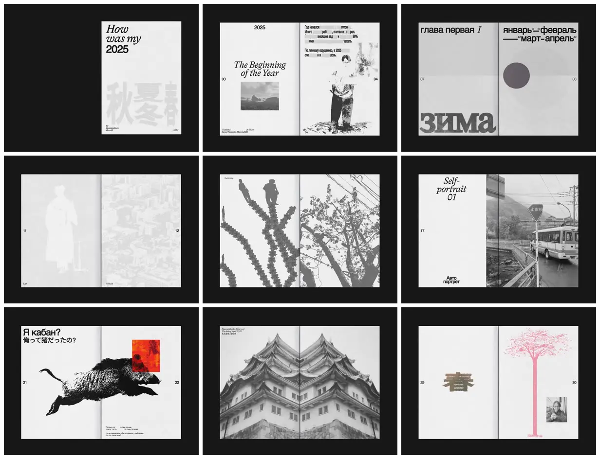
Alternate sparse typographic spreads with image-dominant spreads, retaining consistent outer-edge page numbers and small captions. Contrast large italic serif headings with heavy sans-serif labels, and vary photographs between faint tonal washes, stark threshold-like cutouts, and full-bleed crops. Use a gutter-spanning subject and one isolated color overlay for a visual climax. For a new subject, replace the diary photographs, seasonal characters, and personal text with relevant imagery and section markers while preserving the pacing and tonal contrasts.
No creator prompt published. Reference wrote this brief. Copy for agent includes the brief, visual reference links, and setup guidance.
A year in a pale grey diary zine
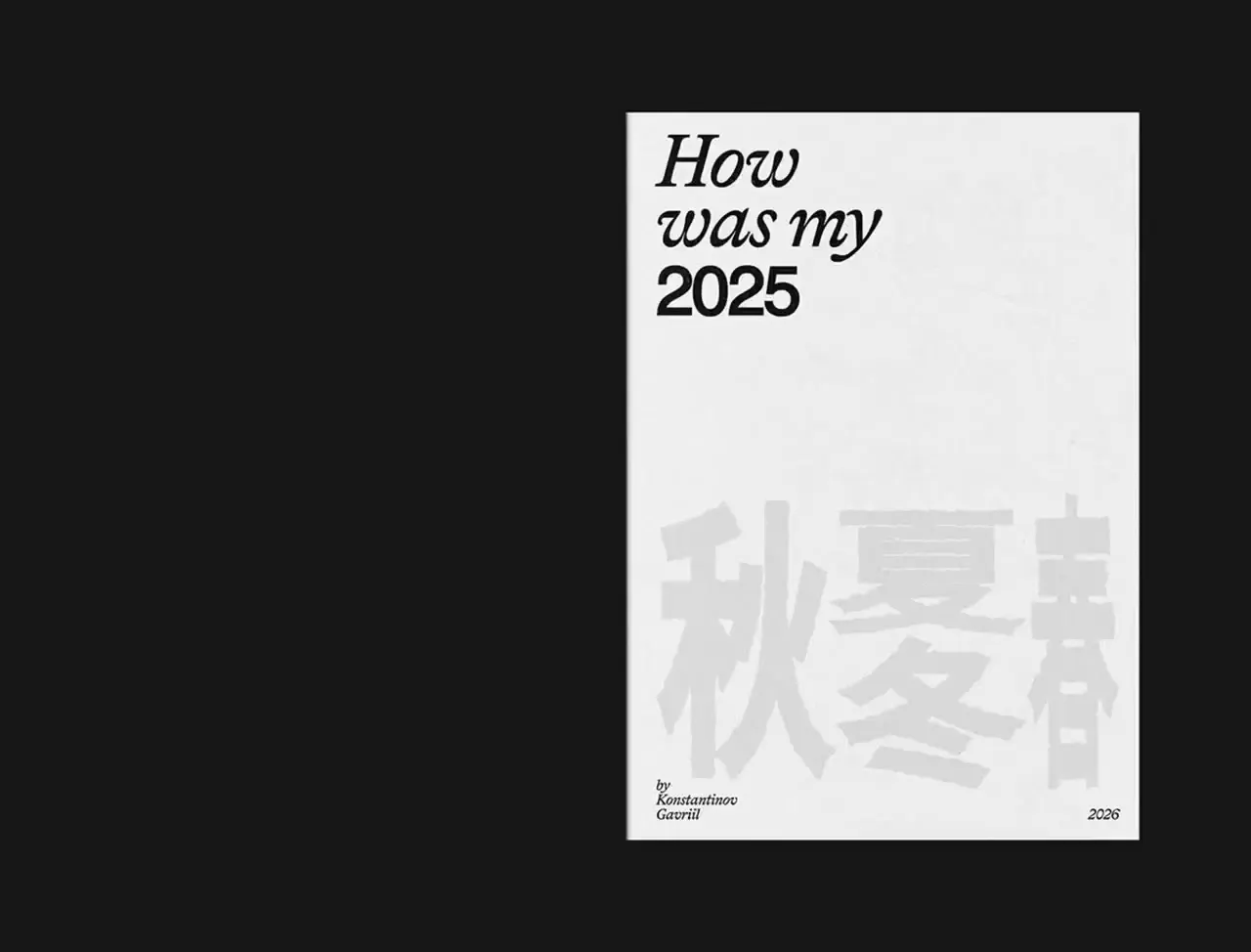
A personal diary zine pairing multilingual typography with travel photographs, faded figures, redacted text, seasonal characters, a spanning boar cutout, mirrored architecture, and occasional orange-red and pink accents.
Source and credit
Website · Feb 9, 2026 · 3.1k views · 7 comments
Authorship not stated by the source
Look notesby Reference
A restrained, personal year-in-review zine combining diary-like typography, photographs, silhouettes, and graphic illustrations.
- Color
- Mostly white, pale grey, charcoal, and black, with occasional red-orange and pink accents.
- Type
- Mixes large serif and italic English headings with clean sans-serif text and multilingual lettering; small page labels and captions appear throughout.
- Framing
- Minimal editorial layouts with generous blank space, asymmetric text and image placement, and some spreads dominated by large photographs or illustrations.
- Structure
- Opens with a 2025 title and an early-year section, then presents chapter or month-like pages, self-portrait material, and varied personal image-led entries.