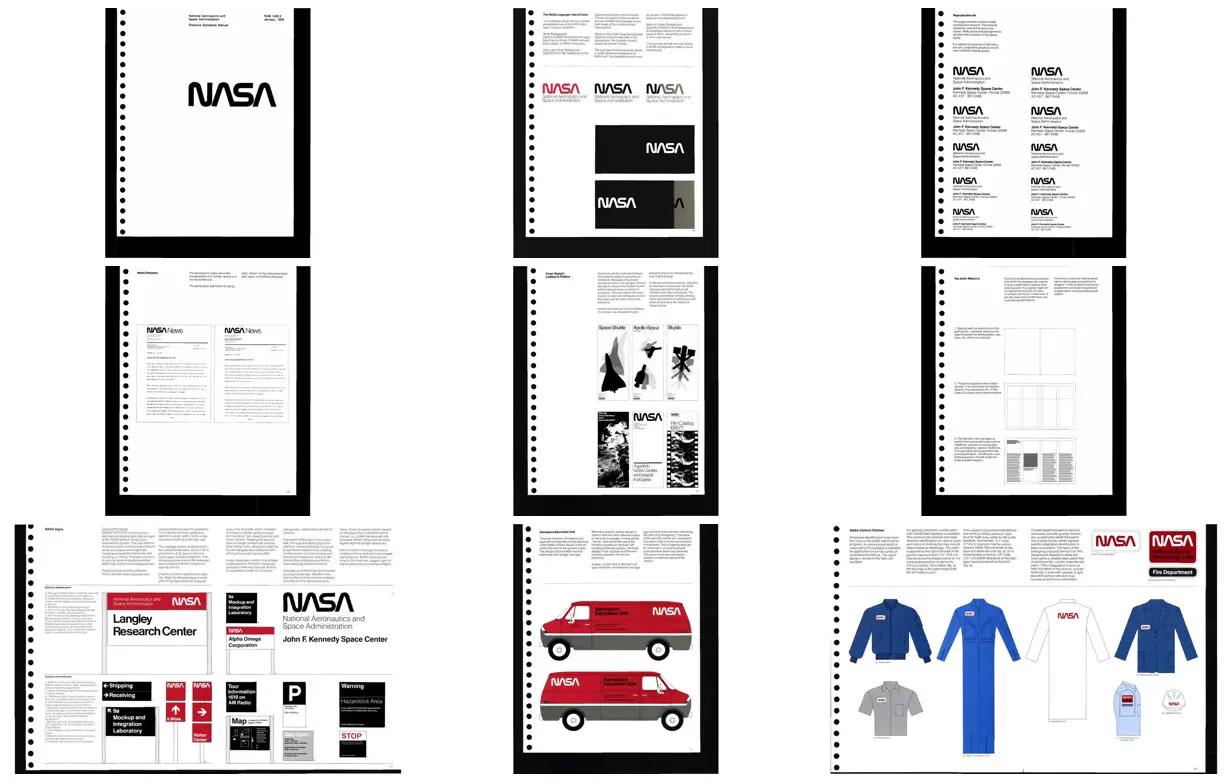
Build an identity manual around consistent left-aligned lockups, limited color roles, and clear differences between primary names and supporting information. Explain layout construction with staged diagrams that progress from blank spread to guide lines to populated columns, then demonstrate the same system on signs, vehicles, and clothing using flat outlined illustrations. For a new subject, replace the NASA identifier and institutional text with an original mark and organization, and adapt the application types and accent palette to its actual needs.
No creator prompt published. This brief was written by Reference.
NASA graphics standards manual
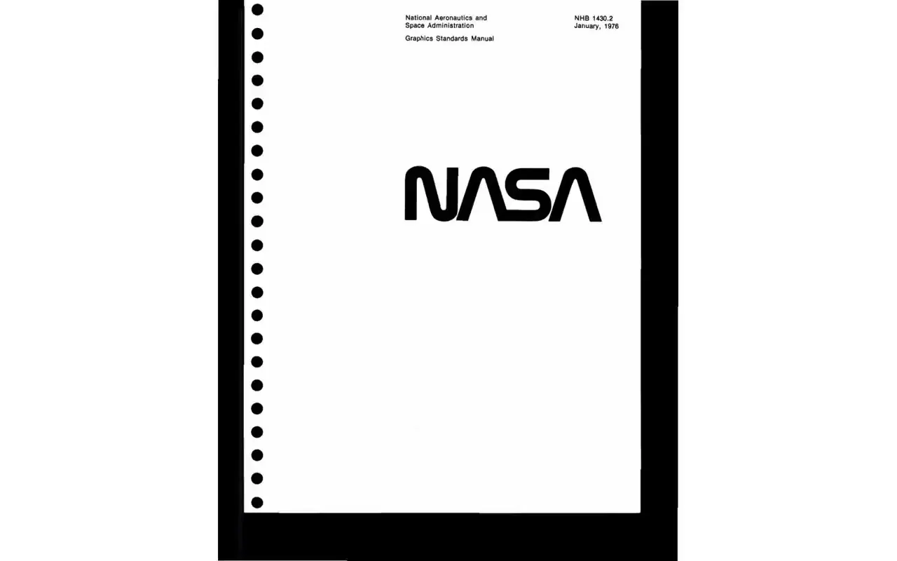
A scanned identity manual showing a minimalist cover, wordmark color variants, scaled identification blocks, news-release layouts, publication-grid construction, wayfinding signs, two-sided van graphics, and illustrated uniform applications.
Source and credit
Look notesby Reference
A restrained, technical identity manual presenting NASA logo standards and examples of their application.
- Color
- Mostly black, white, and gray, with NASA red and blue accents.
- Type
- Clean sans-serif typography, with prominent NASA wordmarks and compact explanatory text.
- Framing
- Individual manual pages use aligned explanatory columns, labeled panels, construction diagrams and generous white space around wordmarks and application illustrations.
- Structure
- A cover and information-heavy standards pages are followed by logo treatments, layout examples, vehicle graphics, and apparel illustrations.