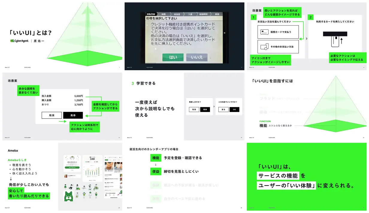
Place a real interface example before a stripped-down redraw, then attach bright rectangular callouts to exact controls using thick elbow arrows. Reuse one geometric framework across conceptual sections, emphasizing the active level while fading the others, but increase inactive-label contrast for standalone readability. For a new subject, replace the payment and app examples with relevant workflows and retain the alternation between evidence, analysis, framework, and a high-contrast concluding slide.
No creator prompt published. This brief was written by Reference.
Explaining good UI through examples
A Japanese educational deck examining interface design through a payment-terminal photograph, annotated payment and ticketing redesigns, an app collage, and diagrams connecting function, benefit, value, and experience.
Source and credit
Authorship not stated by the source
Look notesby Reference
初心者向けに、UIの改善例や使いやすさの考え方を図と画面例で説明するプレゼンテーション。
- Color
- 白と薄いグレーを基調に、鮮やかな緑を強調色として使用。文字や画面例には黒、濃紺、淡い緑も見られる。
- Type
- 日本語のサンセリフ体。見出しは太めで大きく、説明文は小さめ。緑のラベルや色面で重要箇所を目立たせている。
- Framing
- スライドが3列×3段の一覧状に並ぶ。各スライドは余白の広い構成で、文章、ピラミッド図、UI画面例を組み合わせている。
- Structure
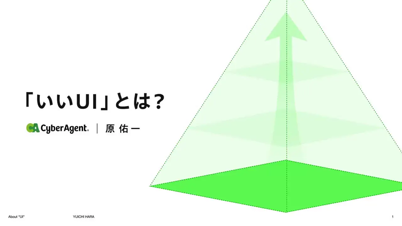
- UIの定義から始まり、決済画面などの改善事例、学習しやすさやサービスらしさの説明へ展開。最後に、よいUIはサービスの機能をユーザーのよい体験に変えるという要点を示す。