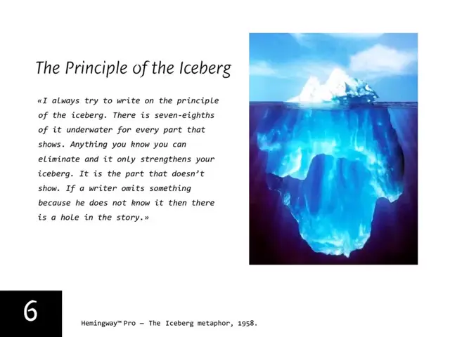
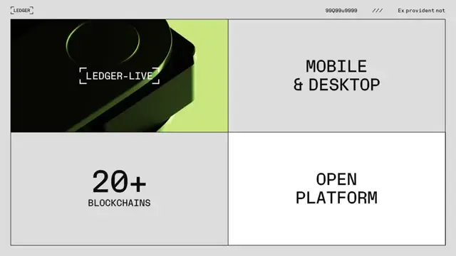
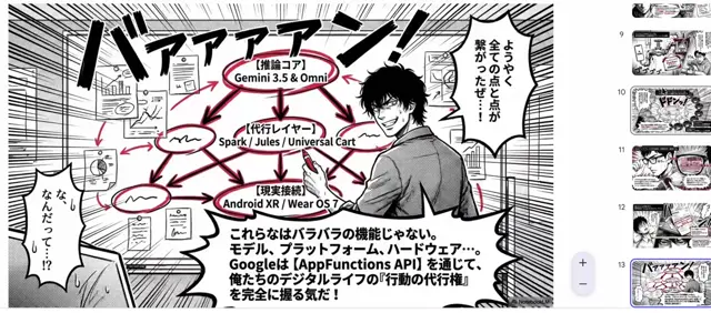
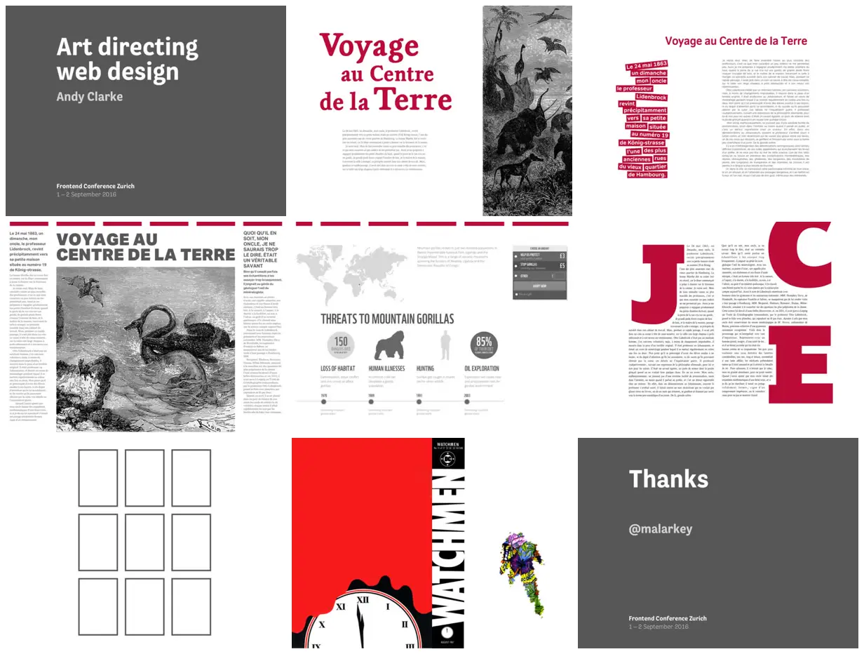
Explore multiple layouts for the same subject while keeping a tightly limited accent palette. Pair oversized display type with a narrow, full-height illustration crop, then vary the rhythm using staggered colored text strips and a central image flanked by slim columns. Let giant initials interrupt and shape the surrounding text rather than sit above it. For a new subject, replace the literary passages and engravings with relevant copy and imagery, and increase body-text size for presentation-distance readability.
No creator prompt published. This brief was written by Reference.
Art directing web design
A presentation pairing restrained gray title slides with editorial layout experiments: crimson typography, monochrome adventure engravings, cutout-style text strips, oversized initials, a nine-panel diagram, and a comic-cover example.
Source and credit
Authorship not stated by the source
Look notesby Reference
Editorial web design concept combining bold typography, wildlife illustrations, and infographic-style content.
- Color
- White and charcoal gray with strong crimson-red accents; wildlife imagery is mostly black and white.
- Type
- Large bold sans-serif headings and labels paired with a prominent red serif title; smaller text is compact and understated.
- Framing
- A white canvas presents multiple page and component mockups in a loose grid, interspersed with charcoal presentation slides.
- Structure
- The examples include a title slide, French editorial pages, wildlife image panels, an infographic section, a grid of empty image frames, and a bold red-and-black graphic. Dark gray slides anchor the presentation.