Attached is a CSV of companies that have been disrupted by AI. Please read through this, analyze the data, and create a 10-slide presentation that:

- Has a strong thesis and narrative
- Presents the most interesting findings in a clear, compelling way
- Uses different charts and data presentation styles to tell the story
- Is concise and created for presenting to an audience with a voiceover, not created for reading

Make the presentation simple and basic. We will do the design later based on the slide content. Just make it 16:9 with black text.

The thesis, narrative, interesting findings, conciseness, clarity, and data visualizations are most important.

Just put the content on the slide in a clean, simple way and we will do design later.
Okay, now let's explore design directions. I want you to generate three different mood boards encompassing styles, colors, fonts, feel, vibe. Give me three options using Image Gen.
I'd now like you to design each slide in our deck in this style using Image Gen.

Don't try to design them within the PowerPoint decks themselves.

Output each slide as an image, design it in the Market Autopsy style using Image Gen, save it for a new deck.

You might, for example, end up with something like original_1.png and then designed_1.png.

What I then want is a compiled final deck that includes generated images in the Market Autopsy style that use the content of the original deck but redesigned in the aligned upon style.

It is essential that the finished deck look cohesive and consistent from start to finish, but also essential that the slides are varied in terms of their visual look that the deck isn't boring.
Just to be clear, you need to generate the new slides with Image Gen. I want to see what you can do with this approach.
Make it yours. Change "a CSV of companies that have been disrupted by AI" and "10-slide" in the first prompt to your own data and length, and "Market Autopsy" in the third to the mood board you pick. The creator suggests asking for data labels on every chart in the first step.
Editorial deck on companies hurt by AI
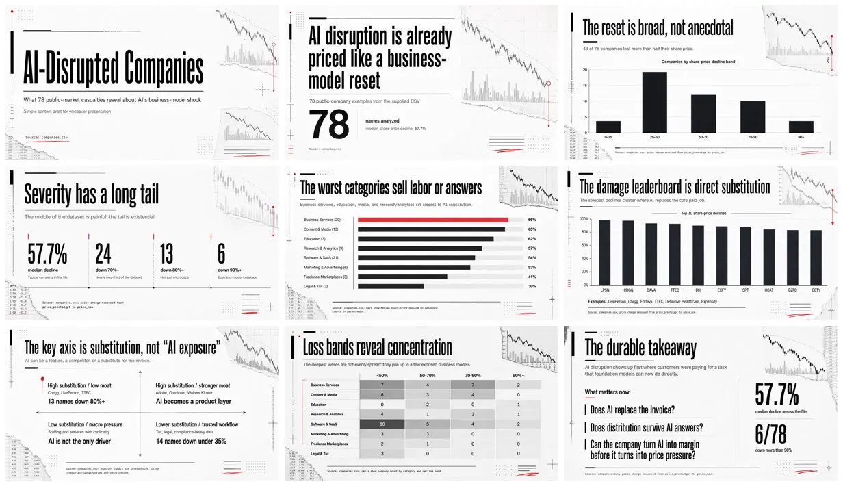
An 11-slide data deck on 78 public companies hit by AI, in condensed black type with red accents and stock-chart scraps on pale gray paper. Codex wrote plain slides from a CSV, made three mood boards, then redrew every slide as one generated image.
“The trick is using the same workflow as humans: Content first. Then design.”
You'll need
- Your own CSV or data file (the creator's was a list of companies disrupted by AI)
- Codex with image generation
How it was made
Step 1: GPT-5.5 read the creator's CSV and wrote a plain 10-slide deck. Step 2: three mood boards with image generation (Market Autopsy, Machine Room, Editorial Shockwave); the creator chose Market Autopsy, and that message isn't quoted. Step 3: redesign every slide as an image in that style. GPT-5.5 first planned to keep live text over generated backgrounds, so the fourth prompt steers it to generate whole slides. The creator notes that charts without data labels came out less accurate, and that an all-image deck is hard to edit and large.
Codex · GPT-5.5 · GPT Image 2
Source and credit
X · Apr 24, 2026 · 164 likes · 26k views · 5 comments
Authorship not stated by the source
Published instructions: X Article body, four prompts quoted in order
Look notesby Reference
Print-like data slides: tall condensed black headlines on pale gray paper, with stock-chart fragments, torn paper, and thin red markers around the edges.
- Color
- Off-white and pale gray paper and black, with one signal red for markers, a highlighted bar, and small annotations.
- Type
- Tall condensed grotesque headlines, a light sans-serif for subheads, monospace source lines at the foot of each slide, and very large numerals for key figures.
- Framing
- Headline top left under a short black rule, one chart, table, or stat row in the middle, and decorative chart scraps and number columns cropped at the corners.
- Structure
- Cover (AI-Disrupted Companies), 78 names analyzed, three patterns, a histogram of share-price decline bands, a stat row (57.7%, 24, 13, 6), a bar chart of the worst categories, a top-10 decline leaderboard, a table of six disruption mechanisms, a two-by-two quadrant, a heat-map table of loss bands, and a closing takeaway with three questions.