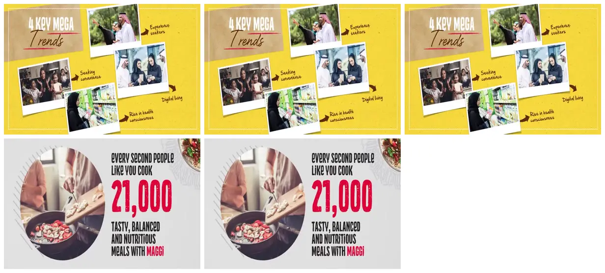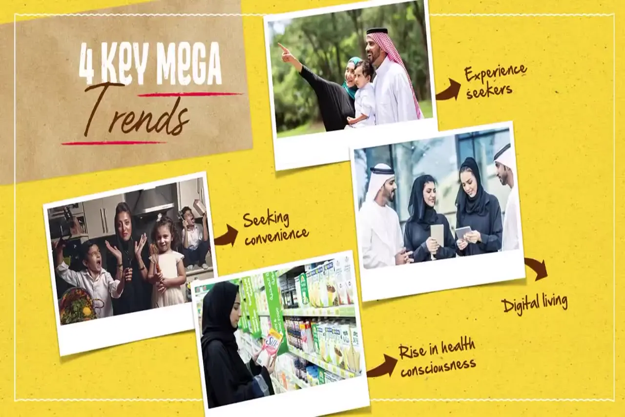
Alternate photographic explanation slides with oversized typographic dividers to create rhythm without relying on bullet lists. Use white-bordered, slightly rotated photos and hand-drawn arrows for a small set of categories; use a circular crop and one oversized accent-colored number for a key statistic. For a new subject, replace the food imagery, bilingual questions, figures, and brand palette while retaining the distressed headline treatment and restrained recurring hatch textures.
No creator prompt published. This brief was written by Reference.
Colorful bilingual food brand deck
Food-brand presentation slides combine consumer-trend photo collages, bilingual ingredient messaging, repeating cooking questions, and a prominent meal statistic. A perspective montage shows additional product and speaker layouts.
Source and credit
Authorship not stated by the source
Look notesby Reference
Bold, graphic presentation design combining editorial trend imagery with a packaged-food campaign.
- Color
- Bright yellow and warm beige on the upper slides; white and light gray with vivid red-pink accents on the lower slide, plus muted colors in the photographs.
- Type
- Condensed uppercase sans-serif headlines paired with handwritten-style script accents.
- Framing
- Repeated slide previews arranged in a grid. The upper slides place overlapping, tilted photo cards around a large headline; the lower slide pairs a large circular cooking photo with prominent text and numerals.
- Structure
- The upper design is headed “4 Key Mega Trends,” with labeled photo callouts. The lower design features the message “Every second people like you cook,” a large “21,000,” and supporting text about tasty, balanced and nutritious meals with Maggi.