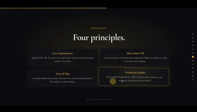
Build a consistent annotation language from sketchy arrows, brackets, icons and irregular uppercase headings, then vary the balance of imagery and text across slides. Use large product cutouts with labeled component arrows and oversized cropped illustrations for section introductions. For a new subject, replace the packaging, ingredient imagery, audience photography and footer motif with subject-specific equivalents; increase contrast and size for secondary data labels.
No creator prompt published. This brief was written by Reference.
Kinder Délice product launch deck
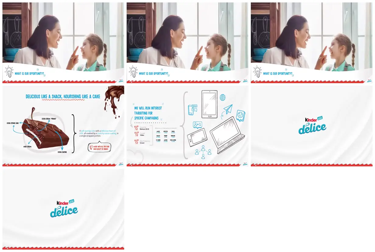
A product launch deck combining family photography, chocolate cake cutouts, illustrated benefit diagrams, a cropped globe and campaign targeting information within a cyan, white and red visual system.
Source and credit
Authorship not stated by the source
Look notesby Reference
A clean, polished Kinder Delice presentation combining product and campaign information with friendly lifestyle imagery and simple illustrations.
- Color
- Mostly white and pale gray, with turquoise/teal accents, red footer details, and dark brown chocolate imagery.
- Type
- Compact blue/turquoise sans-serif headings and small supporting text, alongside the Kinder Delice logo.
- Framing
- The slides use spacious white backgrounds and centered or left-aligned content. Visible examples include a woman and child in a kitchen, a labeled cake cross-section, marketing-targeting information with device illustrations, and logo-only slides.
- Structure
- Slides share a recurring red wavy footer with small branding. Content alternates between image-led, explanatory diagram, campaign-planning, and logo slides; the frames are presented as a tiled overview.