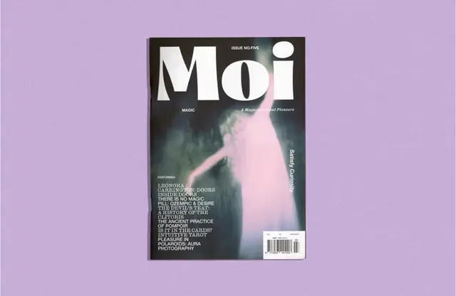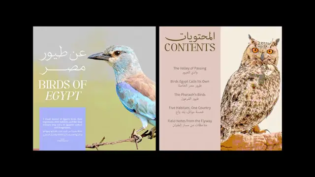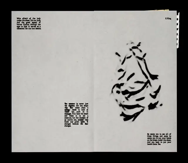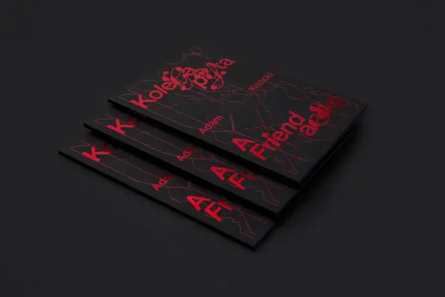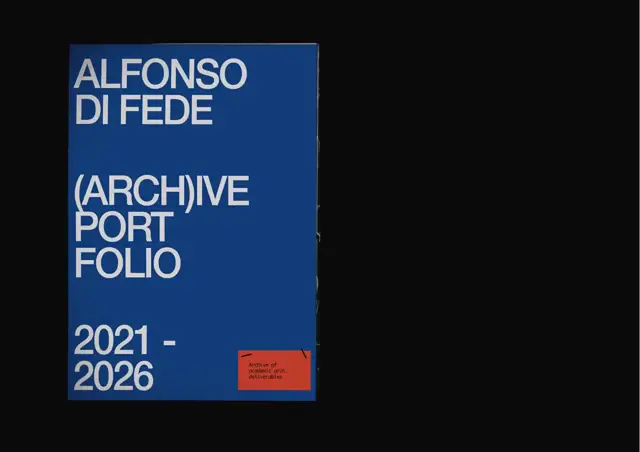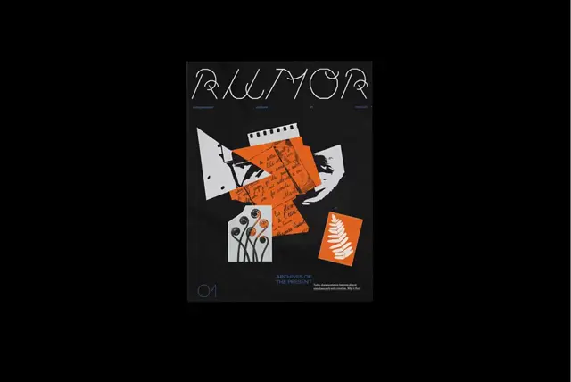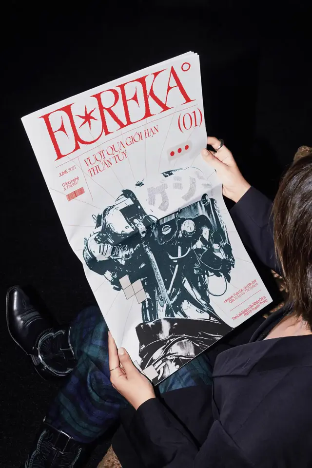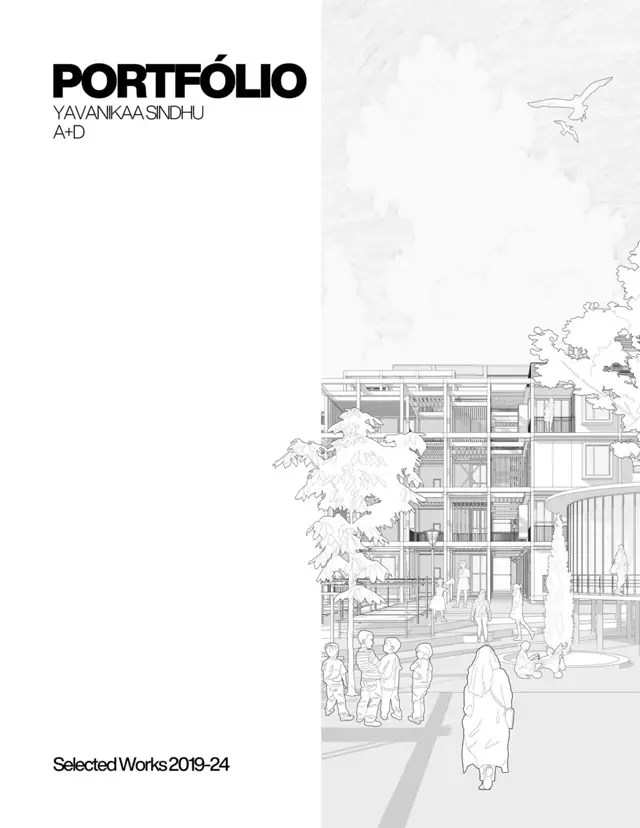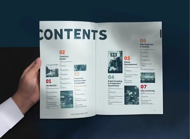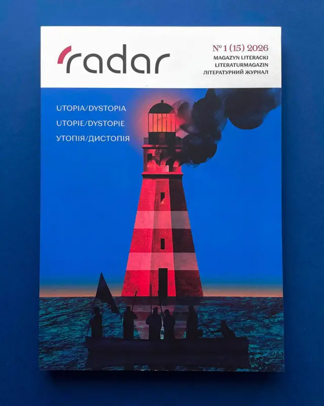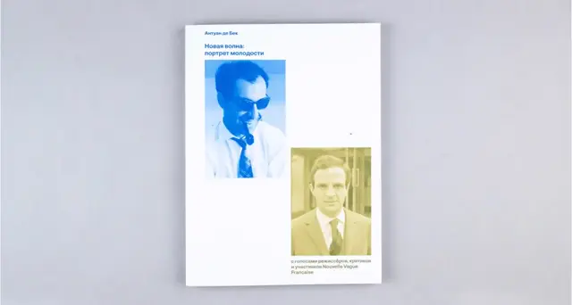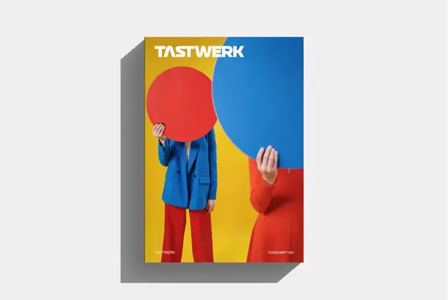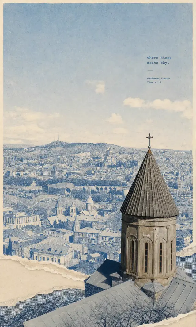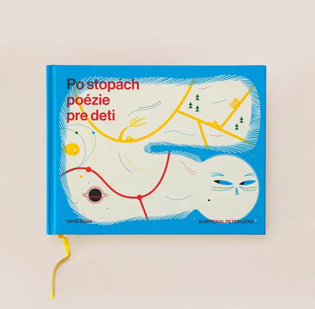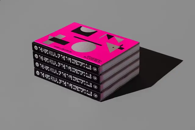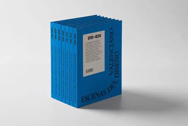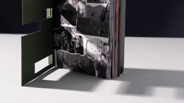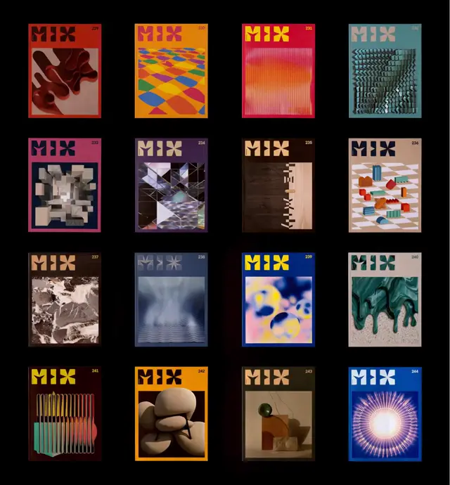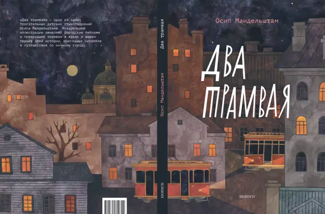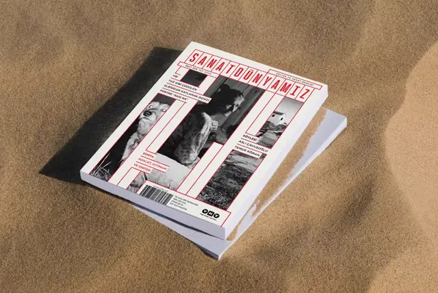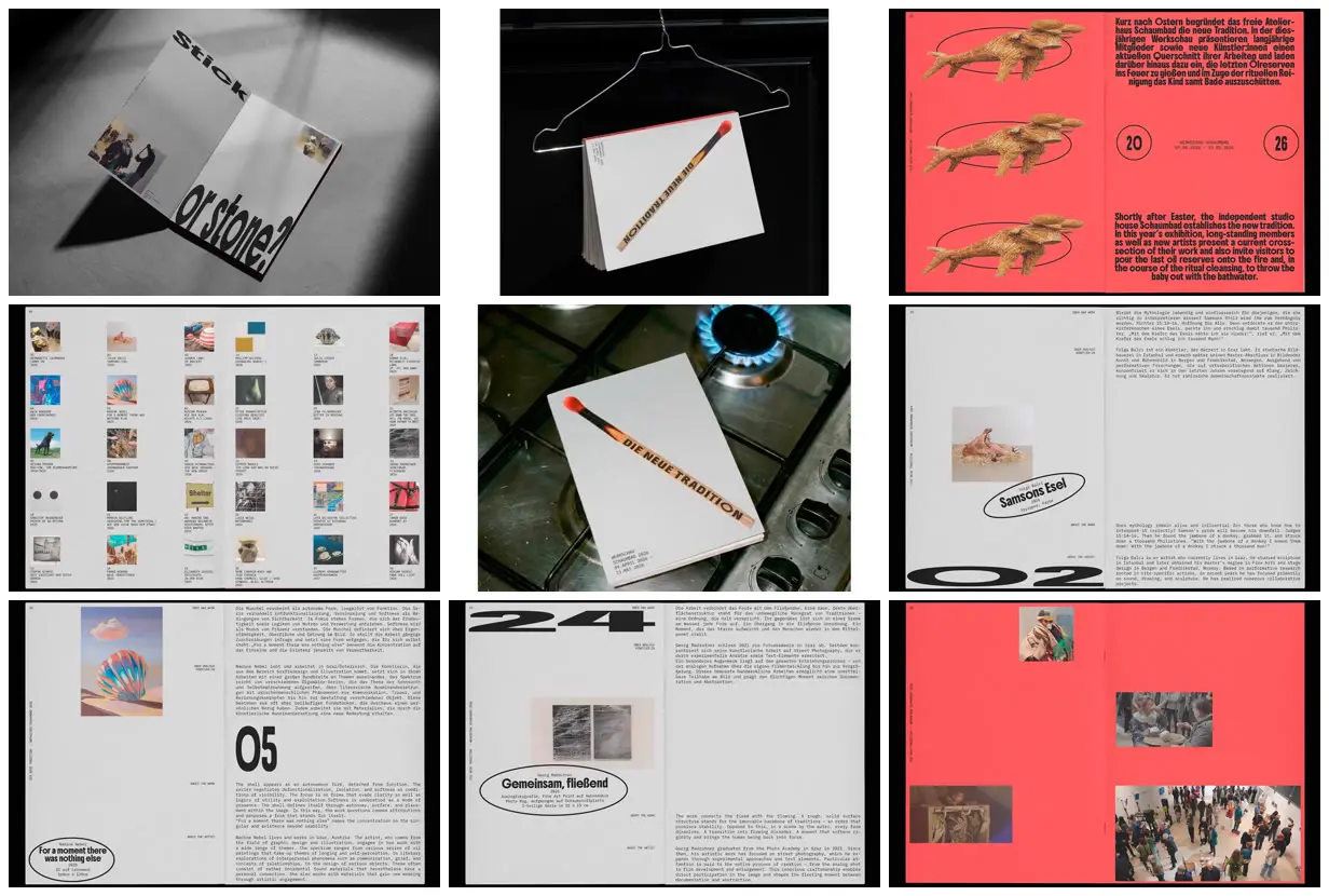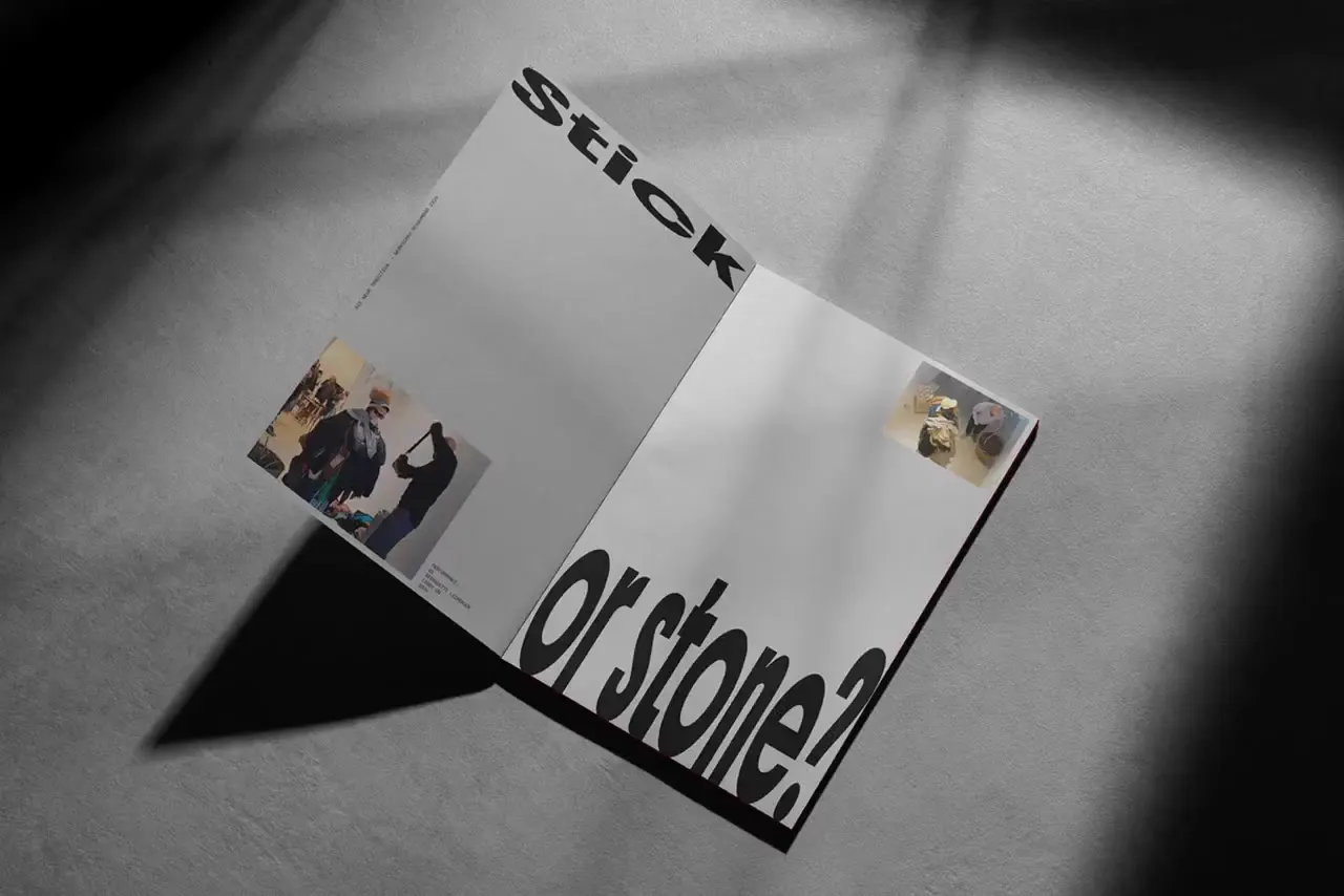
Pair small monospaced descriptions with heavy display titles and oversized, deliberately distorted index numbers on spacious two-page layouts. Place artwork captions inside thin ellipses, occasionally rotating the complete caption group, while keeping explanatory text aligned in stable columns. Use a single saturated accent color for introductory and documentary sections against pale neutral catalog pages. For a new exhibition or collection, replace the matchstick motif, artwork, bilingual copy, and numbering while retaining the contrast between archival precision and exaggerated graphic scale.
No creator prompt published. Reference wrote this brief. Copy for agent includes the brief, visual reference links, and setup guidance.
Coral and gray exhibition booklet
An exhibition booklet with a diagonal matchstick cover, coral bilingual introduction, thirty-image artwork index, spacious artist profiles, ellipse-framed captions, oversized numbers, and scattered event photographs.
Source and credit
Website · Jun 30, 2026 · 4.9k views · 88 comments
Authorship not stated by the source
Look notesby Reference
A stark, experimental exhibition booklet with a deliberately utilitarian, graphic-design feel.
- Color
- Black, white, and cool gray dominate, punctuated by vivid coral red and small areas of muted photographic and pastel color.
- Type
- Bold condensed sans-serif display lettering, oversized numerals, and small, tightly set sans-serif body text.
- Framing
- Asymmetrical layouts combine generous blank space with compact text blocks, isolated images, thin rules, and large typographic elements.
- Structure
- Cover and product-style presentations accompany editorial pages with recurring text-and-image arrangements, including numbered sections and image-led spreads.