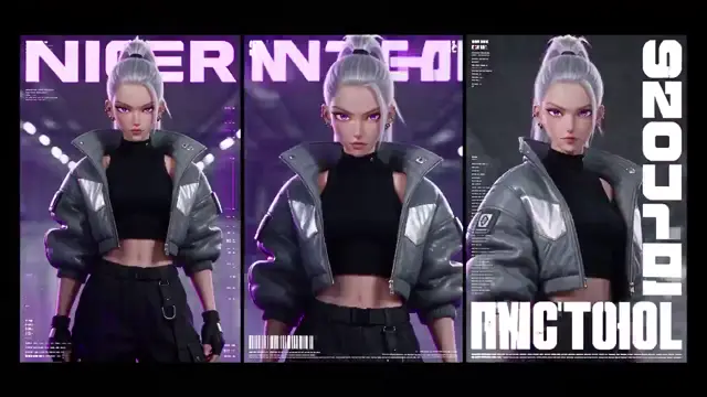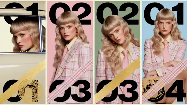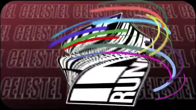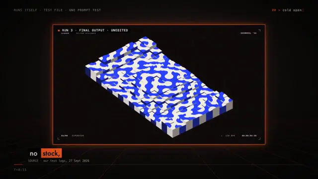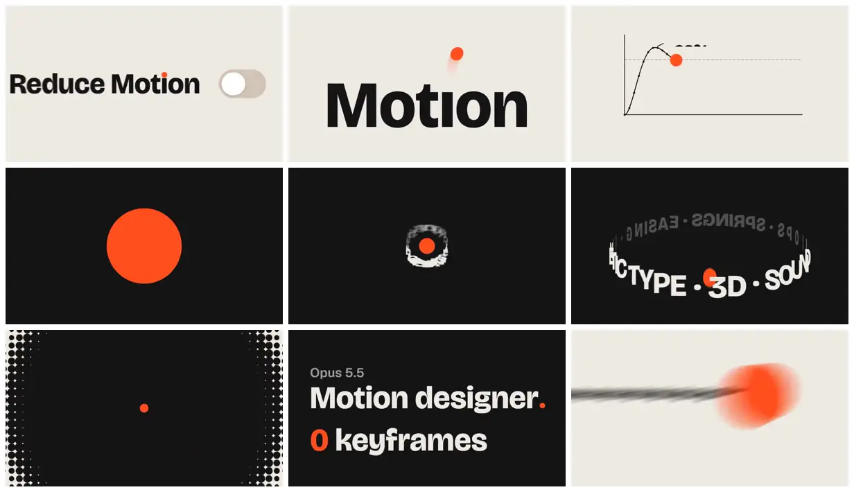
Build a launch identity around one simple accent shape and reuse it in a control, a technical diagram and a typographic composition. Alternate warm light and near-black panels while keeping the headline font consistent. Finish with a short benefit statement whose key number uses the accent color.
No creator prompt published. Reference wrote this brief. Copy for agent includes the brief, visual reference links, and setup guidance.
Orange dot and motion design type
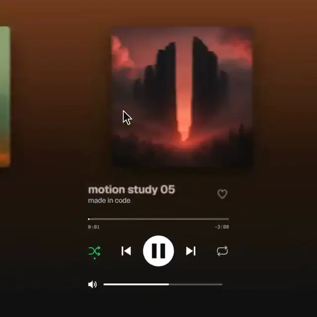
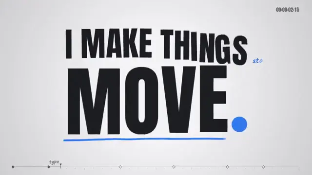
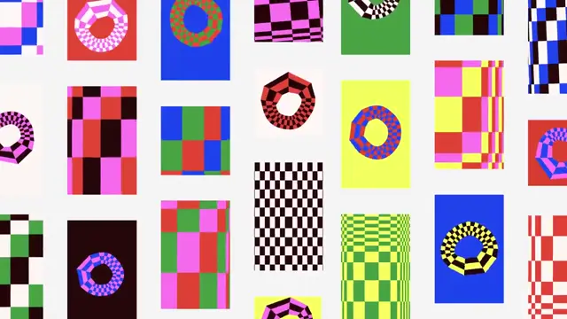
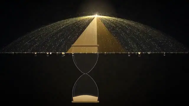
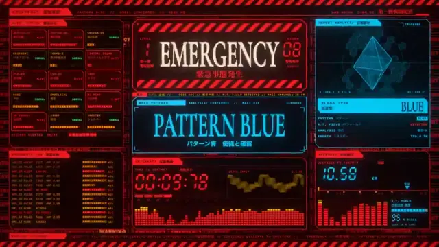
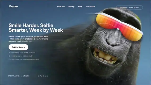
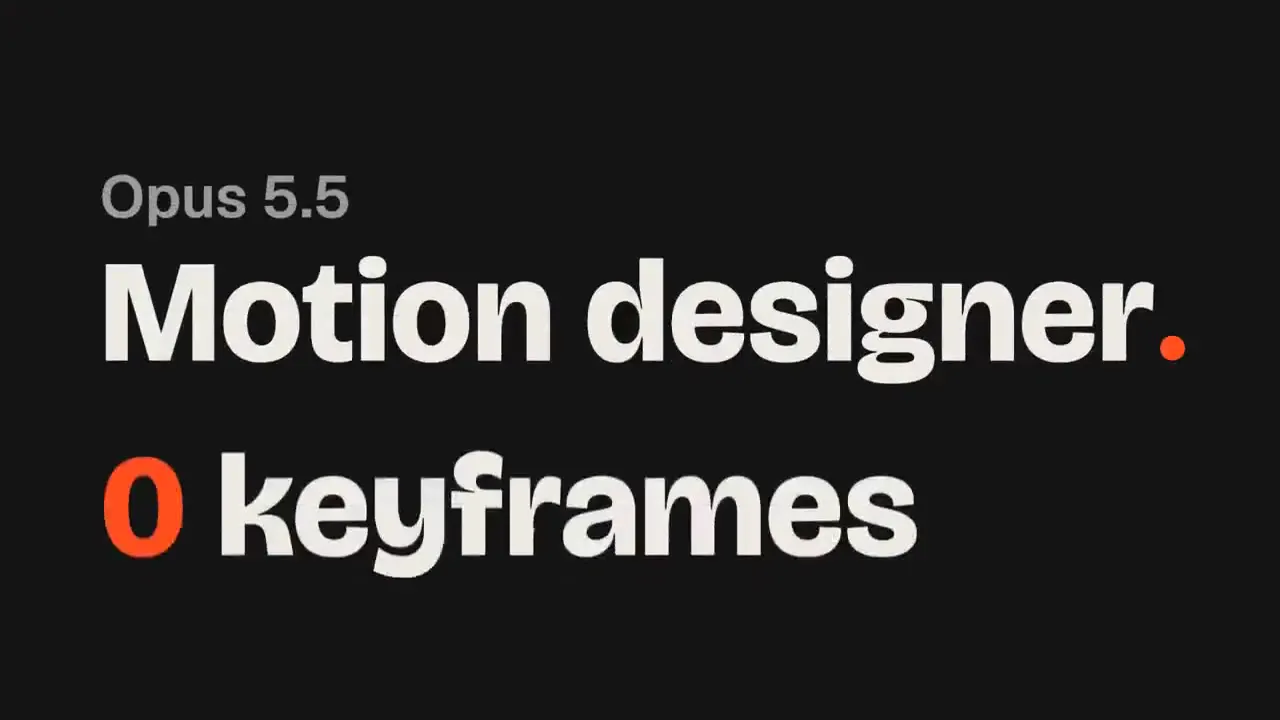
A motion-design promo pairs oversized black-and-cream typography with an orange dot, a reduce-motion toggle, spring-response graphs and a dimensional ring of lettering, ending with “Motion designer. 0 keyframes.”
How it was made
Three Claude agents · Opus 5.5 · Wispr Flow · Figma
Source and credit
X · Sep 28, 2026 · 4.7k likes · 1.8M views · 191 comments
Made with AI, according to the source
Look notesby Reference
Minimalist graphic design built around bold typography, a bright orange-red accent, and simple motion-design motifs.
- Color
- Warm off-white, near-black, white, and vivid orange-red.
- Type
- Large, heavy sans-serif lettering, with smaller restrained labels and diagram text.
- Framing
- Clean, high-contrast layouts with generous negative space, centered graphic elements, and occasional fine-line diagrams or decorative borders.
- Structure
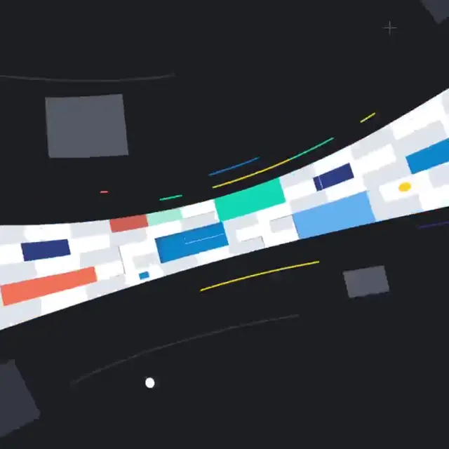
- A consistent orange-red dot recurs alongside typographic title cards and abstract graphic elements, including a curve diagram and a horizontal streak.