Search On dot-network identity
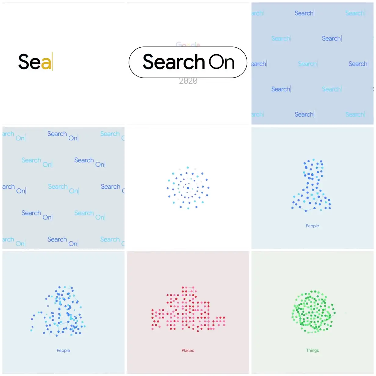
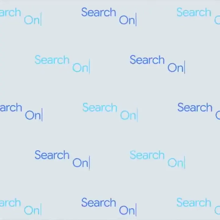
Google’s Search On 2020 identity pairs a rounded search-field title with repeated search text and delicate dot networks representing people, places, and things on pale color-coded backgrounds.
Build an identity for another event around a familiar interface shape, such as a search field or message box. Use one shared dot-and-line vocabulary to depict three topic categories, assigning each a distinct color family. Pair the diagrams with restrained labels and generous empty space so the system works at both title and section-card scale.
No creator prompt published. Reference wrote this brief. Copy for agent includes the brief, visual reference links, and setup guidance.
Source and credit
Look notesby Reference
Minimalist Google Search On 2020 graphics with the words “Search On” and colorful dot-based illustrations.
- Color
- White and pale blue backgrounds with dark navy text and accents of Google-like blue, cyan, red, pink, and green.
- Type
- Clean sans-serif lettering; “Search On” appears large and bold, with smaller labels beneath the illustrations.
- Framing
- Spare, centered layouts with generous whitespace. Text and clusters of colored dots are the main visual elements.
- Structure
- The graphics progress from the “Search On” wordmark to abstract dotted forms and illustrations labeled “People,” “Places,” and “Things.”