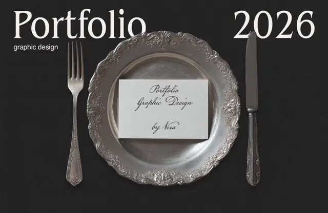
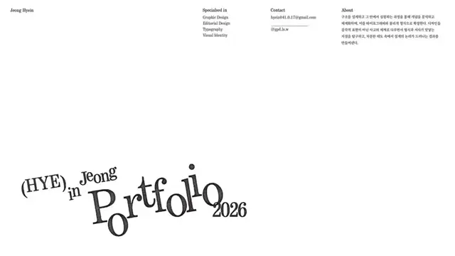
 Captured walkthrough
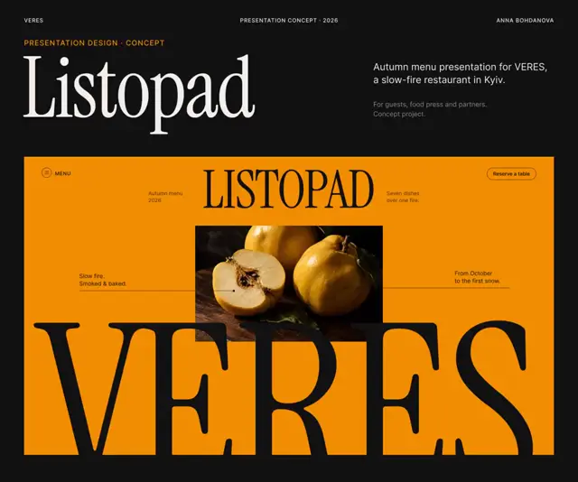
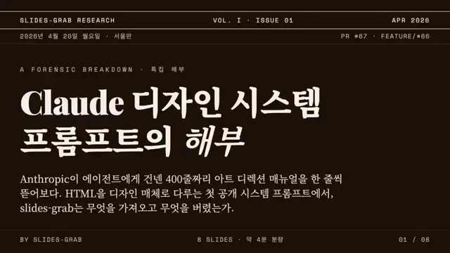
Build an editorial slide system with charcoal and cream backgrounds, high-contrast serif headings, and a single warm accent reserved for key values and conclusions. Reduce charts to fine rules, endpoint dots, direct labels, and generous empty space, pairing each diagram with a short interpretation. Alternate two-column analytical slides with a lighter, oversized-number summary slide; replace the social-content examples with the new subject’s metrics and redraw diagrams to suit their units and relationships.
No creator prompt published. Reference wrote this brief. Copy for agent includes the brief, visual reference links, and setup guidance.
Charcoal and cream data storytelling
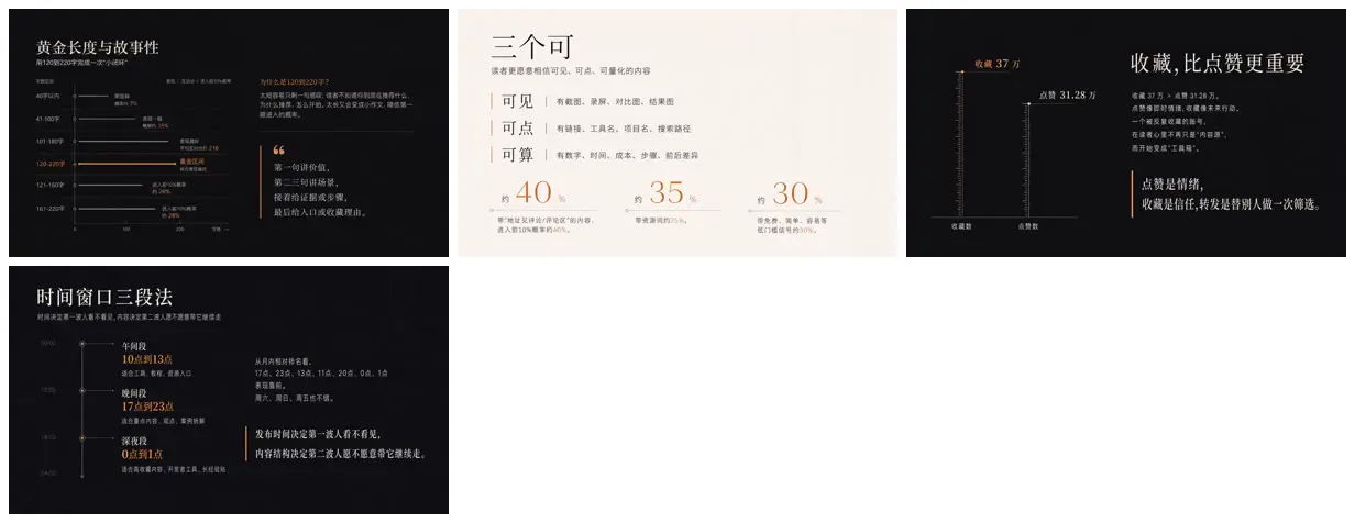
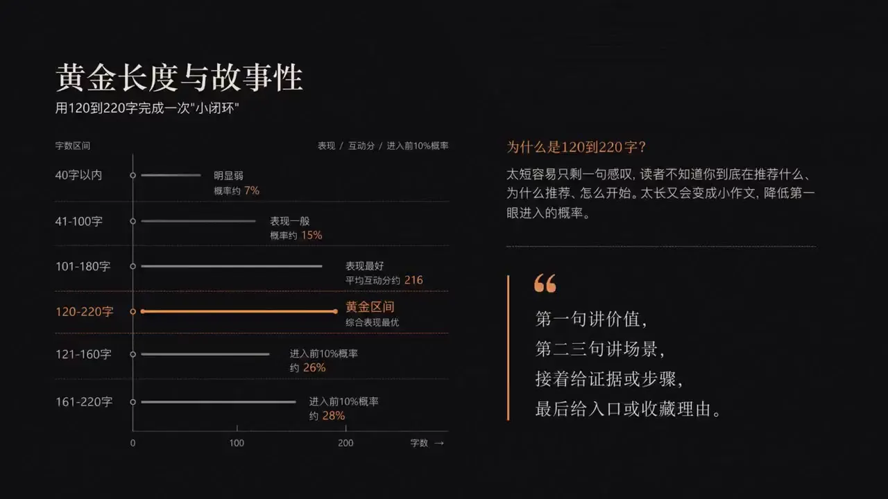
Four Chinese slides on content length, evidence signals, saves versus likes and publishing windows, with sparse charts, large percentages and a vertical timeline. Made with a gpt-image-2 prompt the creator tuned in YouMind.
How it was made
GPT 5.5 Pro and Grok for research, Codex or CC to write a Markdown article, YouMind for 20 slide images, then pasted into Keynote.
Codex · Claude Code · YouMind
Source and credit
X · May 29, 2026 · 130 likes · 18k views · 106 comments
Made with AI, according to the source
Look notesby Reference
Editorial infographic style using Chinese text, concise explanations, charts, and highlighted statistics.
- Color
- Charcoal and near-black backgrounds contrasted with cream, muted gold, and soft gray.
- Type
- Chinese sans-serif typography; large, restrained headings with smaller labels and body text, plus gold-accented numerals.
- Framing
- Clean, information-dense layouts combining charts or timelines with explanatory text and prominent callouts.
- Structure
- A sequence of explanatory slides covering a time-based comparison, a three-part concept with percentages, a favorites-versus-likes comparison, and a time-window method.