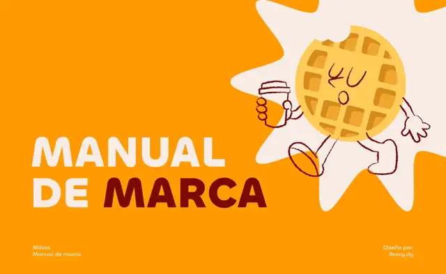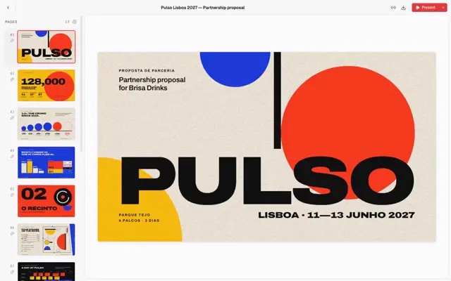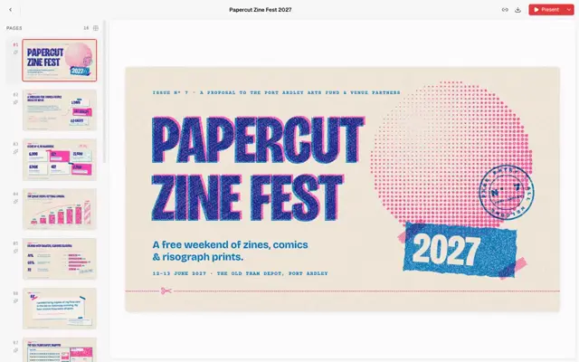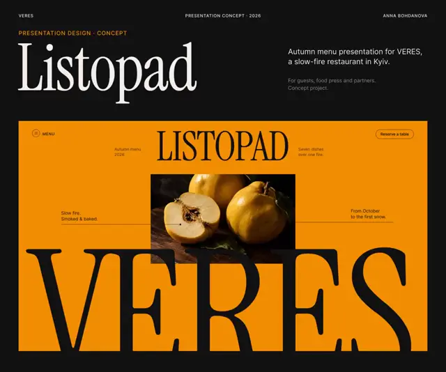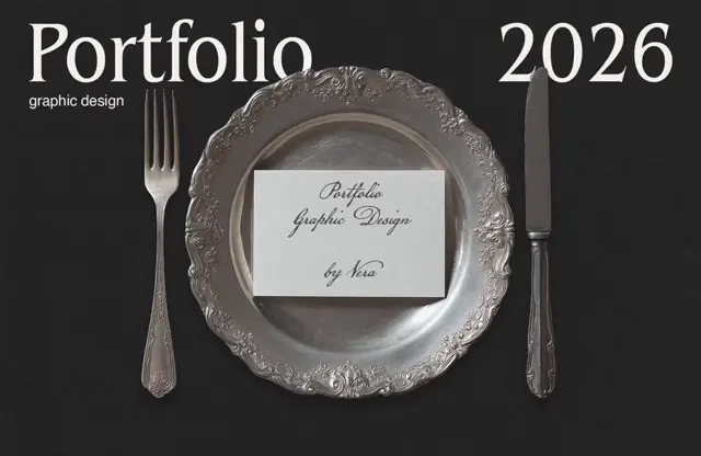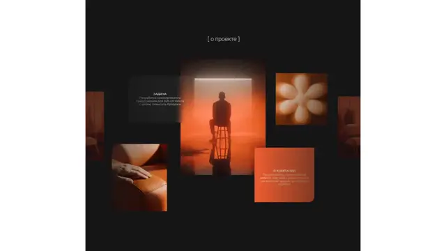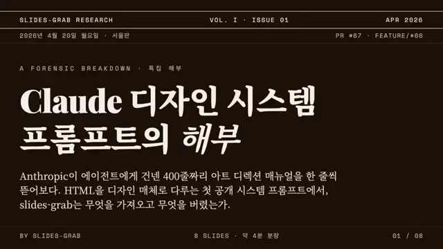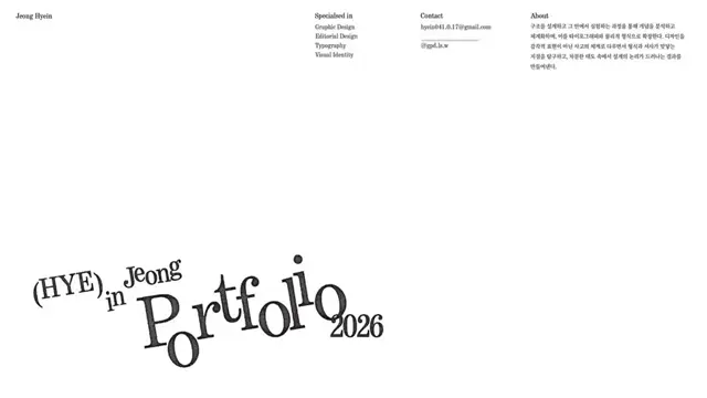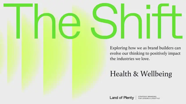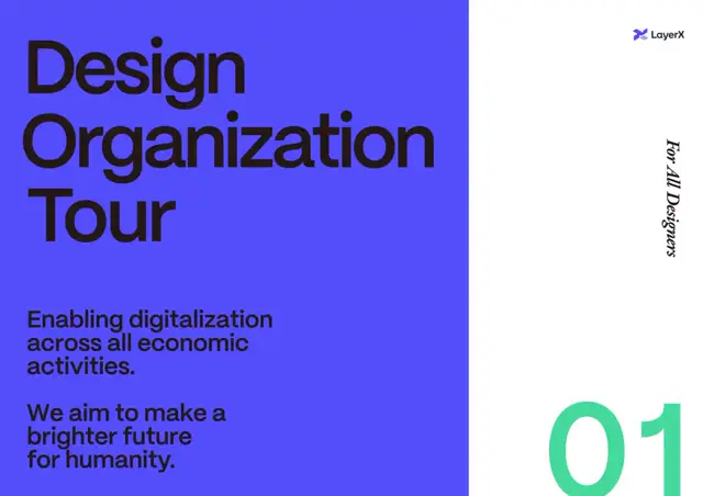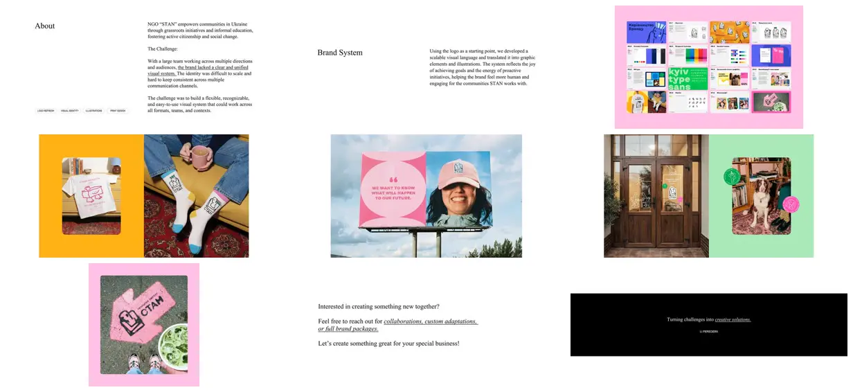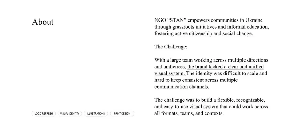
Alternate sparse, two-column editorial pages with saturated application spreads to create a clear change in pacing. Carry one simple outline character across merchandise, signage and circular badges, using consistent stroke weight and small color accents. Pair full-bleed photographs with rounded inset images on solid color fields. For a new subject, replace the mascot, badge messages and documentary settings with context-specific equivalents while retaining the recurring graphic language.
No creator prompt published. Reference wrote this brief. Copy for agent includes the brief, visual reference links, and setup guidance.
Community identity in color and line
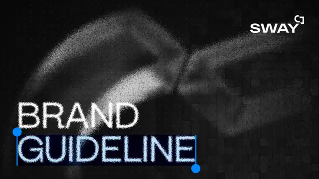
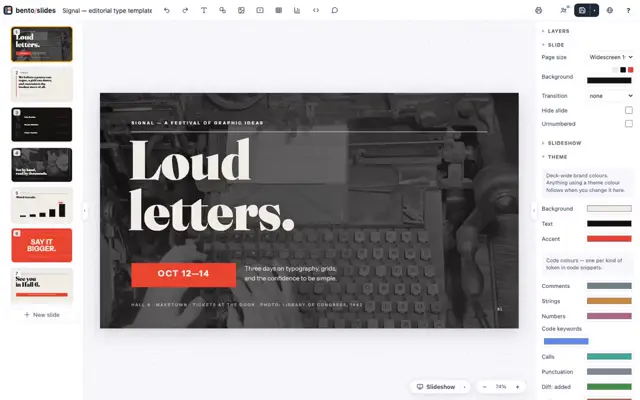
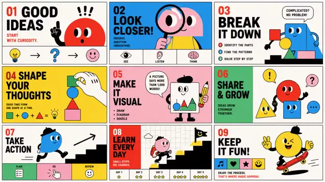
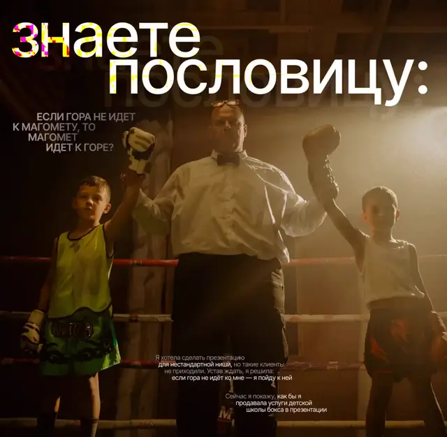
An identity presentation pairing restrained white editorial slides with colorful brandbook spreads and photographs of illustrated shirts, socks, entrance signage, friendly badges and a pink pavement arrow.
Source and credit
Website · Feb 21, 2026 · 5.7k views · 103 comments
Authorship not stated by the source
Look notesby Reference
Polished, approachable identity with a playful mix of bold color, simple graphic marks, and documentary-style photographs.
- Color
- Bright pink, mint green, orange-yellow, cyan and dark blue, balanced with white, black, and neutral photo tones.
- Type
- Small, restrained serif text for explanatory copy, paired with clean sans-serif headings and bold display lettering in the identity examples.
- Framing
- Editorial text and image pairings, with graphic elements and mockups given generous space; the closing appeal uses minimal centered white text on black.
- Structure
- Introduces the organization and its challenge, presents the brand system, shows the identity on printed items, advertising, and photographic settings, then closes with a collaboration invitation.