 Captured walkthrough
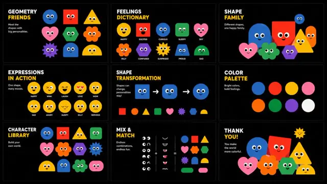
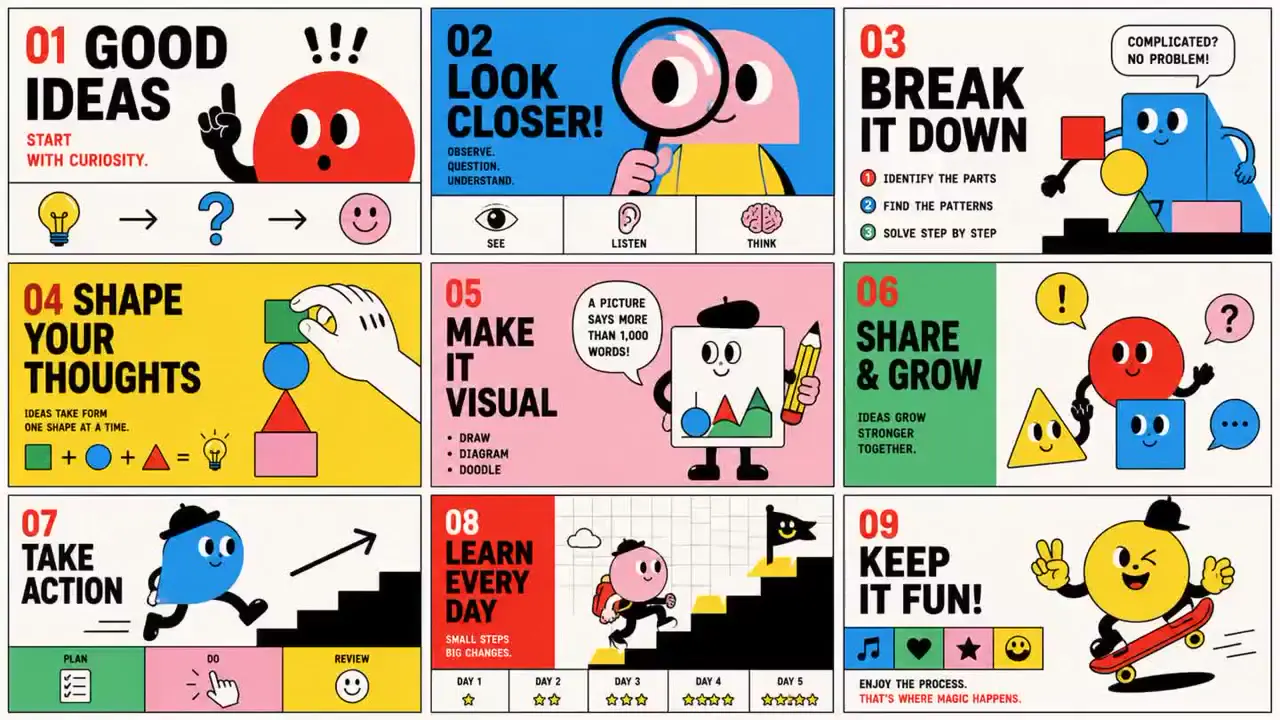
97: Design Style: Name: "Bauhaus Cartoon" Concept: > バウハウスの機能主義、 オランダのグラフィックデザイン、 子ども向け絵本、 美術大学のオープンキャンパスポスター、 ミッドセンチュリーの教育イラストから着想を得た ユーモラスで知的なエディトリアルデザイン。 幾何学図形と単純化されたキャラクターによって、 難しい情報を「誰もが直感的に理解できる記号」に変換する。 真面目さと遊び心、 教育性とナンセンスを同居させ、 思わず微笑んでしまう視覚体験を生み出す。 Canvas: Ratio: "16:9" Mood: - Playful - Intelligent - Graphic - Friendly - Educational - Bold - Minimal - Memorable Temperature: Overall: Vibrant Color Palette: Background: PaperWhite: "#F7F7F4" Primary: SignalRed: "#F1201A" SkyBlue: "#39B8F2" LemonYellow: "#F3E547" Secondary: MintGreen: "#38C172" BubblePink: "#F5C6CF" Accent: InkBlack: "#111111" White: "#FFFFFF" Color Rules: MaximumColorsPerSlide: 4 UseFlatColorsOnly: true Typography: Headlines: Style: > 幾何学的で親しみやすいサンセリフ。 FuturaやBauhaus系書体を想起させる 丸みのある力強い文字。 短い言葉を大きく配置し、 ポスターのアイコンとして扱う。 Weight: 700-900 Tracking: Tight Case: Mixed Secondary: Style: > シンプルなサンセリフ。 情報を整理する役割を担い、 図形とのバランスを重視する。 Weight: 400-500 Body: Weight: 400 LineHeight: 1.3-1.5 Layout: Structure: > コミックのコマ割りと モダニズムポスターのグリッドを融合した タイル型レイアウト。 明確な区画ごとに 異なる情報やイラストを配置し、 一目で内容が把握できる構造をつくる。 Composition: - Modular panels - Thick dividers - Character-centered blocks - Poster hierarchy - Symmetrical balance - Graphic repetition - Editorial simplicity - Strong focal points Alignment: Preference: Grid-first ControlledChaos: Low Graphic Elements: Shapes: - Rounded rectangles - Thick lines - Circles - Pill shapes - Arches - Exclamation marks - Simple frames - Geometric blocks Symbols: - Eyes - Hands - Ears - Mouths - Footsteps - Exclamation marks - Speech fragments - Abstract faces Decorative Rules: - Use symbols as educational icons. - Favor simplicity over detail. - Preserve strong outlines. - Let humor emerge from exaggeration. Patterns: Style: - Solid color fields - Minimal stripes - Repeated punctuation - Geometric repetition Imagery: Style: > 人体の一部や日用品を 抽象的なキャラクターへ変換する。 顔、手、耳、目などを シンプルな図形で再構成し、 ユーモラスで少しシュールな存在として描く。 Treatment: - Flat illustration - Thick black outlines - Minimal facial features - Simplified anatomy - Poster-like silhouettes - No gradients Subjects: - Anthropomorphic objects - Abstract body parts - Cartoon hands - Graphic faces - Everyday gestures - Educational symbols - Friendly mascots Background: Style: > 単色のカラーブロックを タイル状に切り替える。 背景そのものが 情報整理のフレームとして機能する。 Effects: Texture: Smooth offset print Slight paper grain Shadow: None Depth: Flat graphic composition Distortion: None Visual Rules: - Restrict the palette to red, blue, yellow, green, pink, black, and white. - Use thick black outlines consistently. - Divide content into clearly defined panels. - Let illustrations communicate ideas instantly. - Favor short headlines and visual symbols. - Balance seriousness with absurd humor. - Avoid unnecessary detail. - Design for immediate recognition on mobile screens. Exclusions: - Photorealistic imagery - Glassmorphism - Smooth gradients - Complex 3D rendering - Luxury aesthetics - Corporate presentation templates - Delicate watercolor textures - Excessive visual clutter - Hyper-detailed illustrations
98:
Design Style:
Name: "Naive Zine"

Concept: >
インディーズZINE、
子どもの落書き、
90年代の自主制作コミック、
レコードジャケット、
小さなアートブックから着想を得た
素朴で詩的なエディトリアルデザイン。

完璧ではない線、
余白、
ささやかなユーモアを通じて、
「上手ではないからこそ伝わる感情」を大切にする。

情報を説明するのではなく、
誰かのノートを偶然のぞき込んだような
親密な体験をつくる。

Canvas:
Ratio: "16:9"

Mood:
- Naive
- Gentle
- Playful
- Poetic
- Handmade
- Intimate
- Nostalgic
- Optimistic

Temperature:
Overall: Soft

Color Palette:
Background:
CreamWhite: "#F7F4EE"

Primary:
InkBlack: "#111111"

Secondary:
BubblePink: "#F46EB6"
SkyBlue: "#82D6F7"
LemonYellow: "#F3DE53"

Accent:
Lavender: "#C5A6E8"
MintGreen: "#B7D98B"
White: "#FFFFFF"

Color Rules:
MaximumColorsPerSlide: 3
FlatColorsOnly: true

Typography:
Headlines:
Style: >
子どものサインペンで書いたような
不揃いの手描きレタリング。

大文字・小文字を自由に混在させ、
「整いすぎない魅力」を残す。

Weight: Hand-drawn
Tracking: Organic
Scale: Large but casual

Secondary:
Style: >
ノートの余白に書き込まれたような
素朴な手書き文字。

キャプションや短いメッセージとして使用する。

Weight: Variable

Body:
Weight: 400
LineHeight: 1.4-1.6

Layout:
Structure: >
小さなZINEのページや
ステッカーコレクションを思わせる
タイル型レイアウト。

1つのスライドに
1つのイラストと1つの短いメッセージを配置し、
呼吸するような余白を確保する。

Composition:
- Simple framed panels
- Generous white space
- Centered illustrations
- Handwritten captions
- Poster-like simplicity
- Sticker arrangements
- Visual pauses
- Quiet asymmetry

Alignment:
Preference: Centered
ControlledChaos: Low

Graphic Elements:
Shapes:
- Hand-drawn frames
- Rounded rectangles
- Puffy clouds
- Simple stars
- Tiny hearts
- Wavy lines
- Imperfect circles
- Border doodles

Symbols:
- Ghosts
- Mountains
- Fish
- Eggs
- Suns
- Skulls
- Friendly monsters
- Tiny animals

Decorative Rules:
- Embrace imperfection.
- Keep illustrations simple.
- Use decoration sparingly.
- Allow empty space to carry emotion.

Patterns:
Style:
- Minimal doodles
- Hand-drawn textures
- Irregular borders
- Tiny repeating icons

Imagery:
Style: >
子どもの絵のような
単純で素朴なキャラクターを描く。

少しシュールで、
少し寂しく、
だけどどこか優しい存在として表現する。

技術的な完成度よりも、
感情の温度を優先する。

Treatment:
- Thick black outlines
- Flat color fills
- Minimal detail
- Imperfect proportions
- Visible hand-drawn quality
- Simple facial expressions

Subjects:
- Friendly ghosts
- Quiet monsters
- Tiny people
- Fish
- Mountains
- Toast
- Everyday objects
- Symbolic creatures

Character Design Rules:
- Favor awkward charm over polish.
- Use simple dot eyes and tiny mouths.
- Keep anatomy intentionally imperfect.
- Let characters express subtle emotions.
- Preserve innocence and humor.
- Avoid complexity.

Background:
Style: >
単色のパステル背景を
小さなポスターのように切り替える。

黒背景も時折使用し、
イラストを静かに浮かび上がらせる。

Effects:
Texture:
Slight paper grain
Marker unevenness
Handmade imperfections

Shadow:
None

Depth:
Flat zine layering

Distortion:
Natural hand wobble
Uneven line quality

Visual Rules:
- Limit each slide to one illustration and one short message.
- Preserve generous breathing room.
- Use hand-drawn typography consistently.
- Let awkwardness become a strength.
- Balance melancholy with warmth.
- Avoid visual noise.
- Prioritize emotional connection over precision.
- Design for intimate reading experiences.

Exclusions:
- Corporate presentation aesthetics
- Glassmorphism
- Photorealistic imagery
- Smooth gradients
- Complex 3D rendering
- Luxury branding
- Hyper-detailed illustration
- Aggressive advertising aesthetics
- Excessive information density
99:
Design Style:
Name: "Comic Vibe"

Concept: >
インディーコミック、
ニューヨーカー風カートゥーン、
90年代オルタナティブ漫画、
SNSミーム文化、
ZINEカルチャーから着想を得た
ユーモラスで共感性の高いエディトリアルデザイン。

日常のどうでもいい瞬間や、
ちょっとした感情の暴走を、
コミックのコマ割りによって描き出す。

「あるある」と「なんだこれ」を行き来しながら、
見る人の記憶に残るストーリーテリングを生み出す。

Canvas:
Ratio: "16:9"

Mood:
- Humorous
- Relatable
- Playful
- Chaotic
- Warm
- Expressive
- Youthful
- Story-driven

Temperature:
Overall: Bright

Color Palette:
Background:
PaperWhite: "#F6F4EF"

Primary:
CandyPink: "#F3A9D8"
SunshineYellow: "#F5E34B"
SkyBlue: "#9FD8F6"

Secondary:
MintGreen: "#A9D88E"
SoftPeach: "#F3C7A5"
WarmGray: "#D8D3CA"

Accent:
InkBlack: "#111111"
White: "#FFFFFF"

Color Rules:
MaximumColorsPerSlide: 5
FlatColorsOnly: true

Typography:
Headlines:
Style: >
手描き感のある太めのサンセリフ。

コミックのタイトルロゴのように、
少し不揃いで親しみやすい印象を持たせる。

大文字を中心に、
大胆に配置する。

Weight: 700-900
Tracking: Slightly Tight
Case: Uppercase preferred

Dialogue:
Style: >
ノートに書き込んだような
ラフな手書き文字。

吹き出しや独り言、
感情のツッコミとして使用する。

Weight: Variable

Secondary:
Style: >
シンプルなサンセリフ。

補足情報やラベルとして
最小限に使用する。

Weight: 400-500

Body:
Weight: 400
LineHeight: 1.3-1.5

Layout:
Structure: >
3×3のコミックグリッドを基本とする。

1枚のスライドを
「短編マンガの1ページ」として設計し、
起承転結のリズムをつくる。

Composition:
- Comic panel systems
- Narrative sequences
- Speech bubbles
- Character close-ups
- Reaction shots
- Punchline panels
- Consistent framing
- Editorial storytelling

Alignment:
Preference: Panel-first
ControlledChaos: Medium

Graphic Elements:
Shapes:
- Comic frames
- Speech bubbles
- Rounded captions
- Music notes
- Tiny hearts
- Stars
- Exclamation marks
- Scribble effects

Symbols:
- Sweat drops
- Sound effects
- Emoji-like expressions
- Tiny icons
- Floating thoughts
- Handwritten arrows
- Motion lines
- Mood indicators

Decorative Rules:
- Emotion should be exaggerated.
- Humor should emerge from everyday situations.
- Use repetition for comedic timing.
- Let silence and reaction shots breathe.

Patterns:
Style:
- Simple dots
- Minimal hatching
- Small decorative motifs
- Occasional checkerboard details

Imagery:
Style: >
少し脱力感のある
カートゥーンキャラクターを描く。

人物や動物は
ぷっくりしたフォルムと
大きな鼻や目を持ち、
愛嬌とだらしなさを併せ持つ。

完璧な美しさではなく、
「ちょっと変」が魅力になる。

Treatment:
- Thick black outlines
- Flat color fills
- Minimal shading
- Rounded anatomy
- Expressive faces
- Exaggerated reactions
- Soft imperfections

Subjects:
- Everyday people
- Anthropomorphic animals
- Friends
- Families
- Drivers
- Music lovers
- Urban moments
- Relatable scenarios

Character Design Rules:
- Prioritize personality over attractiveness.
- Use expressive eyes and noses.
- Exaggerate emotional reactions.
- Keep proportions slightly awkward.
- Make every character feel approachable.
- Blend absurdity with sincerity.

Background:
Style: >
日常の風景を
シンプルな舞台装置として描く。

車内、部屋、街並みなどは
必要最小限の情報にとどめ、
キャラクターの感情を引き立てる。

Effects:
Texture:
Smooth print finish
Slight marker texture
Minimal paper grain

Shadow:
None

Depth:
Flat comic layering

Distortion:
Hand-drawn wobble
Slight line inconsistency

Visual Rules:
- Treat each slide as a complete comic strip.
- Use 6–9 panels for storytelling when appropriate.
- Prioritize emotional relatability over polish.
- Combine humor with small moments of truth.
- Use dialogue sparingly and naturally.
- Leave room for reaction shots.
- Maintain visual consistency across characters.
- Design for both mobile reading and print.

Exclusions:
- Corporate presentation aesthetics
- Luxury branding
- Glassmorphism
- Photorealistic imagery
- Smooth gradients
- Complex 3D rendering
- Hyper-detailed realism
- Anime aesthetics
- Excessive information density
100:
Design Style:
Name: "Kawaii Monster"

Concept: >
日本のソフビ文化、
インディーキャラクタートイ、
ステッカーパック、
子ども向け図鑑、
Y2Kキャラクターブランドから着想を得た
ポップで愛嬌あふれるエディトリアルデザイン。

少しヘンテコで不完全なモンスターたちを
「個性の象徴」として扱い、
違いを楽しむ世界観をつくる。

情報を説明するのではなく、
キャラクターとの出会いを通して
好奇心と親近感を生み出す。

Canvas:
Ratio: "16:9"

Mood:
- Playful
- Cute
- Quirky
- Friendly
- Youthful
- Collectible
- Graphic
- Optimistic

Temperature:
Overall: Vibrant

Color Palette:
Background:
PaperWhite: "#F7F7F5"

Primary:
TomatoRed: "#FF3B4E"
SunshineYellow: "#F4E81E"
ElectricBlue: "#25B8FF"

Secondary:
MintGreen: "#59D86D"
BubblePink: "#FF7FB8"

Accent:
InkBlack: "#111111"
White: "#FFFFFF"

Color Rules:
MaximumColorsPerSlide: 3
OneSolidBackgroundPerCard: true

Typography:
Headlines:
Style: >
太くて丸みのあるサンセリフ。

キャラクターパッケージのロゴのように、
シンプルかつ強い存在感を持たせる。

タイトルは左上に固定配置し、
シリーズ感を生み出す。

Weight: 700-900
Case: Uppercase preferred
Tracking: Tight

Secondary:
Style: >
図鑑の分類ラベルや
おもちゃのパッケージ情報を思わせる
コンパクトなサンセリフ。

Weight: 400-600

Body:
Weight: 400
LineHeight: 1.2-1.4

Layout:
Structure: >
コレクションカードや
ブラインドボックスのパッケージを思わせる
タイル型レイアウト。

1スライドにつき1体のキャラクターを主役とし、
情報は最小限に整理する。

Composition:
- Character-centered layouts
- Large title blocks
- Sticker-like hierarchy
- Product-card structure
- Strong symmetry
- Generous margins
- Collectible layouts
- Minimal information density

Alignment:
Preference: Centered
ControlledChaos: Low

Graphic Elements:
Shapes:
- Rounded rectangles
- Simple circles
- Oval shadows
- Small badges
- Capsule labels
- Sticker tabs
- Rounded frames
- Tiny icons

Symbols:
- Eyes
- Crowns
- Stars
- Hearts
- Sparkles
- Tiny monsters
- Exclamation marks
- Smiley faces

Decorative Rules:
- Characters must remain the hero.
- Use minimal supporting decoration.
- Preserve a toy packaging aesthetic.
- Prioritize instant recognition.

Patterns:
Style:
- Solid color fills
- Minimal dots
- Tiny icon repetition
- Sticker motifs

Imagery:
Style: >
愛嬌のあるモンスターを
フラットなキャラクターイラストとして描く。

少し奇妙でアンバランスな特徴を持ちながらも、
怖さより親しみやすさを優先する。

「失敗したところが魅力になる」
不完全さを積極的に残す。

Treatment:
- Thick black outlines
- Flat colors
- Minimal shading
- Exaggerated proportions
- Toy-like silhouettes
- Simplified anatomy
- Expressive eyes

Subjects:
- Friendly monsters
- Hybrid creatures
- Anthropomorphic objects
- Animal-inspired mascots
- Fantasy companions
- Collectible characters
- Playful oddities

Character Design Rules:
- One defining feature per character.
- Mix cute and strange equally.
- Favor asymmetry and imperfection.
- Use expressive eyes and tiny limbs.
- Silhouettes should be instantly recognizable.
- Each character should feel collectible.

Background:
Style: >
白、赤、黄、青などの
単色背景をカードごとに切り替える。

背景は装飾しすぎず、
キャラクターが浮かび上がる舞台として機能する。

Effects:
Texture:
Smooth print finish
Toy packaging cleanliness

Shadow:
Simple oval drop shadow

Depth:
Flat character layering

Distortion:
None

Visual Rules:
- Use only one dominant background color per slide.
- Limit each character to 3–5 colors.
- Maintain thick black outlines consistently.
- Keep compositions simple and centered.
- Treat every slide as a collectible card.
- Balance cuteness with absurdity.
- Optimize for instant readability on mobile.
- Design to encourage collecting and sharing.

Exclusions:
- Photorealistic imagery
- Glassmorphism
- Luxury branding aesthetics
- Heavy gradients
- Complex 3D rendering
- Corporate presentation templates
- Horror gore aesthetics
- Excessive visual clutter
- Highly detailed realism
Make it hereFree runs soon
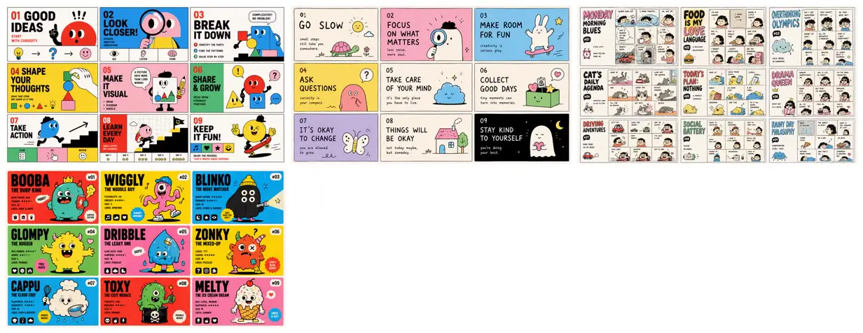
Playful illustrated slide systems
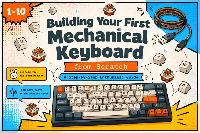
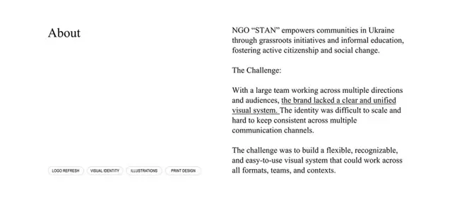
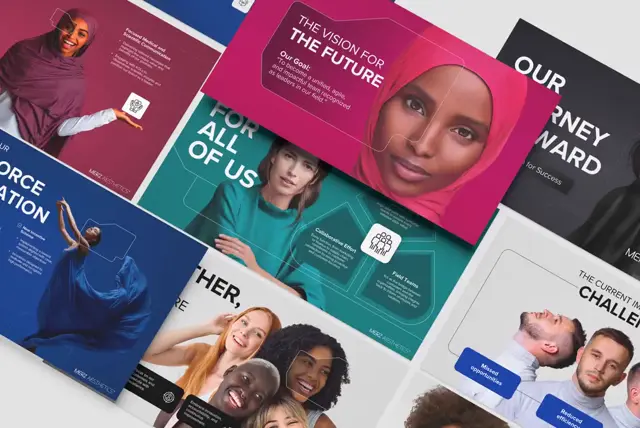
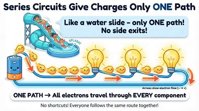
Four illustrated slide sequences show geometric characters teaching creative habits, pastel doodles offering gentle advice, nine-panel comics about everyday life, and brightly colored monster profile cards. Made in NotebookLM from published YAML prompts.
You'll need
- Your own source material in NotebookLM
How it was made
NotebookLM
Source and credit
X · Jun 19, 2026 · 1.4k likes · 134k views · 8 comments
Made with AI, according to the source
Published instructions: Four self-replies on X (one YAML per style)
Look notesby Reference
Whimsical, kid-friendly graphic design combining cheerful cartoon characters, short headlines, and playful themed cards.
- Color
- Bright, saturated colors—including cyan, yellow, pink, green, red, and purple—balanced with white or dark backgrounds and bold black outlines.
- Type
- Large, heavy sans-serif headlines; smaller supporting labels and captions; occasional numbers, icons, and speech bubbles.
- Framing
- Each card pairs a prominent character or simple illustration with a clear text area and small decorative accents. Characters have rounded shapes, expressive faces, and simple details.
- Structure
- Several distinct card-deck concepts: numbered advice or activity cards with recurring layouts, alongside character cards that introduce individual monsters with names and brief labels.