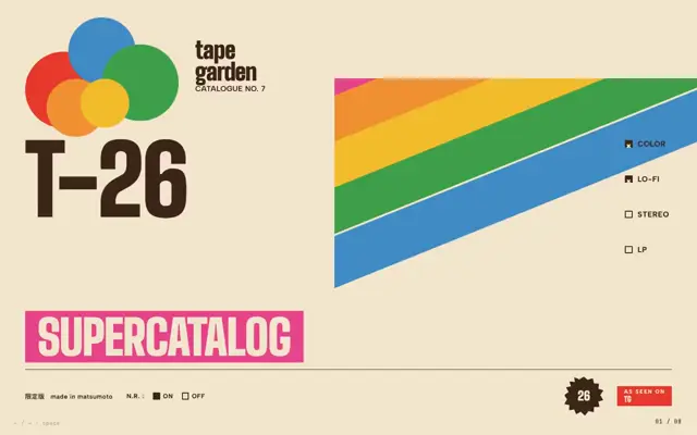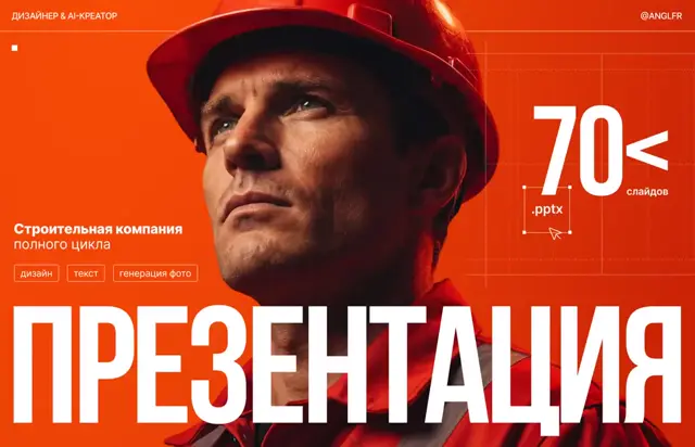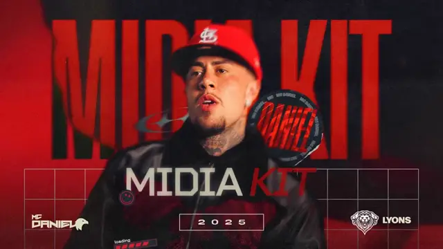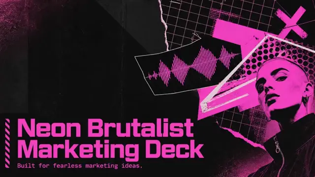
Red industrial conference identity
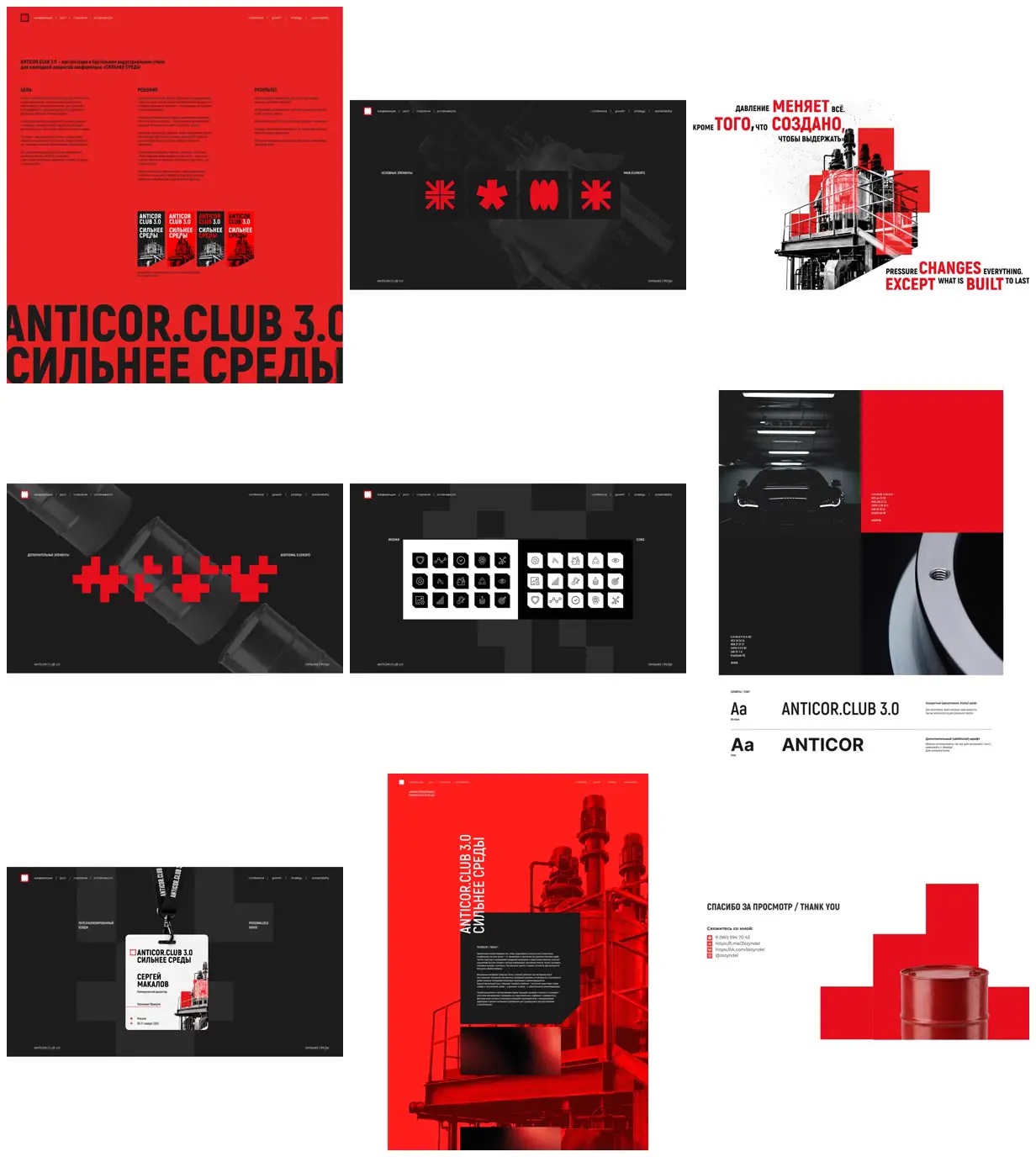
A conference identity presentation combining condensed bilingual headlines, reactor and barrel imagery, red geometric symbols, palette and typography studies, and a personalized badge mockup.
Build a limited geometric vocabulary from stepped blocks and heavy radial marks, then reuse it as image overlays, background silhouettes, and small information markers. Alternate near-black specimen slides with white photographic collages and saturated red panels to establish rhythm. Layer isolated grayscale subject imagery with opaque and translucent accent blocks, keeping fine photographic detail visible beneath selected overlays. For a new subject, replace the reactors, barrels, bilingual slogans, and event details with relevant objects and copy while preserving the scale contrasts and repeated edge labels.
No creator prompt published. Reference wrote this brief. Copy for agent includes the brief, visual reference links, and setup guidance.
Source and credit
Website · Sep 28, 2026 · 166 views · 47 comments
Authorship not stated by the source
Look notesby Reference
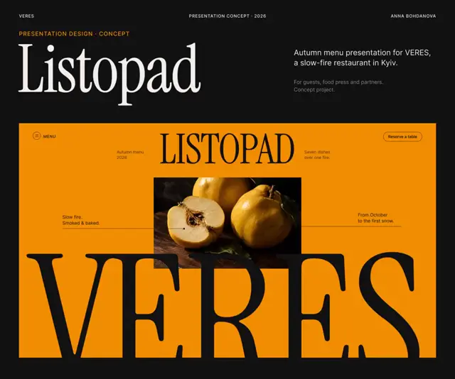
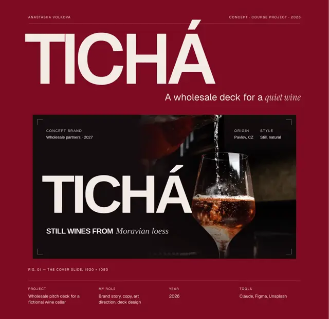
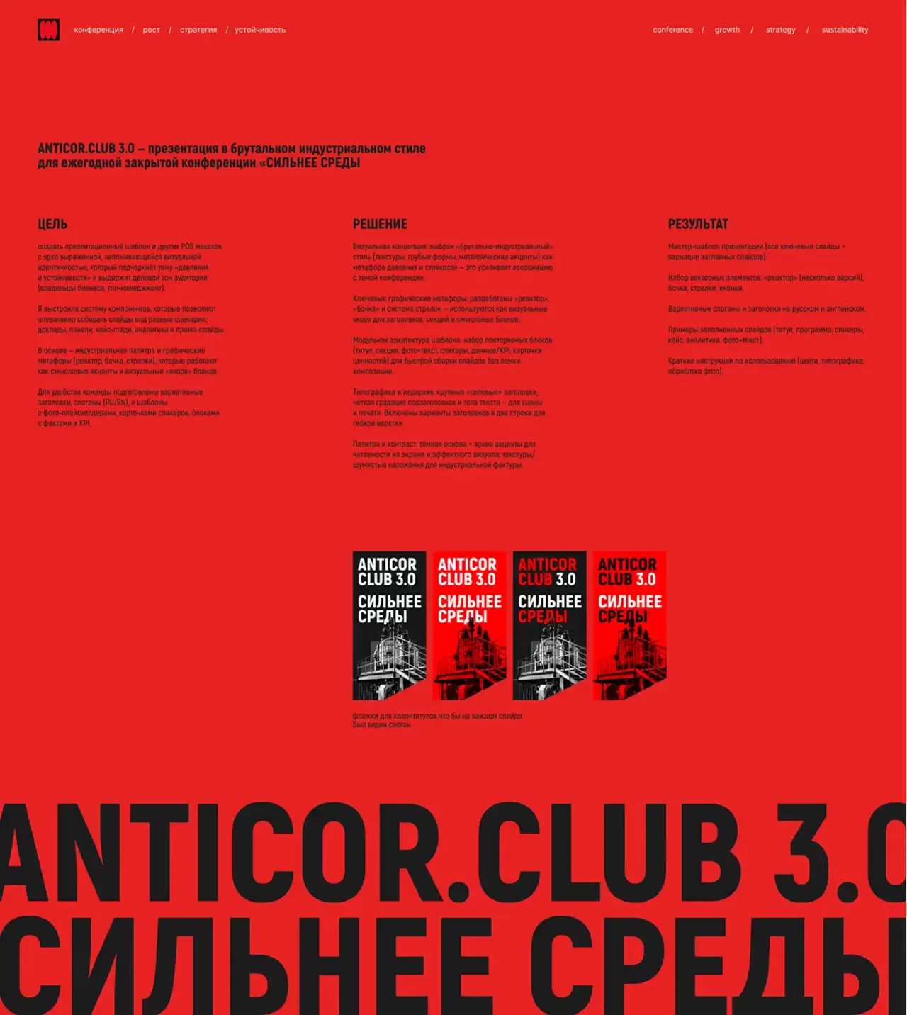
Brutalist identity for ANTICOR.CLUB 3.0, pairing industrial imagery with bold red graphic elements and Russian-language copy.
- Color
- Signal red, black, charcoal gray, and white, with occasional muted metallic tones.
- Type
- Heavy condensed uppercase sans serif for headlines, paired with compact sans-serif labels and body text.
- Framing
- Asymmetrical layouts with oversized type, crisp geometric blocks, restrained technical details, and stark industrial imagery, including factory structures and a barrel.
- Structure
- A sequence of identity sections covering the opening title, symbol and graphic system, icon set, typography, presentation or interface applications, and a closing thank-you page.