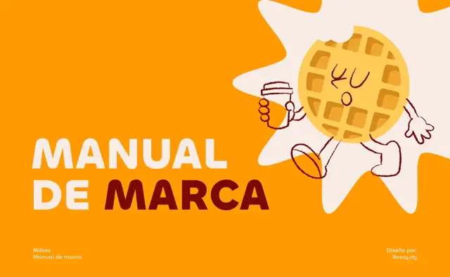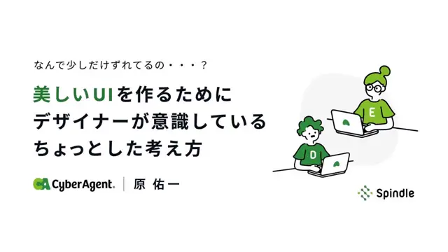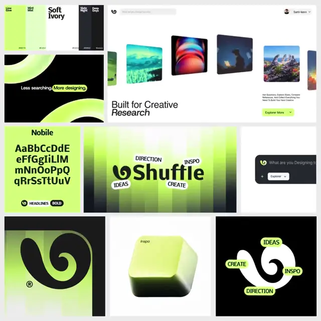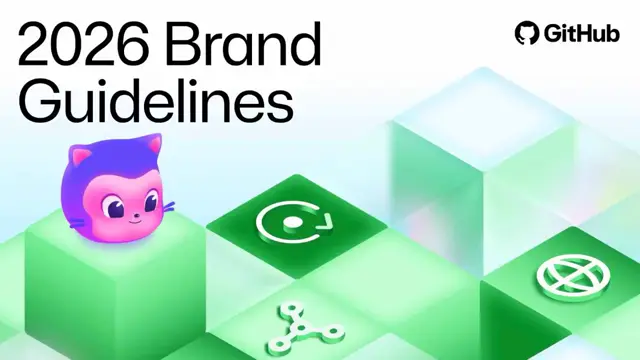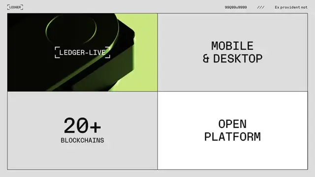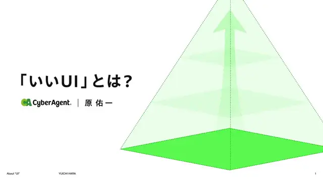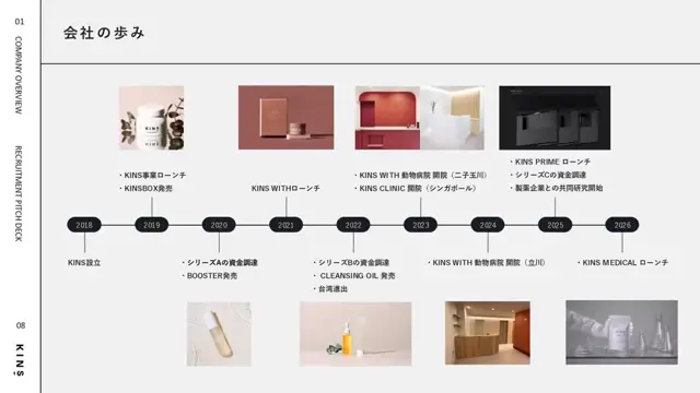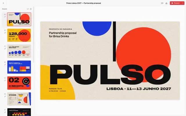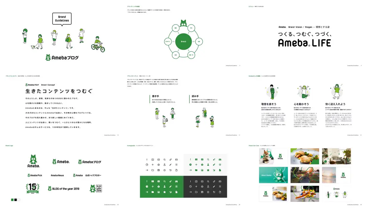
Build rhythm by alternating oversized statement slides with compact diagrams and orderly asset grids, keeping section labels and page markers fixed. Use a limited accent palette across outlined characters, filled icons, and loose looping overlays on photographs to connect expressive imagery with practical system documentation. For a new subject, replace the mascot, characters, copy, and photographs while retaining the contrast between spacious presentation pages and denser comparison pages.
No creator prompt published. Reference wrote this brief. Copy for agent includes the brief, visual reference links, and setup guidance.
Ameba blog brand guidelines
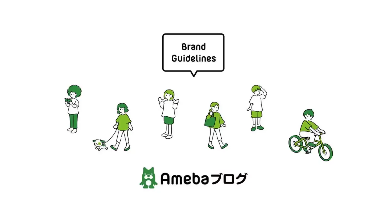
A white-and-green brand guideline deck showing an illustrated cover, brand relationship diagram, vision and concept statements, three illustrated principles, logo variants, icon treatments, and photographic brand applications.
Source and credit
Website · Jun 8, 2023 · 45k views · 5 stars
Authorship not stated by the source
Look notesby Reference
Clean, friendly Japanese digital-brand identity built around a small green mascot and simple geometric graphics.
- Color
- Primarily white with Ameba green accents, black or charcoal text, and occasional neutral gray; application examples add photographic colors.
- Type
- Modern sans-serif typography, with bold Japanese headings and prominent Ameba wordmarks.
- Framing
- Editorial guideline pages combine open white space, short text blocks, logos, diagrams, character illustrations, icon samples, and product imagery.
- Structure
- A sequence of brand-guideline sections covers the brand concept and principles, mascot and logo usage, visual language and iconography, and examples of the identity in use.