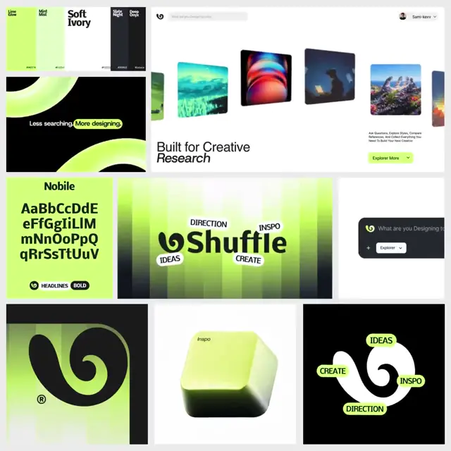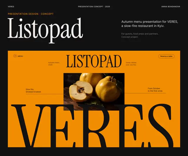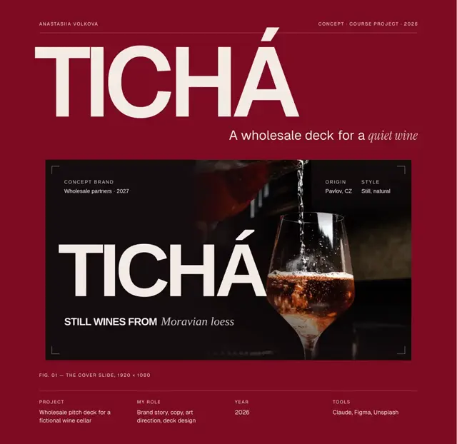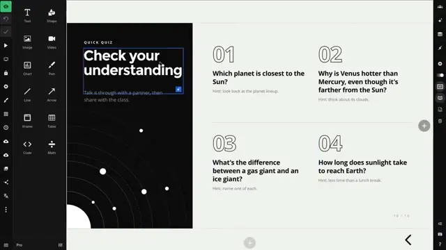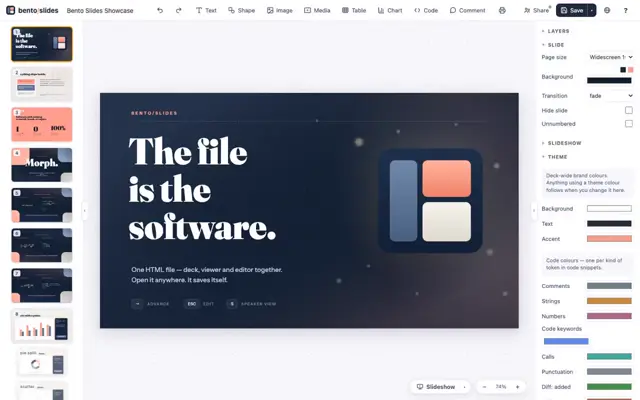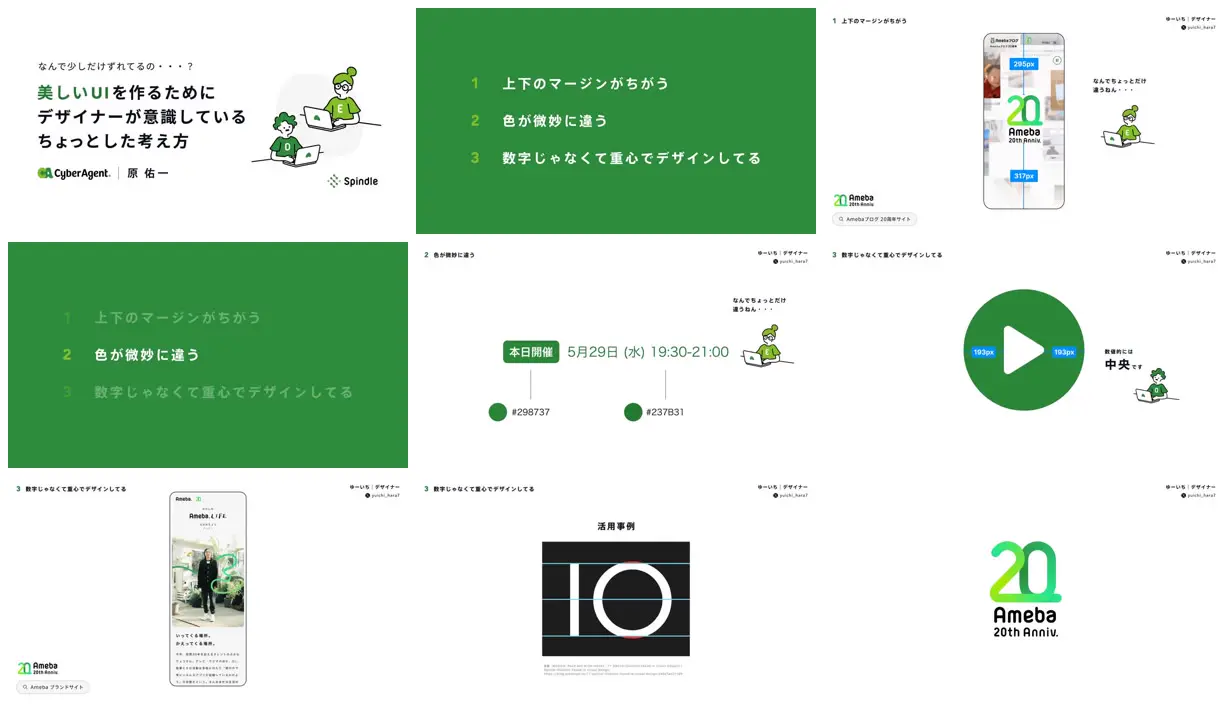
Alternate full-color agenda slides with white demonstration slides, dimming inactive agenda items to signal the current topic. Enlarge one object per demonstration and overlay thin measurement lines with high-contrast numeric labels so the visual discrepancy can be inspected directly. Use small outlined characters beside short explanations to soften the technical material. For a new subject, replace the branded phone screens and symbols with relevant examples while retaining the diagram scale, annotation system, and chapter rhythm.
No creator prompt published. Reference wrote this brief. Copy for agent includes the brief, visual reference links, and setup guidance.
Optical balance in UI design
A Japanese instructional deck about visual balance in UI, combining green chapter slides, annotated mobile-page examples, an enlarged play-button diagram, letterform alignment guides, and small cartoon characters.
Source and credit
Website · Aug 26, 2024 · 86k views · 97 stars
Authorship not stated by the source
Look notesby Reference
A clean instructional presentation about small design choices for beautiful UI, combining concise Japanese text, green-accented diagrams, interface examples, and a recurring illustrated character.
- Color
- Mostly white backgrounds with vivid and dark greens, charcoal or black text, and occasional pale gray interface details.
- Type
- Japanese sans-serif typography with bold headings, smaller explanatory labels, and prominent numerals; simple geometric logo and interface lettering.
- Framing
- Generous whitespace and minimal layouts. Slides place text alongside small illustrations or interface examples; some focus on a single centered graphic or mobile screen.
- Structure
- Opens with a title slide, introduces three design principles, then shows examples illustrating spacing, subtle color differences, and centered or balanced UI elements, alongside related mobile and branding visuals.