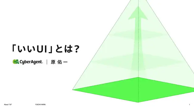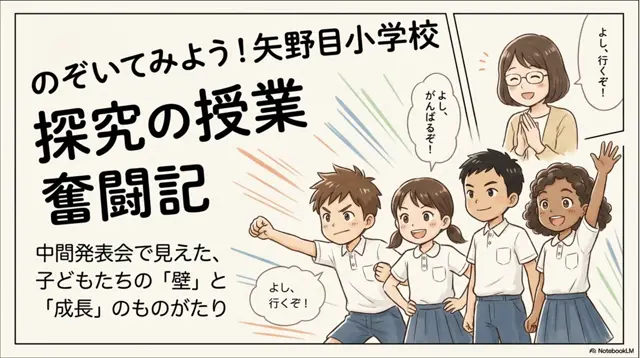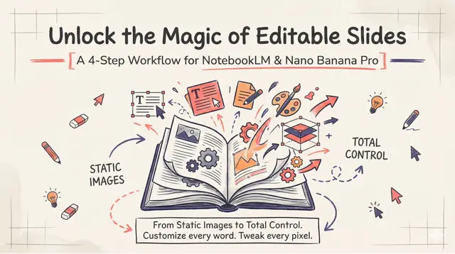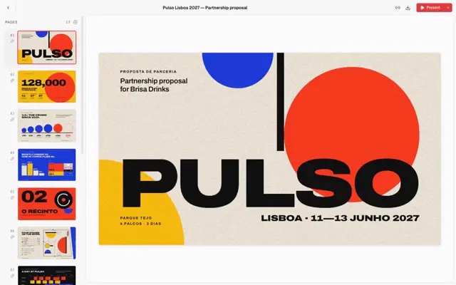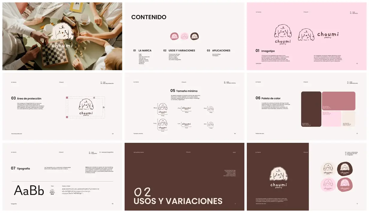
Pair a deliberately uneven illustrated mascot with a strict page grid, keeping running labels and numbered headings in consistent positions. Alternate quiet cream specification pages with a pastel identity page and a dark, oversized section divider to establish rhythm. Show practical rules through dashed clear-space geometry, unequal rounded color swatches, and a two-by-two badge comparison. For a new subject, replace the dog, wordmark, photography, and palette while preserving the contrast between expressive brand assets and orderly documentation.
No creator prompt published. Reference wrote this brief. Copy for agent includes the brief, visual reference links, and setup guidance.
Doodle-dog pastry brand manual
A pastry identity manual featuring a sketched dog mascot and rounded wordmark. Pages show a photographic opener, contents, logo lockups, clear-space rules, four-color palette, typography specimen, section divider, and color variations.
Source and credit
Website · Sep 12, 2025 · 69k views · 14 comments
Authorship not stated by the source
Look notesby Reference
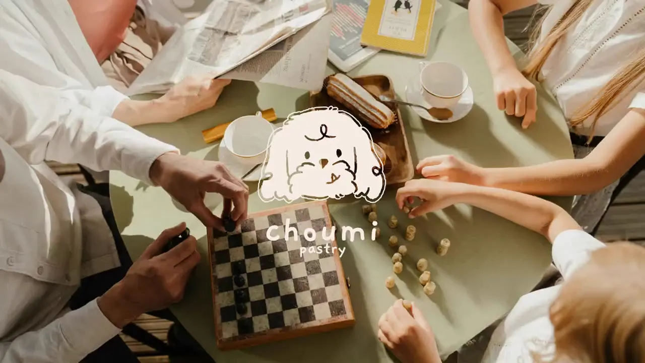
Playful, polished identity for “choumi pastry,” centered on a simple doodle-dog mascot and rounded wordmark. One page uses an overhead pastry-making photograph; the remaining pages present the brand system.
- Color
- Warm off-white and cream, deep chocolate brown, blush and dusty rose pink, with occasional muted sage accents.
- Type
- Clean sans-serif typography with rounded, friendly letterforms in the wordmark. Large bold section headings contrast with small, restrained explanatory text.
- Framing
- Minimal editorial layouts with generous negative space, precise alignment, small navigation labels, and clearly separated examples, diagrams, and color swatches.
- Structure
- The manual progresses through brand contents and identity, logo applications and protective spacing, minimum-size guidance, color palette, typography, and logo variations.