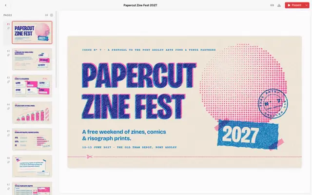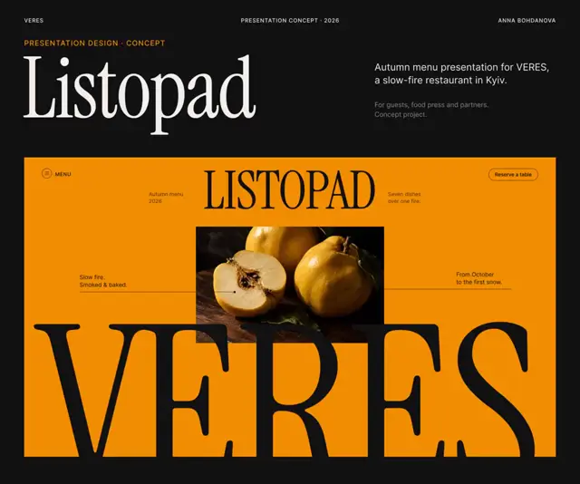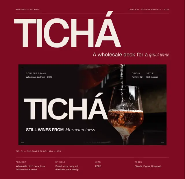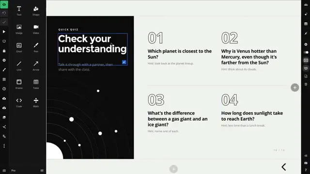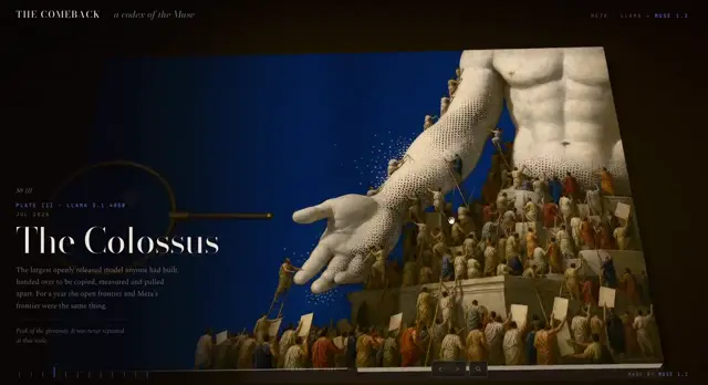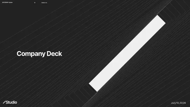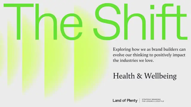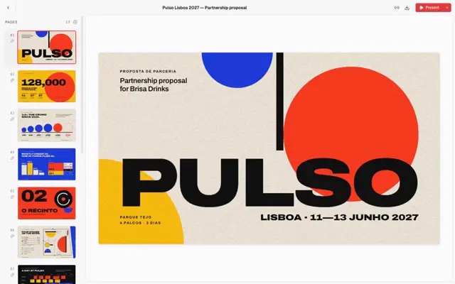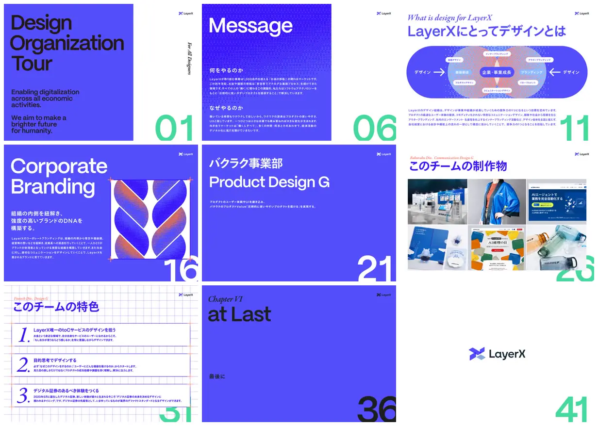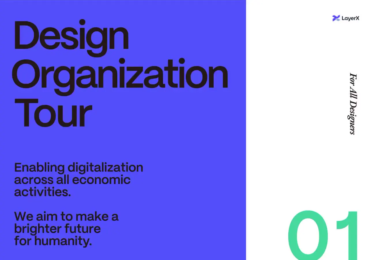
Build a slide system around alternating violet and white fields, oversized headings, and page numerals cropped against the lower-right edge. Contrast bold sans-serif titles with smaller italic serif section labels, and reuse square-dot textures in both backgrounds and geometric illustrations. Alternate dense explanatory slides with a wide relationship diagram, an evenly cropped image gallery, and sparse chapter dividers. For a new subject, replace the organization’s wording, relationships, logo, and gallery assets while preserving the hierarchy and layout rhythm.
No creator prompt published. Reference wrote this brief. Copy for agent includes the brief, visual reference links, and setup guidance.
LayerX design organization tour
A design organization deck combining bilingual headings, mission statements, an overlapping-circle model of design’s role, abstract branding graphics, a six-image work gallery, team principles, and sparse closing slides.
Source and credit
Website · Dec 3, 2024 · 41k views · 5 stars
Authorship not stated by the source
Look notesby Reference
Polished corporate design deck introducing LayerX’s design organization, principles, and work.
- Color
- Vivid indigo and electric blue, white, black, and mint-green accents, with occasional warm coral gradients.
- Type
- Large modern sans-serif headlines paired with small Japanese body text; occasional italic serif section labels.
- Framing
- Bold title-led layouts, generous negative space, compact explanatory copy, diagram panels, and a portfolio-style collection of product examples.
- Structure
- The presentation opens with a title and mission, explains the design organization and its purpose, presents branding and product-design sections with supporting examples, outlines team characteristics, and closes with a final message and LayerX logo.