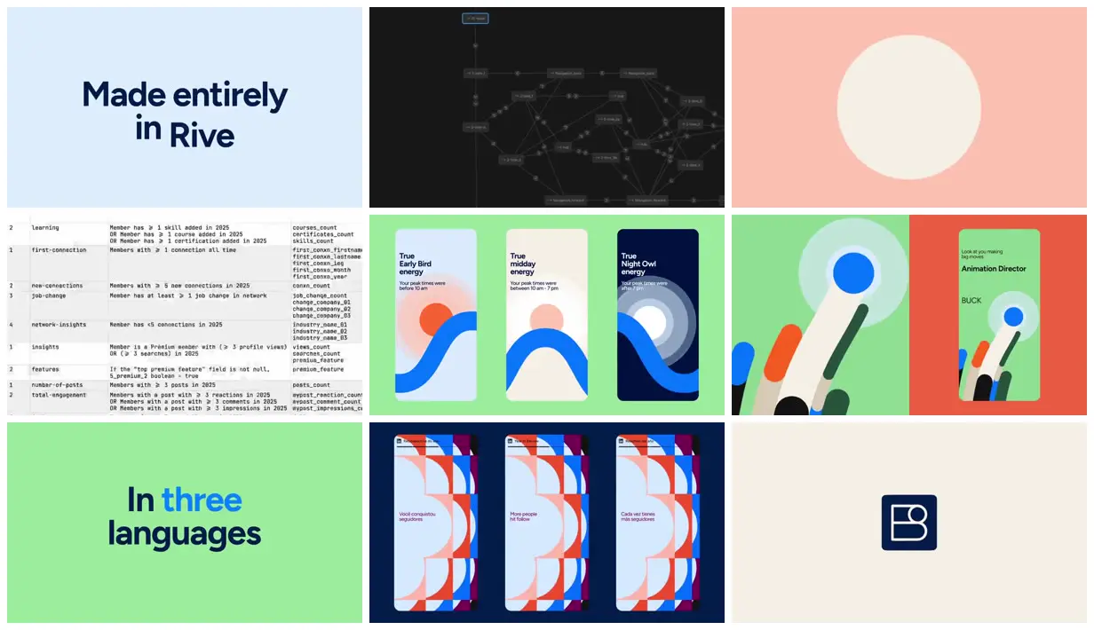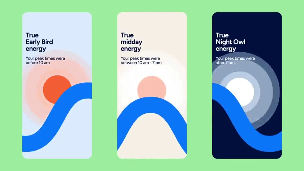
Build a small vocabulary of circles, semicircles, wedges, and rounded bars, then reuse it across full-frame graphics and narrow mobile cards. Use contrasting solid backgrounds and reserve a pale, uninterrupted area for the main statistic while patterned geometry occupies the edges. Adapt the visible side-by-side presentation to compare variants, replacing the branding, metrics, copy, and language examples with those of the new subject.
No creator prompt published. This brief was written by Reference.
LinkedIn year in review
A colorful year-in-review system turns LinkedIn statistics into patterned mobile cards. BUCK built the modular, multilingual experience in Rive and shows its design and logic in this case-study film.
How it was made
Rive
Source and credit
Authorship not stated by the source
Look notesby Reference
Polished, minimalist motion-graphics style using bold typography, flat vector shapes, and simplified interface elements.
- Color
- Navy and dark blue, bright blue, coral red, mint and light green, pale blue, cream, and white.
- Type
- Heavy navy sans-serif headings accompany smaller labels on the mobile cards; a spreadsheet and node diagram appear in the process views.
- Framing
- Centered titles and logo marks alternate with full-frame panels and tightly arranged dashboard or card layouts; large areas of solid color create clear contrast.
- Structure
- A Rive title card, a node diagram, a circular motif, a data table, three themed mobile cards, paired device views, a three-language heading, patterned cards in different languages, and a minimal studio mark.