Hermes features in glowing line diagrams
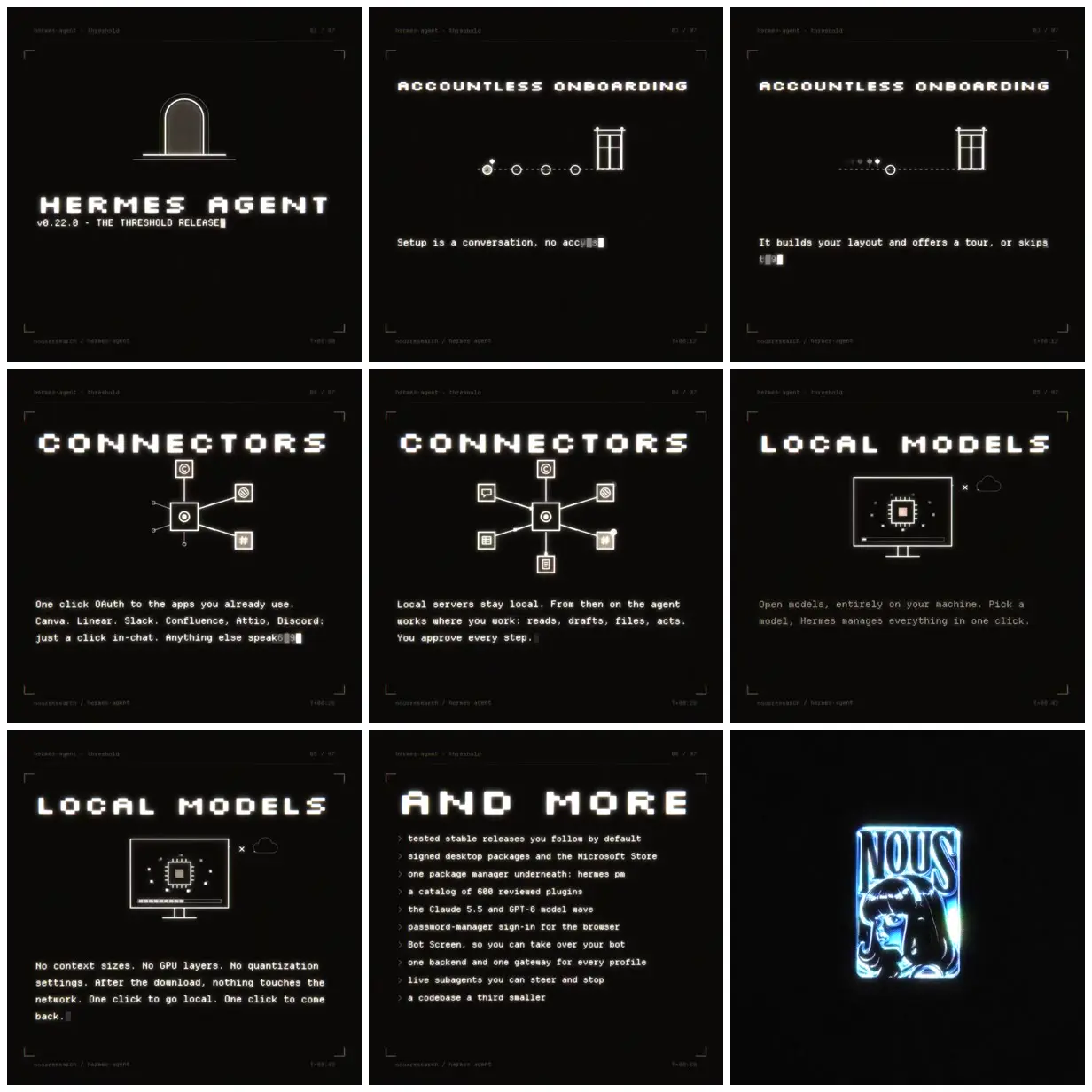
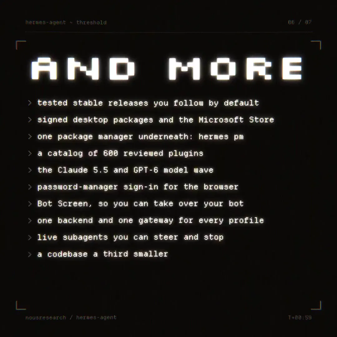
A black-and-white software release promo pairs pixelated headings and monospaced descriptions with doorway, connector-network, and local-computer diagrams, ending on a blue luminous Nous emblem.
Adapt this system to another technical product by giving each feature one simple luminous line diagram, such as a bridge for compatibility or a vault for privacy. Keep pixel headings, monospaced explanations, and corner brackets consistent across cards. Reserve a saturated color treatment for the final brand image so it contrasts with the monochrome feature sections.
No creator prompt published. Reference wrote this brief. Copy for agent includes the brief, visual reference links, and setup guidance.
Source and credit
X · Oct 14, 2026 · 1.9k likes · 535k views · 112 comments
Authorship not stated by the source
Look notesby Reference
Minimal, dark terminal-inspired software release promo with a crisp retro-computing aesthetic.
- Color
- Near-black backgrounds with white and pale gray text and line art; the closing Hermes mark adds bright cyan and blue glow.
- Type
- Large, widely spaced geometric pixel-style uppercase headings paired with small monospaced text.
- Framing
- Centered headings and simple technical illustrations sit above short text blocks, framed by subtle corner marks and fine interface lines. The closing frame centers a luminous Hermes logo.
- Structure
- Opens with the release title, then presents feature sections on accountless onboarding, connectors, local models, and an update list, ending on the Hermes logo.