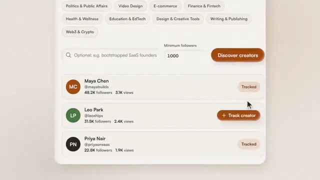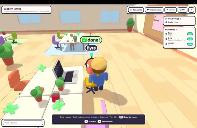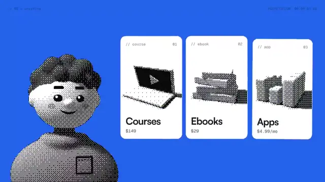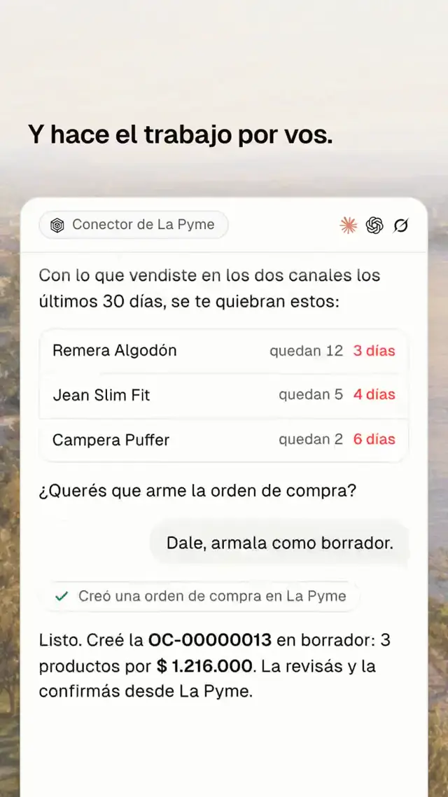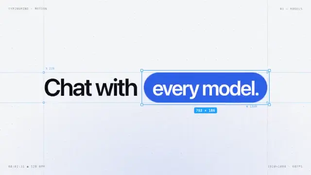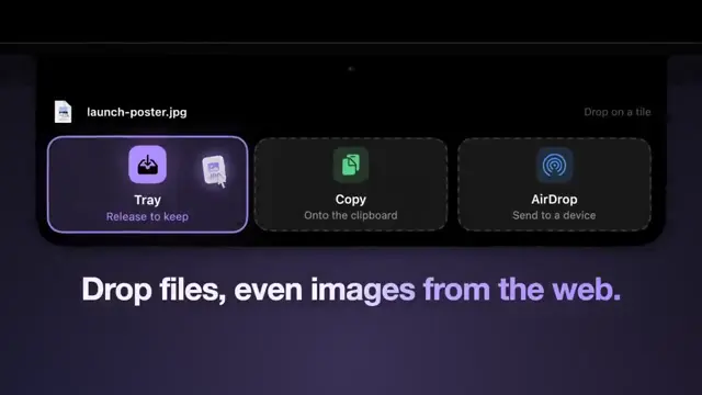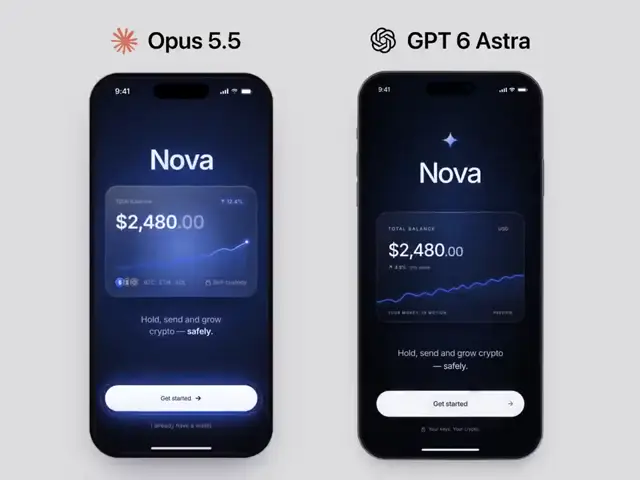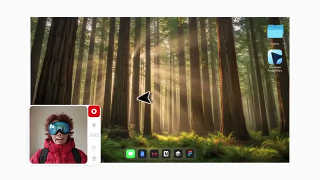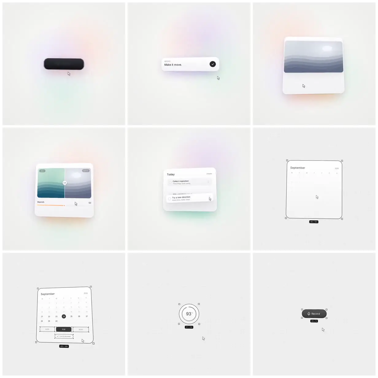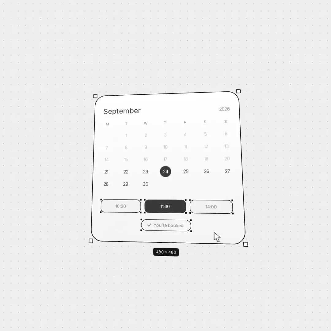
UI cards with selection outlines
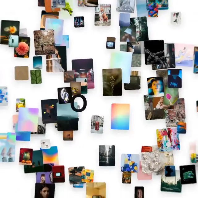
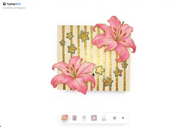
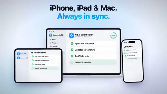
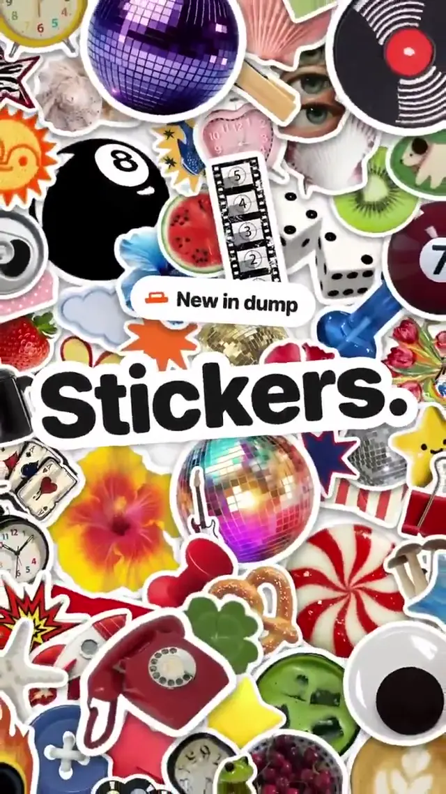
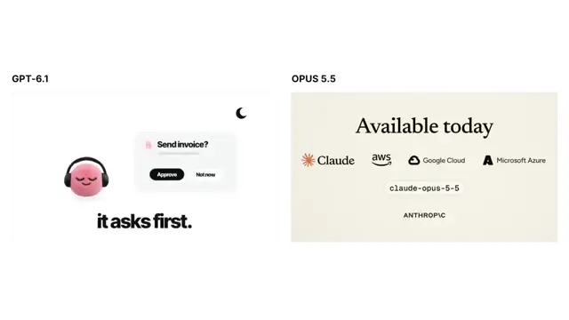
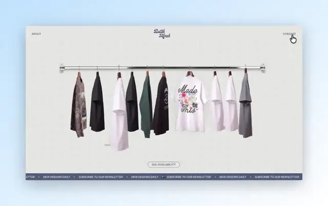
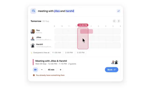
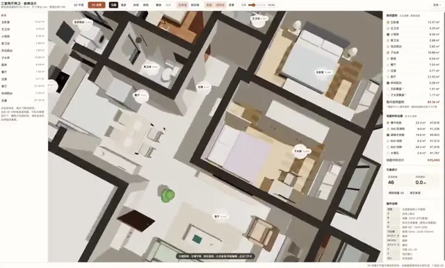
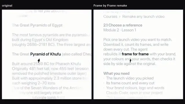
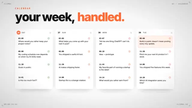
Rounded interface components sit against pale backgrounds with pastel halos. Image controls and task cards give way to outlined calendar, progress and recording widgets with selection handles and dimension labels.
"Read my brand folder and write DESIGN.md. Break down the reference video I give you: pacing, type, transitions. Show me 3 storyboards, then one still per scene for the one I pick. Build every scene in HyperFrames, add music, render a draft. Review it second by second without editing and list the problems. Pass every note to Jev and have it score each one against DESIGN.md: fix now / later / skip. Fix only "fix now". After I approve: cut 3 ad variants with different hooks in 9:16, 1:1 and 16:9, then build the landing page from the same DESIGN.md with the video loop as the hero."
Make it hereFree runs soon
You'll need
- The published prompt refers to supplied reference images, footage or files. Provide your own equivalents.
How it was made
Opus 5.5
Source and credit
X · Sep 29, 2026 · 299 likes · 41k views · 12 comments
Made with AI, according to the source
Published instructions: https://x.com/ArchiveExplorer/status/2105023417716191488
Look notesby Reference
Minimal, refined productivity-app interface mockups with soft shadows and subtle ambient color.
- Color
- Warm off-white backgrounds, white cards, charcoal text and controls, cool slate-blue imagery, and faint pastel pink, blue, and mint accents.
- Type
- Small, clean sans-serif labels and headings paired with simple rounded controls and icons.
- Framing
- UI components are centered and generously spaced; some sit on a subtle dotted design canvas.
- Structure
- A sequence of isolated interface elements: a dark pill button, a short text-entry card, image and comparison cards, a task list, a calendar and scheduling panel, a circular progress indicator, and a recording button.