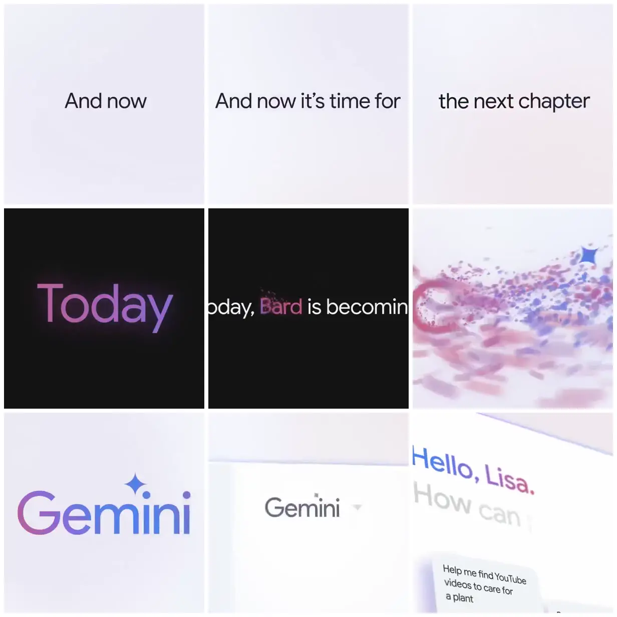
Gemini name reveal and interface
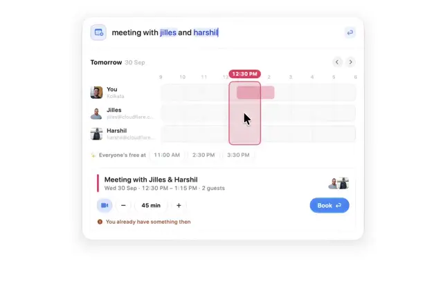
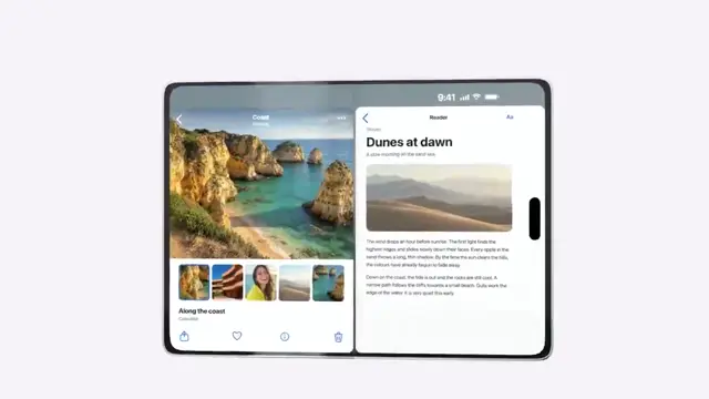
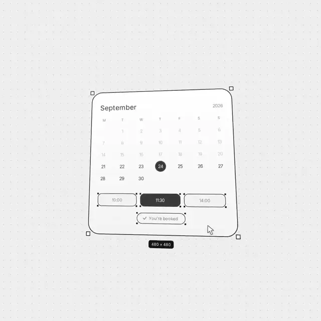
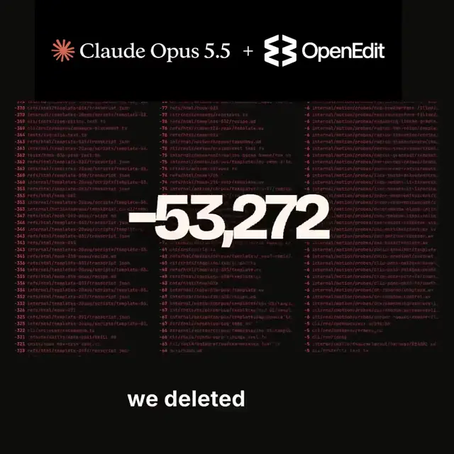
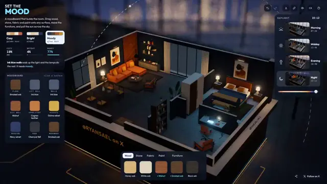
A typography-led Gemini launch piece pairs spare black-and-white statements with pink-to-blue lettering, a field of colorful fragments, the Gemini wordmark, and close-up product interface cards.
Adapt the approach to a product rename or feature introduction using short, spacious typographic statements. Give the key name a restrained gradient treatment and use letter-like fragments as a visual bridge to the new identity. Finish with a few tightly cropped interface examples that retain the same palette and typographic clarity.
No creator prompt published. Reference wrote this brief. Copy for agent includes the brief, visual reference links, and setup guidance.
Source and credit
Look notesby Reference
Minimalist Google Gemini brand and product presentation built around concise text cards and a clean interface.
- Color
- Pale lavender, off-white, and light gray backgrounds; near-black panels and text; magenta-to-blue gradient accents.
- Type
- Large, clean sans-serif lettering, with gradient treatment on the “Today” and “Gemini” wordmarks.
- Framing
- Short phrases are centered on spacious cards; later frames feature a prominent wordmark and a tilted text-and-chat interface view.
- Structure
- Opens with sparse text cards, introduces a dark typographic panel and Gemini branding, then shows a light interface mockup with a visible chat prompt.