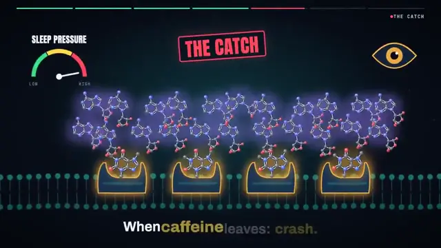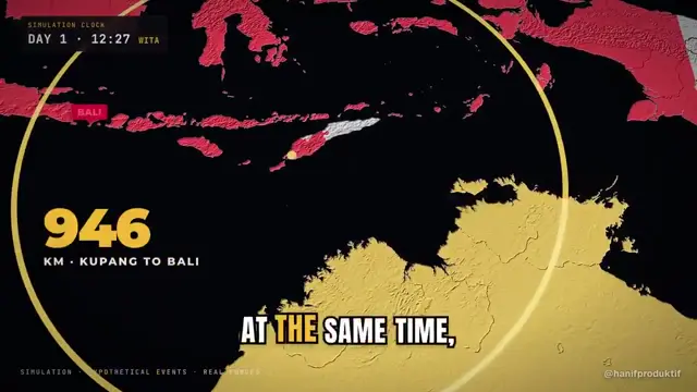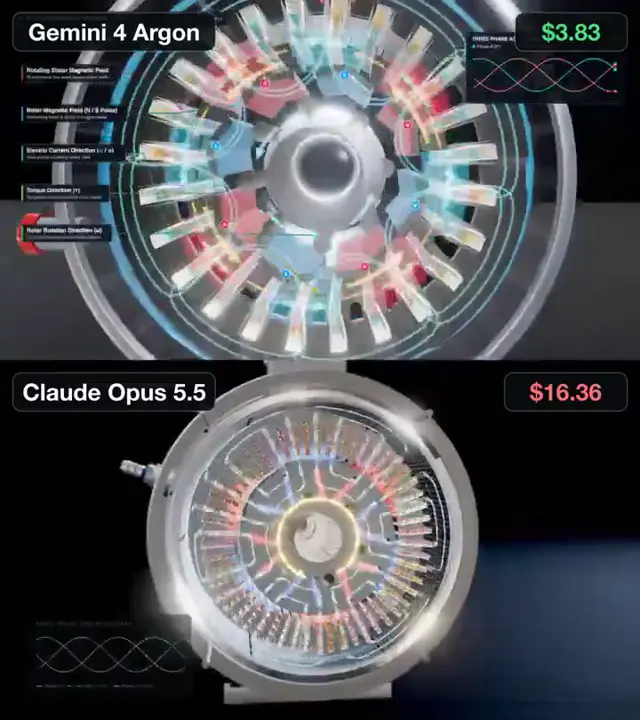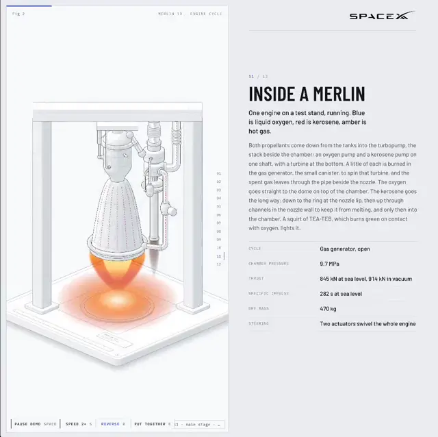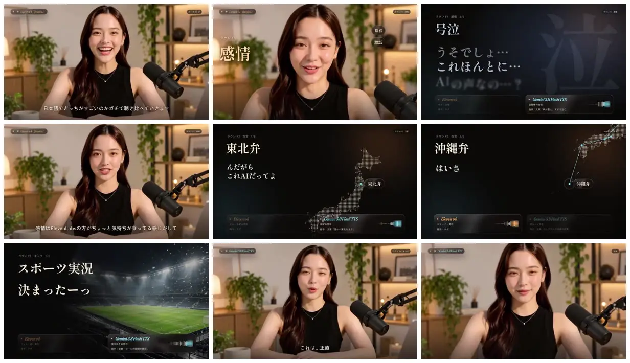
Adapt this format to compare two approaches to another subject, alternating a welcoming presenter setting with restrained editorial example cards. Give each test a large heading and a relevant visual, such as a map or location image. Keep paired comparison labels in the same bottom positions and use two accent colors to distinguish the alternatives.
No creator prompt published. Reference wrote this brief. Copy for agent includes the brief, visual reference links, and setup guidance.
Voice tests with maps and a presenter
A Japanese voice-model comparison pairs a studio presenter with dark test cards for emotion, regional dialects and sports commentary. Serif headlines, dotted maps and paired model panels organize the examples.
How it was made
Claude Code · Codex · Opus 5.5 · Elevenlabs Eleven v4 · Gemini 3.8 Flash TTD · GPT-Image-2.5 · LTX 2.3 · Hyperframes · Epidemic Sound · Colab CLI
Source and credit
X · Sep 29, 2026 · 4.2k likes · 1.3M views · 44 comments
Made with AI, according to the source
Look notesby Reference
A polished presenter-led explainer featuring a woman in a warm studio alongside dark, data-focused comparison graphics.
- Color
- Warm beige and wood tones with leafy greens in the studio; charcoal and black panels with white text and teal accents in the graphics.
- Type
- Clean, modern Japanese typography, with prominent white headings and smaller labels.
- Framing
- The presenter is centered in a medium shot with a large microphone at the right. Separate graphics use spacious layouts, maps, chart marks, and labeled service panels.
- Structure
- Alternates between the studio presenter and minimal comparison slides, including Japanese dialect examples, ElevenLabs and Gemini TTS labels, and a sports-themed graphic.