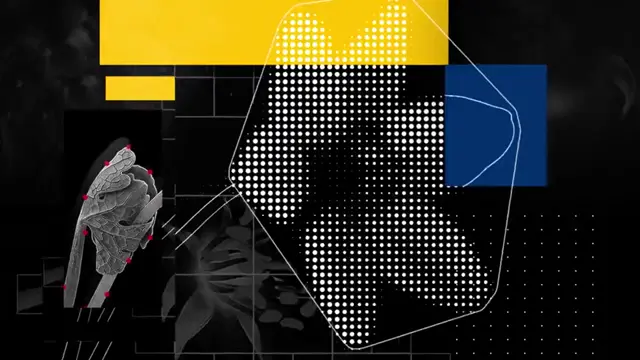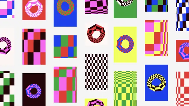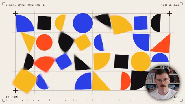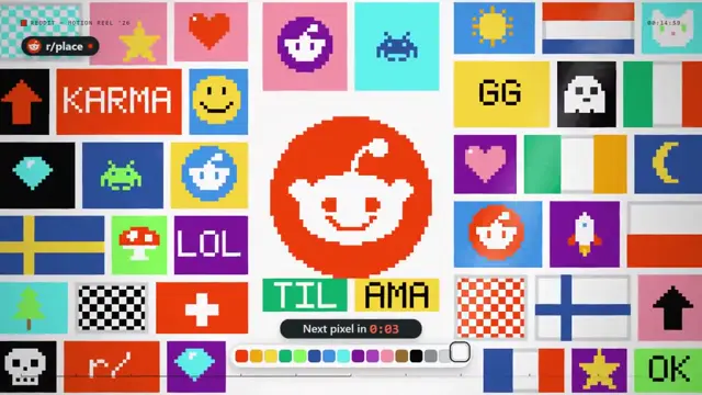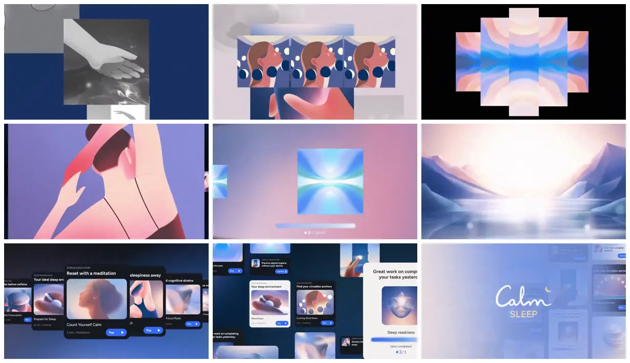
Combine clean silhouette shapes with softly blurred color shading, translucent edges and small luminous accents to give illustrations depth without heavy outlines. Carry the same cool-blue and warm-peach lighting across figures, objects and landscapes, then show those assets in both isolated image panels and rounded interface cards. For a new subject, replace the sleep activities, mountain scenery and branding with relevant scenes and objects while preserving the lighting grammar and variation in panel scale.
No creator prompt published. This brief was written by Reference.
Calm Sleep visual system
A soft visual identity for Calm Sleep combines luminous gradients, wellness illustrations and reflective landscapes. The case-study film shows how the imagery works across the app.
Source and credit
Authorship not stated by the source
Look notesby Reference
Calm, soft-edged visual design for a sleep and relaxation app, combining abstract illustrations with interface screens.
- Color
- Deep navy and blue, lavender, pale pink, teal, and white, with gentle gradients and occasional coral accents.
- Type
- Small sans-serif headings and blue pill buttons label the app cards. A white cursive Calm wordmark sits above a small pale SLEEP label in the closing view.
- Framing
- Rectangular image studies overlap on blue and pastel fields; later views place illustrations inside floating rounded app cards.
- Structure
- Monochrome image studies, repeated illustrated faces, mirrored pastel panels, a close figure, an abstract progress view, a mountain lake, overlapping app cards, and the Calm Sleep end card.