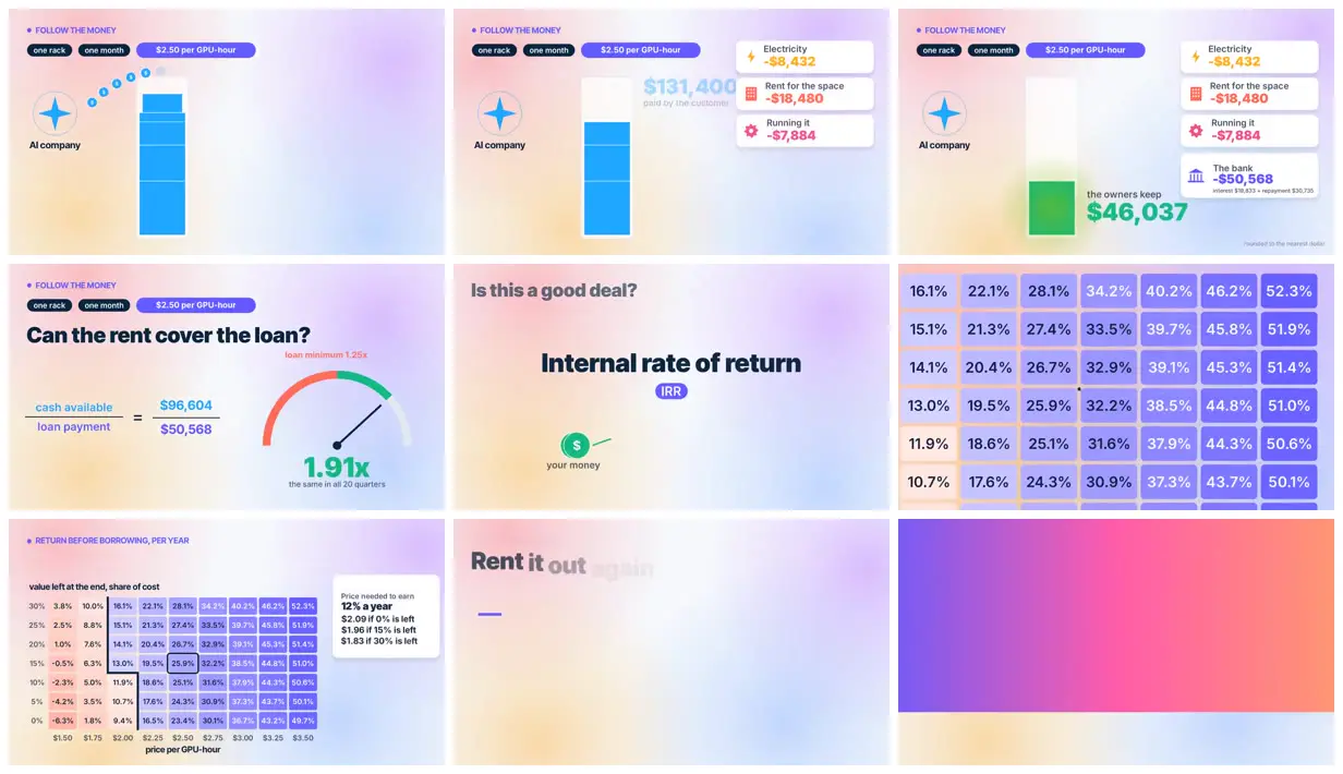
Adapt the approach to another infrastructure business by introducing a familiar analogy before showing its unit economics. Use a consistent pastel background, bold headings and color-coded cards to separate revenue, expenses and risk. Pair an illustrated asset stack with a cash-flow breakdown, then summarize sensitivity with a labeled heatmap and compare projected capacity with operating capacity.
No creator prompt published. Reference wrote this brief. Copy for agent includes the brief, visual reference links, and setup guidance.
Neocloud economics in diagrams
A business explainer presents neocloud economics through a landlord analogy, isometric server racks, expense cards, return calculations and company comparisons, unified by pastel gradients and bold typography.
How it was made
Reference shows a muted excerpt from 1:15 to 2:45. Watch the complete video at the original source.
Tools not stated by the source.
Source and credit
X · Sep 29, 2026 · 2.1k likes · 156k views · 160 comments
Authorship not stated by the source
Look notesby Reference
Clean, colorful financial infographic with a small server-cost illustration, loan calculations, an IRR heading, and percentage tables.
- Color
- Soft cream, pink, and pale-blue gradients with vivid blue and purple accents; green highlights gains and red marks costs.
- Type
- Bold modern sans-serif headings and labels, with large figures and compact table text.
- Framing
- Simple illustrated icons and stacked cost cards sit alongside prominent numbers, a semicircular gauge, and tightly aligned data tables.
- Structure
- Progresses from a cost breakdown to loan-coverage and IRR calculations, then to return tables and a brief rent-it-out prompt.