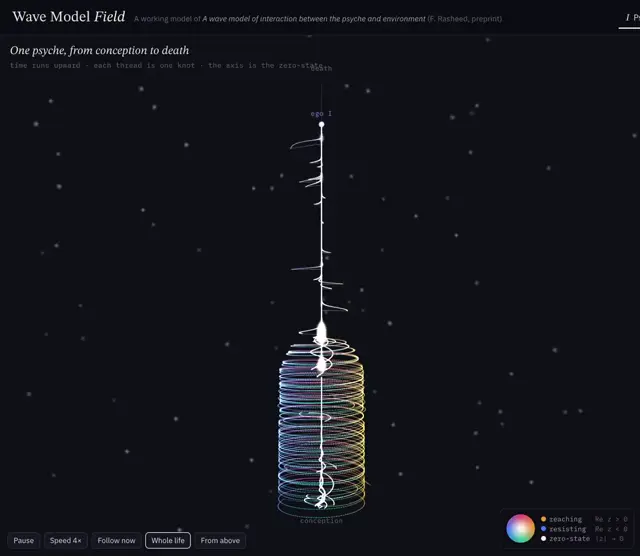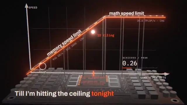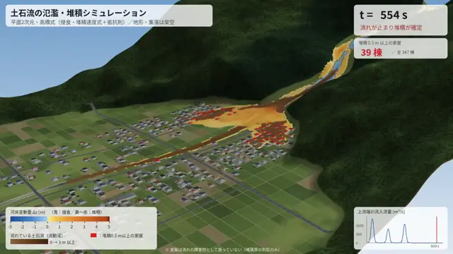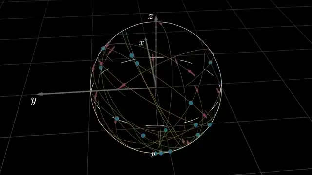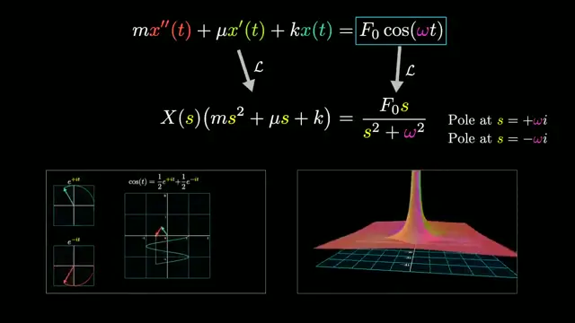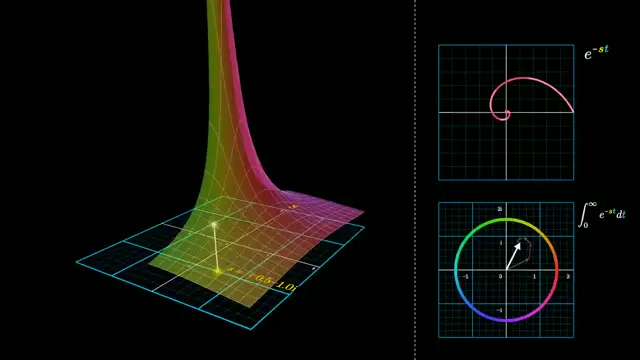
Adapt the laboratory-dashboard layout to another invisible phenomenon, such as airflow or electric potential. Use a dark central diagram for delicate colored contours, with a restrained light interface around it. Pair the spatial visualization with a gauge and two compact plots so viewers can connect geometry to measurements.
No creator prompt published. Reference wrote this brief. Copy for agent includes the brief, visual reference links, and setup guidance.
Electromagnetic fields around a coil
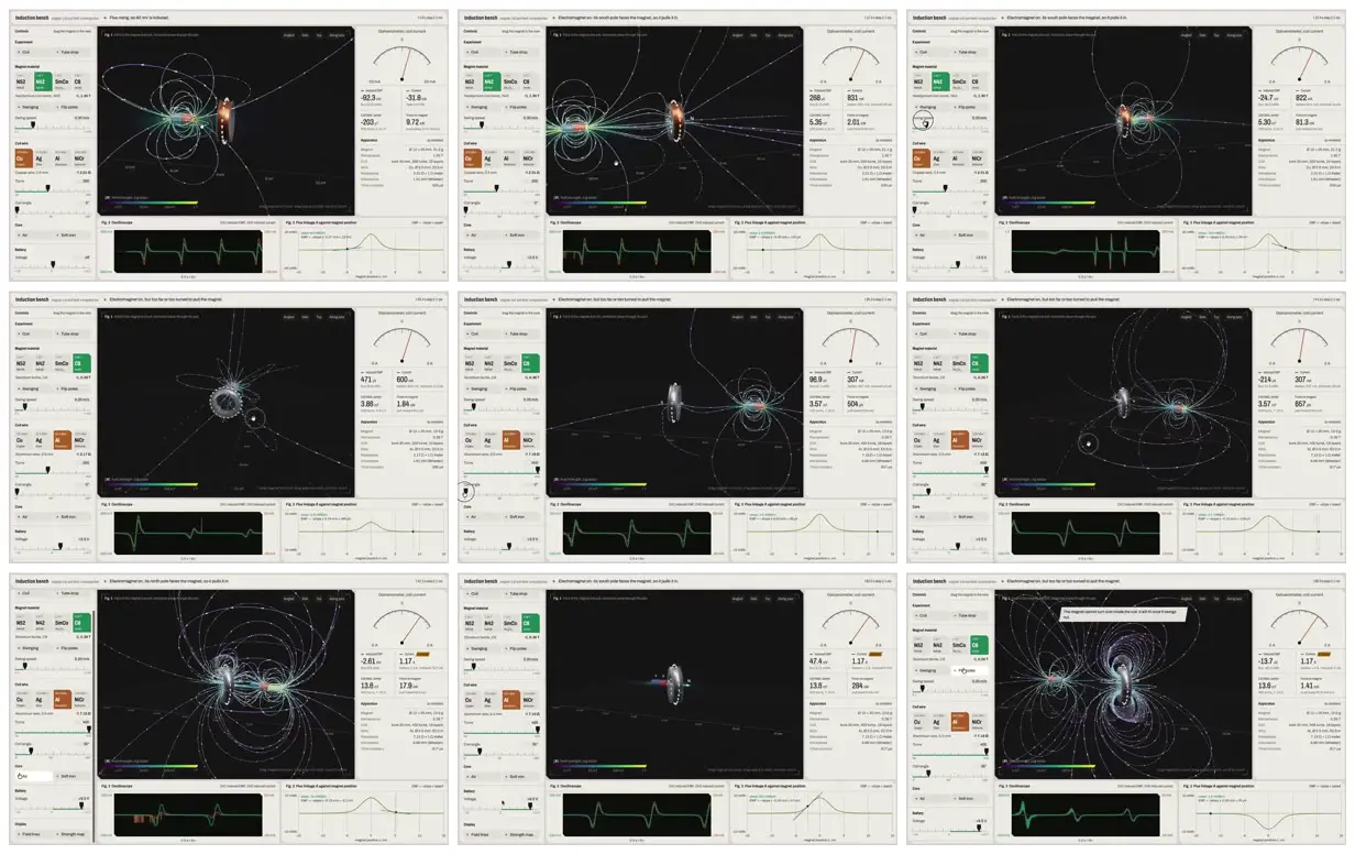
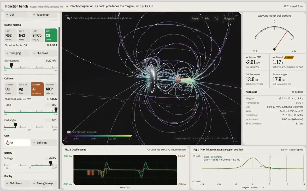
An electromagnetic induction dashboard presents luminous field lines around a magnet and coil, alongside material selectors, parameter sliders, a needle gauge, and waveform plots.
How it was made
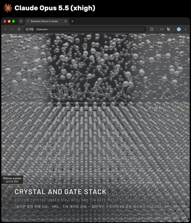
Claude Opus 5.5
Source and credit
X · Sep 28, 2026 · 2.8k likes · 195k views · 68 comments
Made with AI, according to the source
Look notesby Reference
Dark scientific visualization showing glowing charged objects surrounded by curved electromagnetic field lines, alongside an interactive control interface.
- Color
- Near-black visualization canvas, pale gray interface panels, fine white and violet field lines, and cyan, green, and orange highlights.
- Type
- Compact sans-serif interface labels, numeric readouts, sliders, and small chart annotations.
- Framing
- A large central field diagram is flanked by parameter controls and instrument-style readouts, with waveform and graph panels below.
- Structure
- Dashboard interface with grouped controls, a central visualization, gauge and measurement panels, and compact plots.