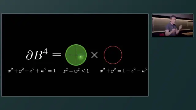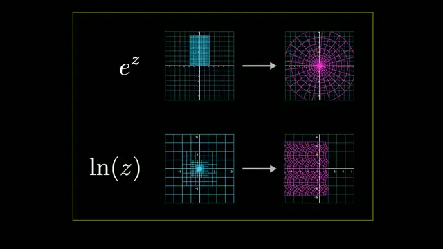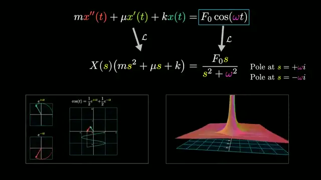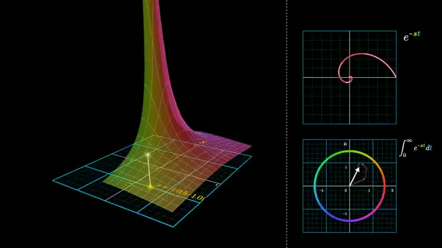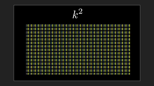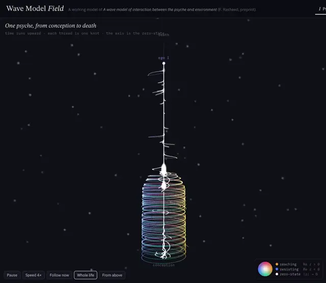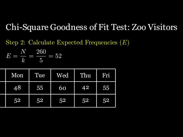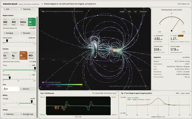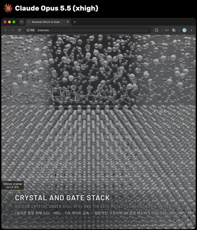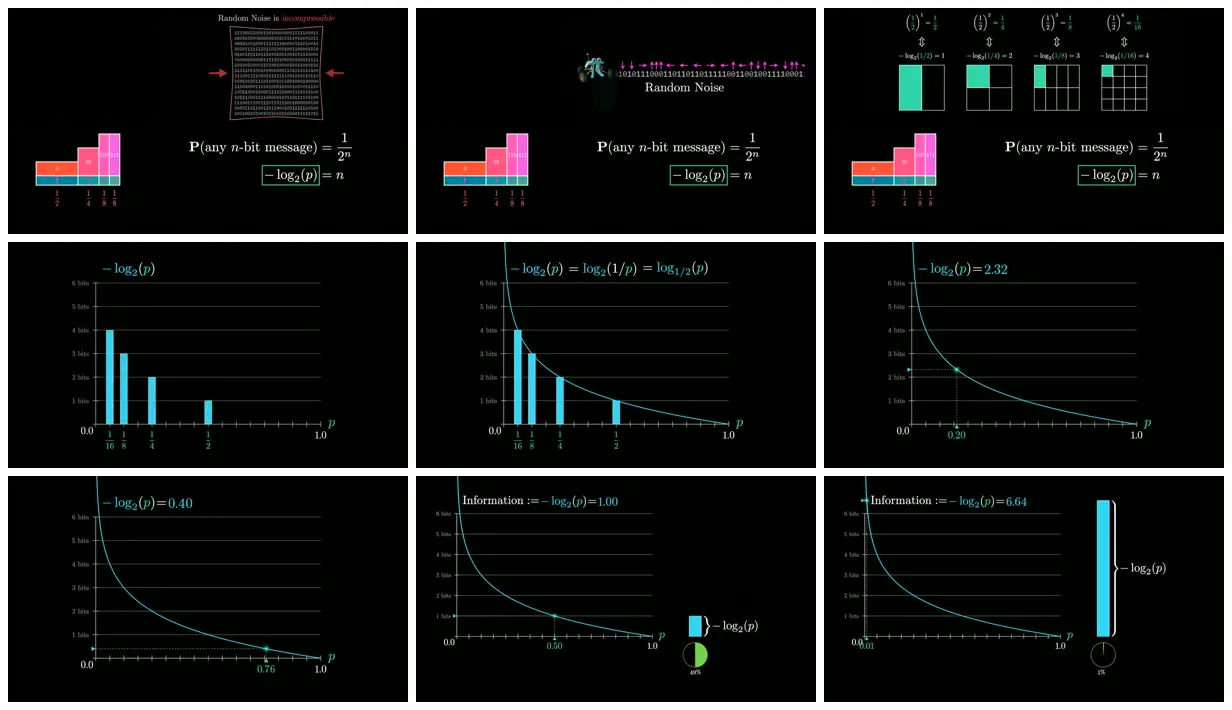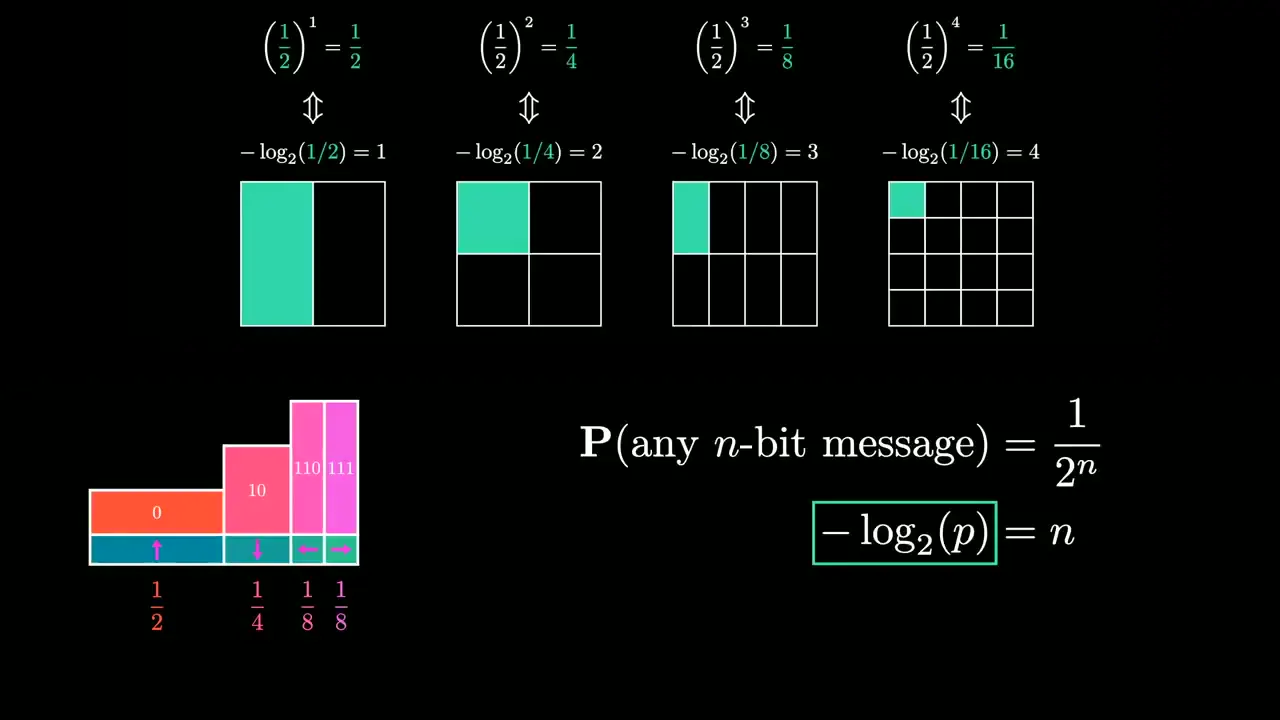
Explain another abstract quantity by giving its inputs and outputs consistent colors across code lists, equations and charts. Pair a simple comparison diagram with a plotted mathematical relationship, then reuse that visual vocabulary in a real-world example. Keep backgrounds sparse and reserve character illustrations or portrait cutouts for contextual sections.
No creator prompt published. Reference wrote this brief. Copy for agent includes the brief, visual reference links, and setup guidance.
Entropy through codes and probability
An information-theory explainer connects binary compression, language probabilities and entropy using partition diagrams, logarithmic graphs, letter charts, illustrated pi characters and monochrome historical portraits.
How it was made
Reference shows a muted excerpt from 15:24 to 16:54. Watch the complete video at the original source.
Manim
Source and credit
YouTube · Jun 7, 2026 · 55k likes · 1.6M views · 2.3k comments
Authorship not stated by the source
Look notesby Reference
A mathematical explainer connects random noise and compression with information measured as −log₂(p), using probability examples and plotted curves.
- Color
- Black backgrounds with cyan and teal lines, green accents, and occasional magenta, orange, and white.
- Type
- Refined serif-style mathematical lettering paired with small sans-serif graph labels and equations.
- Framing
- Sparse, high-contrast diagrams and equations sit beside or above charts, with generous black negative space.
- Structure
- The visible graphics progress from a random-noise illustration and probability bars to logarithmic information curves, marked probability values, and vertical measures of information.