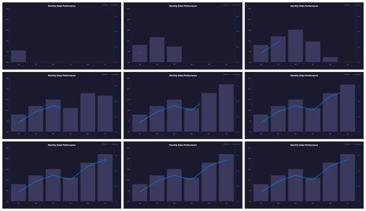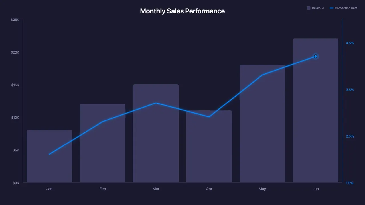
Create a 1920x1080 dark-themed (#1A1A2E) composition called 'BarLineChart' with a combination chart showing monthly sales data — bars for revenue ($8K, $12K, $15K, $11K, $18K, $22K for Jan-Jun) that grow upward from the baseline, overlaid with a blue (#0B84F3) line tracking conversion rate (2.1%, 2.8%, 3.2%, 2.9%, 3.8%, 4.2%) that draws progressively with a glowing effect, bars animate sequentially with slight overlap while the line follows behind, include axis labels and a pulsing dot marker at the line tip, smooth spring-based timing over 120 frames at 30fps — use remotion-best-practices skill.
Make it yours. Change the data: the revenue list "$8K, $12K, $15K, $11K, $18K, $22K for Jan-Jun", the conversion rates, and the colors "#1A1A2E" and "#0B84F3". Keep "smooth spring-based timing over 120 frames at 30fps" for the same pacing.
Monthly revenue bars with a glowing line
A 4-second dark chart: six monthly revenue bars rise in turn while a glowing blue conversion-rate line draws across them and ends on a pulsing dot. Every value, color, and timing is set in one long sentence, run in OpenCode with Remotion's agent skills.
You'll need
- A Remotion project (npx create-video@latest)
- Remotion's agent skills (npx skills add remotion-dev/skills), since the prompt ends by asking for the remotion-best-practices skill
How it was made
Submitted to Remotion's Prompt Showcase with the tool (OpenCode) and model (Opus 4.5) listed. No other process details are given.
Posted Feb 4, 2026 · Remotion Prompt Showcase on Website · 63 likes
Prompt from: Remotion Prompt Showcase submission
Look notesby Reference
A dark dashboard chart titled "Monthly Sales Performance": six muted lavender bars for January to June, with a thin bright-blue line and end dot across them.
- Color
- Deep navy background, dusty lavender-gray bars, a bright blue line and dot, and faint gray axis text.
- Type
- A small bold white sans-serif title at top center, a tiny legend at top right (Revenue, Conversion Rate), gray dollar ticks on the left axis, blue percentage ticks on the right, and month abbreviations along the bottom.
- Framing
- A full-frame chart with two axes: revenue on the left and conversion rate on the right. Wide bars with narrow gaps; the line climbs from Jan to Jun with a dip at Apr and ends on a ringed dot over June.
- Structure
- Early frames show only the first bars, the line trails a step behind the bars, and the last frames hold the finished chart.