Agent costs and payroll dashboard
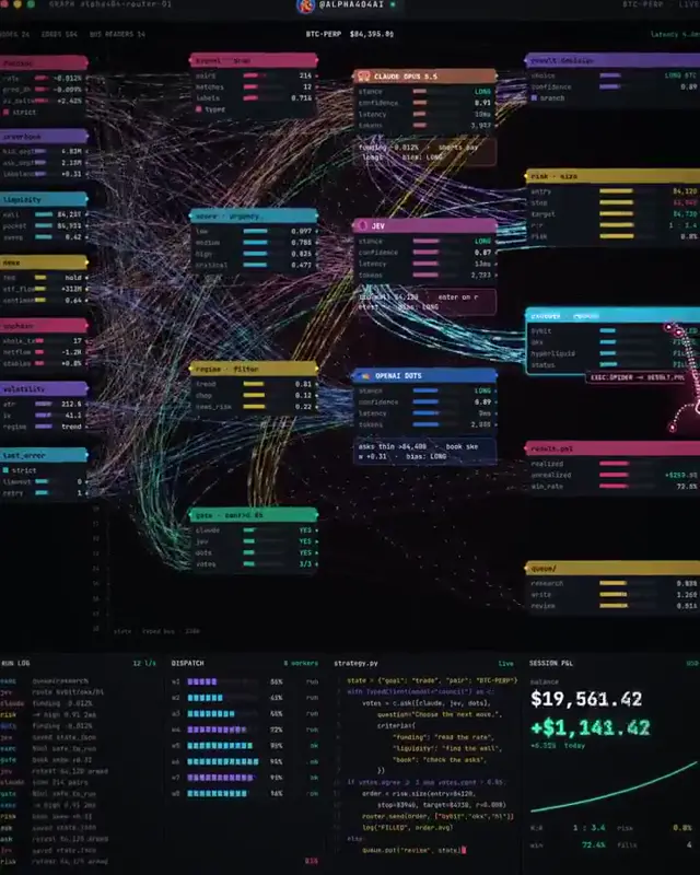
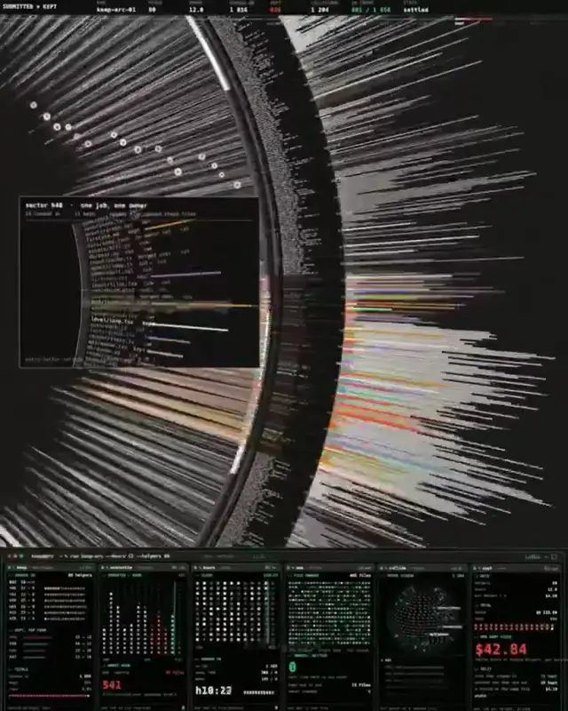
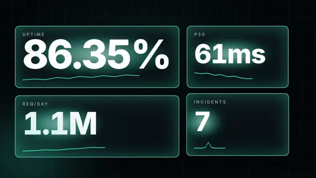
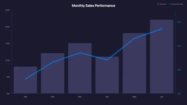
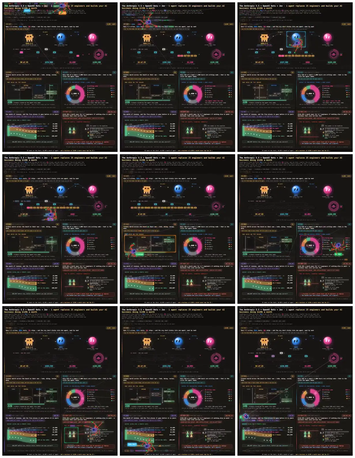
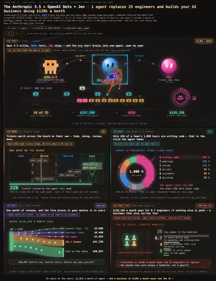
A dark, retro-styled dashboard compares software agents with engineering payroll through pixel mascots, staffing counts, a ticket board, a work-hours donut, and a layered revenue breakdown.
Adapt this dashboard to compare two operating models for another business. Give each role a simple pixel mascot and reuse its accent color in the staffing diagram and charts. Pair a workflow board with a time-allocation donut and revenue breakdown, while enlarging the key labels to reduce reading density.
No creator prompt published. Reference wrote this brief. Copy for agent includes the brief, visual reference links, and setup guidance.
Source and credit
X · Oct 3, 2026 · 146 likes · 19k views · 15 comments
Authorship not stated by the source
Look notesby Reference
Dark analytics dashboard illustrating an AI agent replacing 25 engineers, with payroll savings, ticket metrics, and other business figures.
- Color
- Near-black and charcoal backgrounds with neon cyan, teal, magenta, green, yellow, and blue accents.
- Type
- Small, bold sans-serif headings and labels, with compact numerical readouts and code-like text.
- Framing
- A headline and agent icons sit above rows of metrics, charts, and data panels.
- Structure
- Dense, grid-based dashboard made of bordered sections, including a top overview, middle ticket and pie-chart panels, and lower financial charts and summaries.