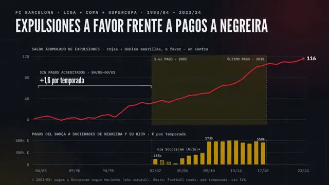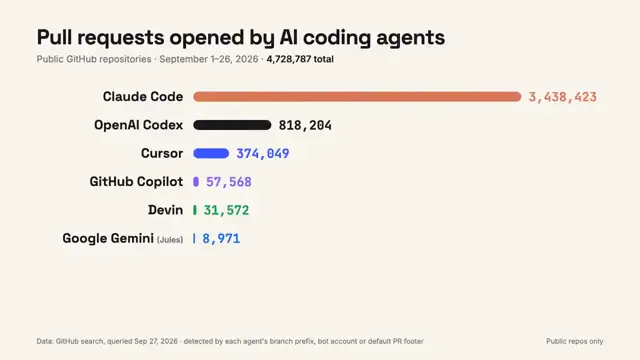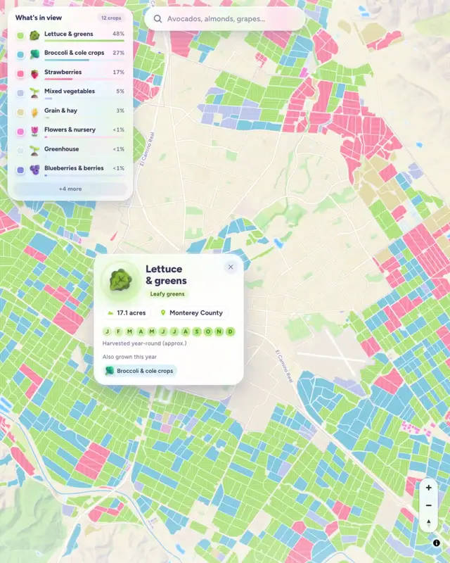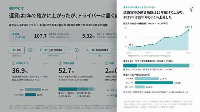
One percent odds across repeated trials
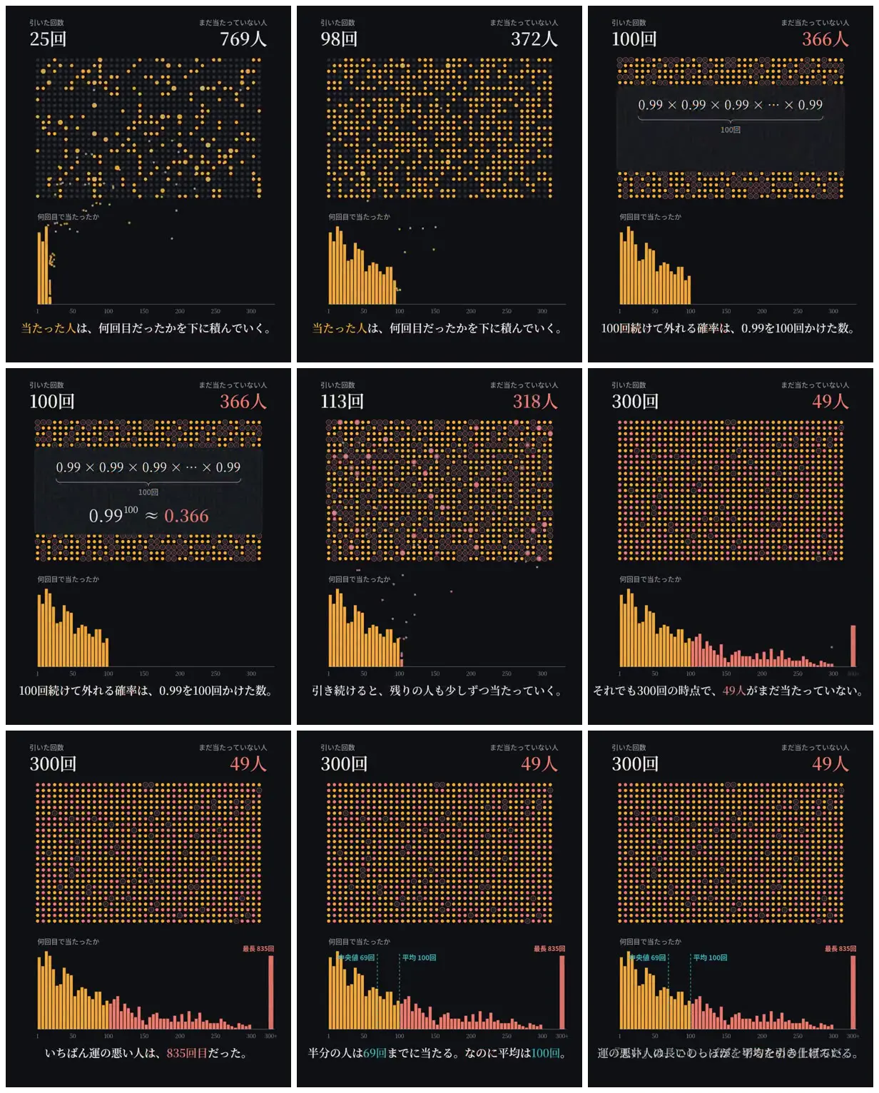
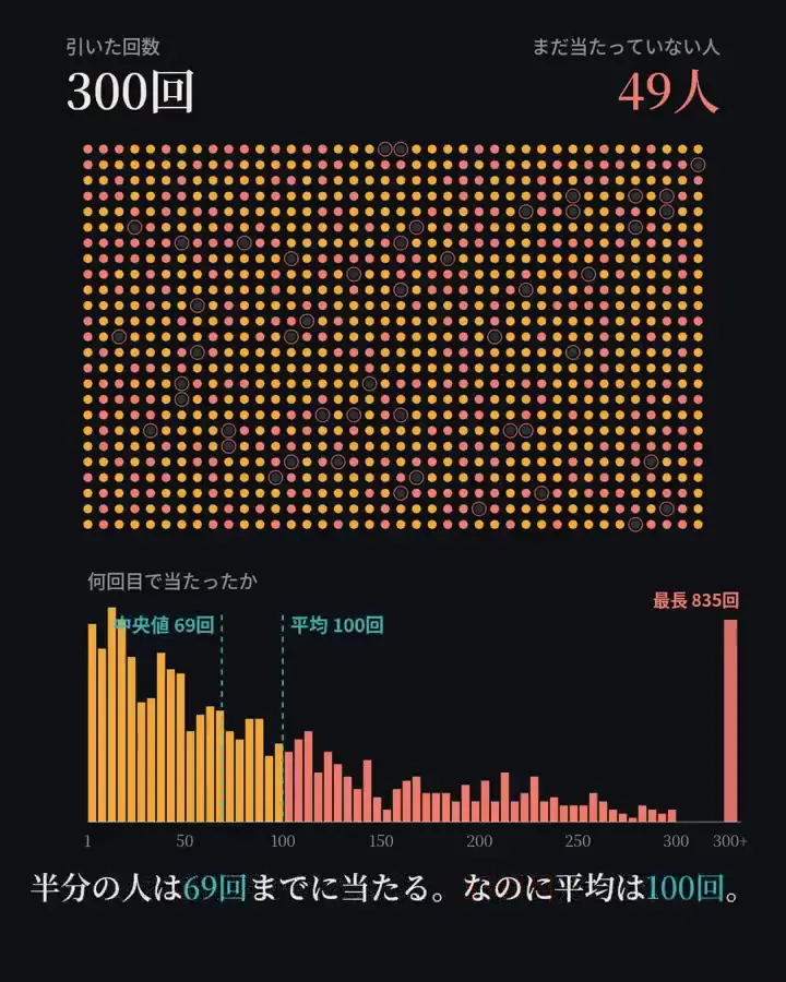
A Japanese probability explainer pairs a dot-grid population with a waiting-time histogram, showing why a 1% chance does not guarantee success after 100 attempts and contrasting median, mean and long-tail outcomes.
Adapt this paired-view layout to another repeated-event problem, using one dot per participant above a histogram of individual outcomes. Keep the colors consistent between the population and distribution, and reserve a contrasting accent for the long tail. Introduce the governing equation in a central panel, then finish with clearly labeled median, mean and extreme cases.
No creator prompt published. Reference wrote this brief. Copy for agent includes the brief, visual reference links, and setup guidance.
How it was made
Opus 5.5
Source and credit
X · Oct 3, 2026 · 1.2k likes · 326k views · 17 comments
Made with AI, according to the source
Look notesby Reference
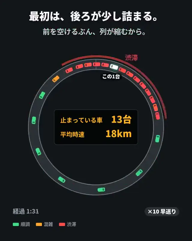
Data-driven infographic about repeated chances, with colored dots representing people or trials and charts showing when successes occur.
- Color
- Near-black and charcoal backgrounds with white and gray text, yellow-orange dots and bars, and coral-pink accents for remaining people and highlighted values.
- Type
- Clean Japanese sans-serif labels and captions, paired with large serif-style numerals and prominent mathematical notation.
- Framing
- Each graphic places a labeled dot grid above a compact histogram, with concise explanatory text along the bottom. Some frames feature a centered equation between sections of the grid.
- Structure
- The explanation progresses from sparse early successes to a 100-trial probability calculation, then to larger samples, averages, and an unusually late success.