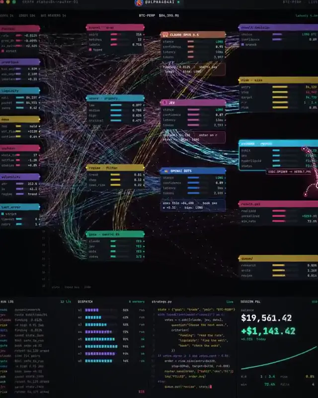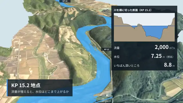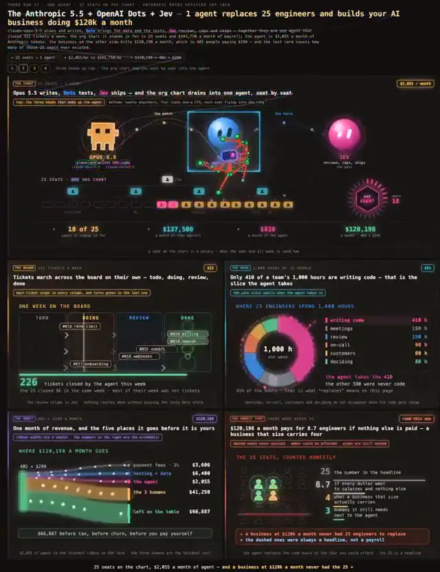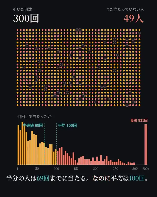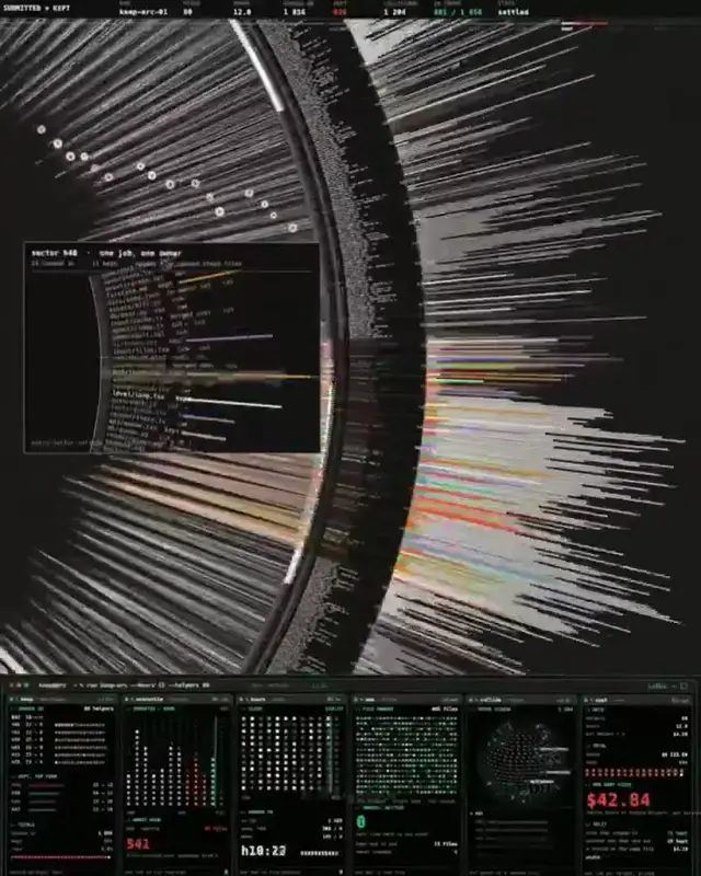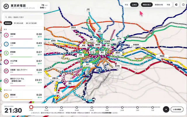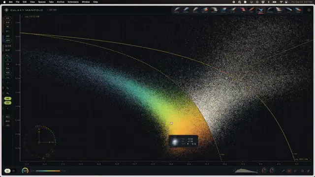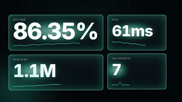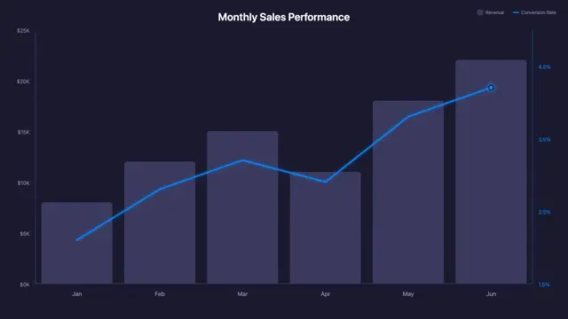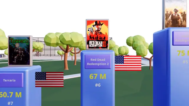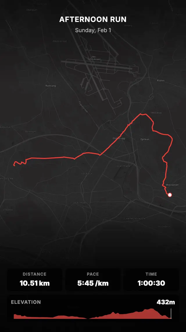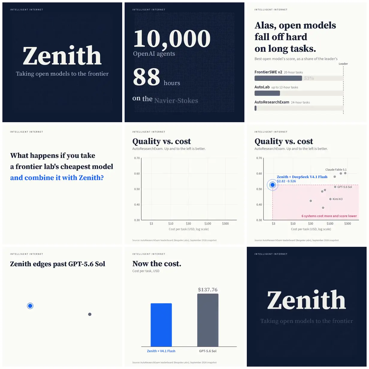
Zenith benchmark charts
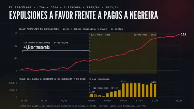
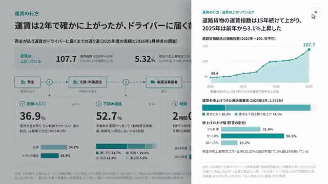
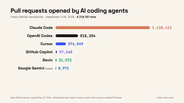
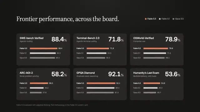
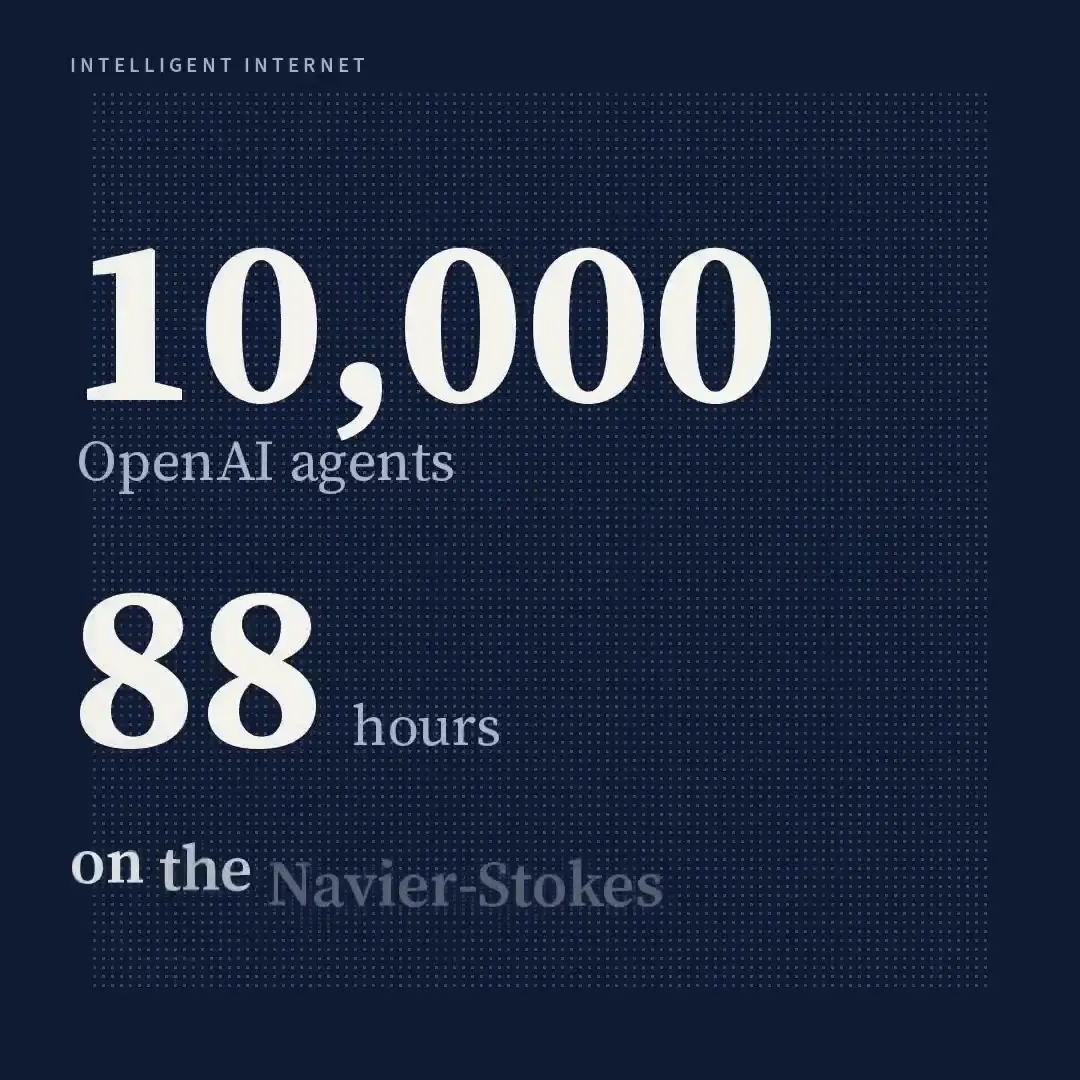
An editorial presentation introduces Zenith, outlines long-task benchmark gaps, and compares quality and cost using bar charts, a scatterplot, oversized figures, and navy title cards.
Adapt this approach to a comparison of products, methods, or research results. Establish one accent color for the featured option and keep competitors neutral. Pair an annotated scatterplot with a shaded comparison region, then isolate the key cost comparison on a separate, spacious card.
No creator prompt published. Reference wrote this brief. Copy for agent includes the brief, visual reference links, and setup guidance.
How it was made
Opus 5.5
Source and credit
X · Sep 23, 2026 · 278 likes · 32k views · 19 comments
Made with AI, according to the source
Look notesby Reference
Editorial technology presentation comparing open AI models, task performance, and cost. Prominent text includes “Zenith,” “1,000 OpenAI agents,” “88 hours,” and “Quality vs. cost.”
- Color
- Deep navy and warm off-white, with bright blue accents and slate-gray chart elements.
- Type
- Large, high-contrast serif headlines and numerals paired with small, widely spaced uppercase branding and restrained sans-serif chart labels.
- Framing
- Generous whitespace and crisp alignment; bold headlines anchor the text sections, while charts use fine gridlines, labeled axes, dots, and simple bars.
- Structure
- A consistent “INTELLIGENT INTERNET” brand label accompanies title and claim sections, performance and cost comparisons, and a closing Zenith brand treatment.