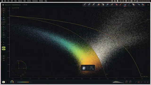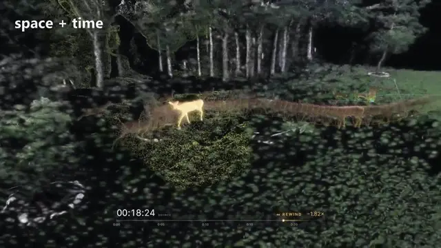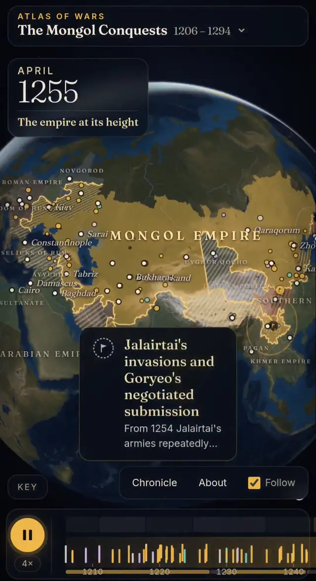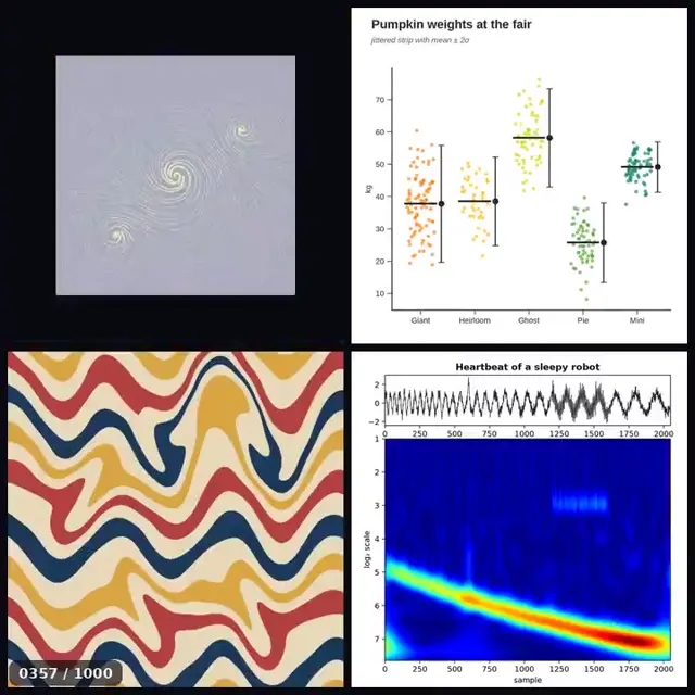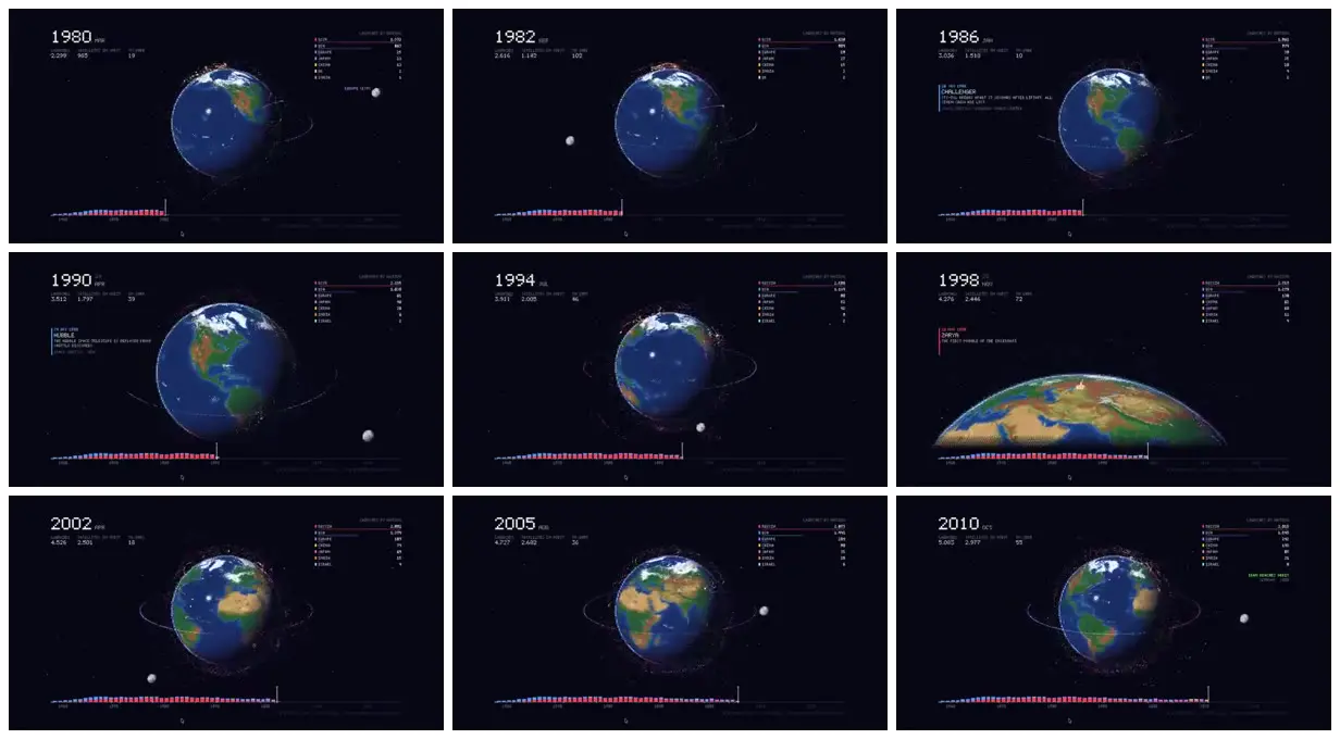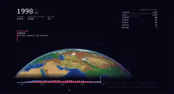
Use a central geographic object to contextualize a historical dataset, with a matching color key across rankings, plotted marks and the bottom timeline. Keep dates prominent and supporting statistics peripheral. Introduce a few milestone annotations and closer geographic views to distinguish important events without abandoning the overall dashboard layout.
No creator prompt published. Reference wrote this brief. Copy for agent includes the brief, visual reference links, and setup guidance.
Space launches around a globe
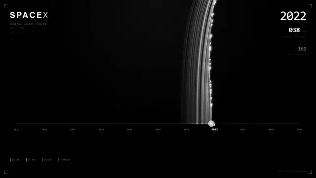
A dark space-launch dashboard pairs Earth and orbital traces with year labels, country rankings and a color-coded launch timeline. Selected milestones appear beside both full-globe and horizon-scale views.
How it was made
Reference shows a muted excerpt from 1:13 to 2:43. Watch the complete video at the original source.
Opus 5.5
Source and credit
X · Sep 23, 2026 · 215 likes · 10k views · 5 comments
Made with AI, according to the source
Look notesby Reference
A dark, data-rich infographic visualizing space launches across years, centered on an illustrated Earth and launch statistics.
- Color
- Near-black navy background with blue oceans, green and tan land, white text, and small multicolored chart accents.
- Type
- Small, clean sans-serif interface text; large white year numerals anchor each view.
- Framing
- A prominent globe sits near the center, with year and summary figures at upper left, a compact legend at upper right, and a dense timeline chart along the bottom.
- Structure
- Consistent dashboard layout with yearly headings and metrics, a central globe with orbital lines and markers, occasional event callouts, and a bottom bar timeline.