Radial networks and task metrics
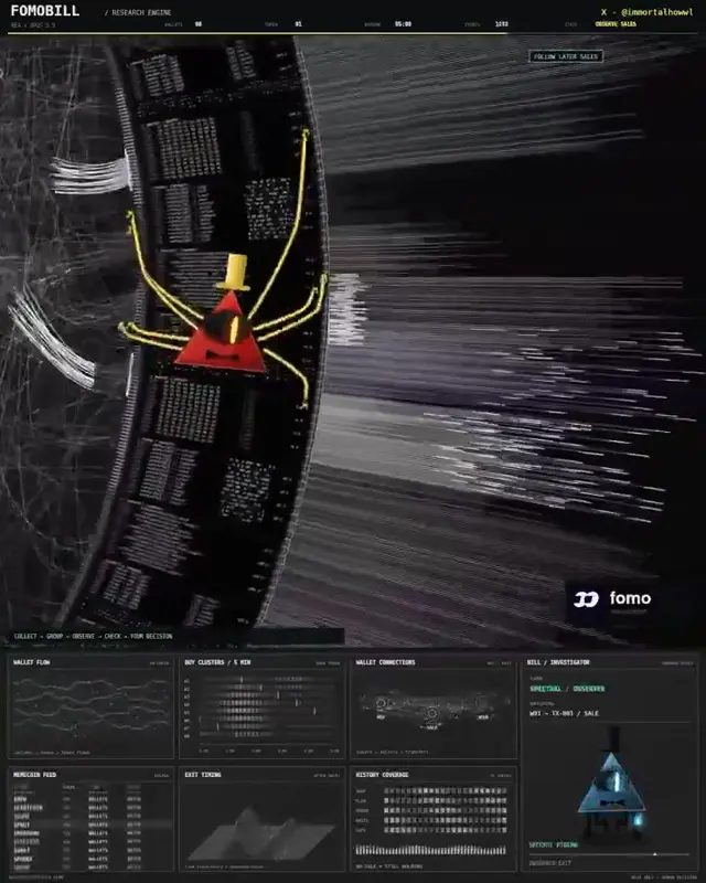
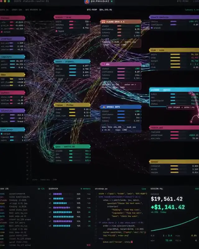
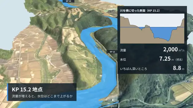
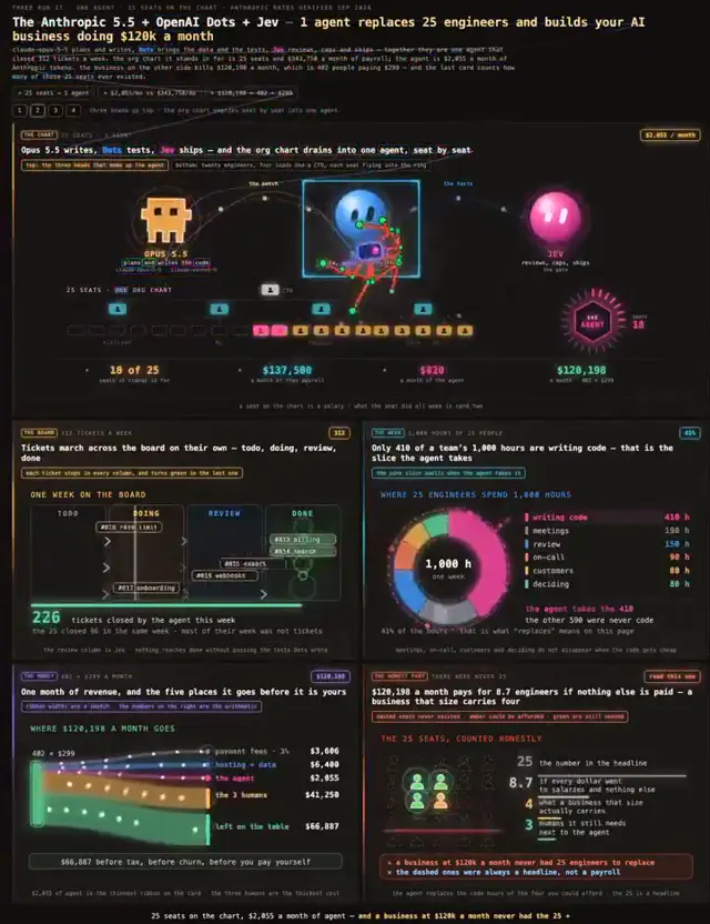
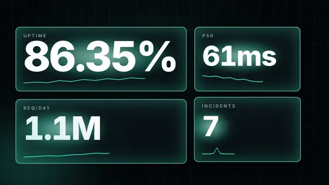
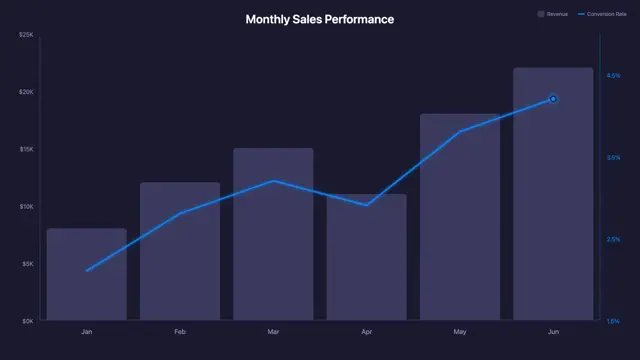
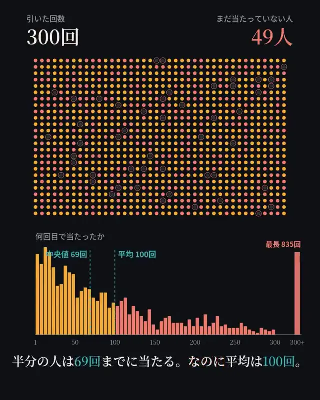
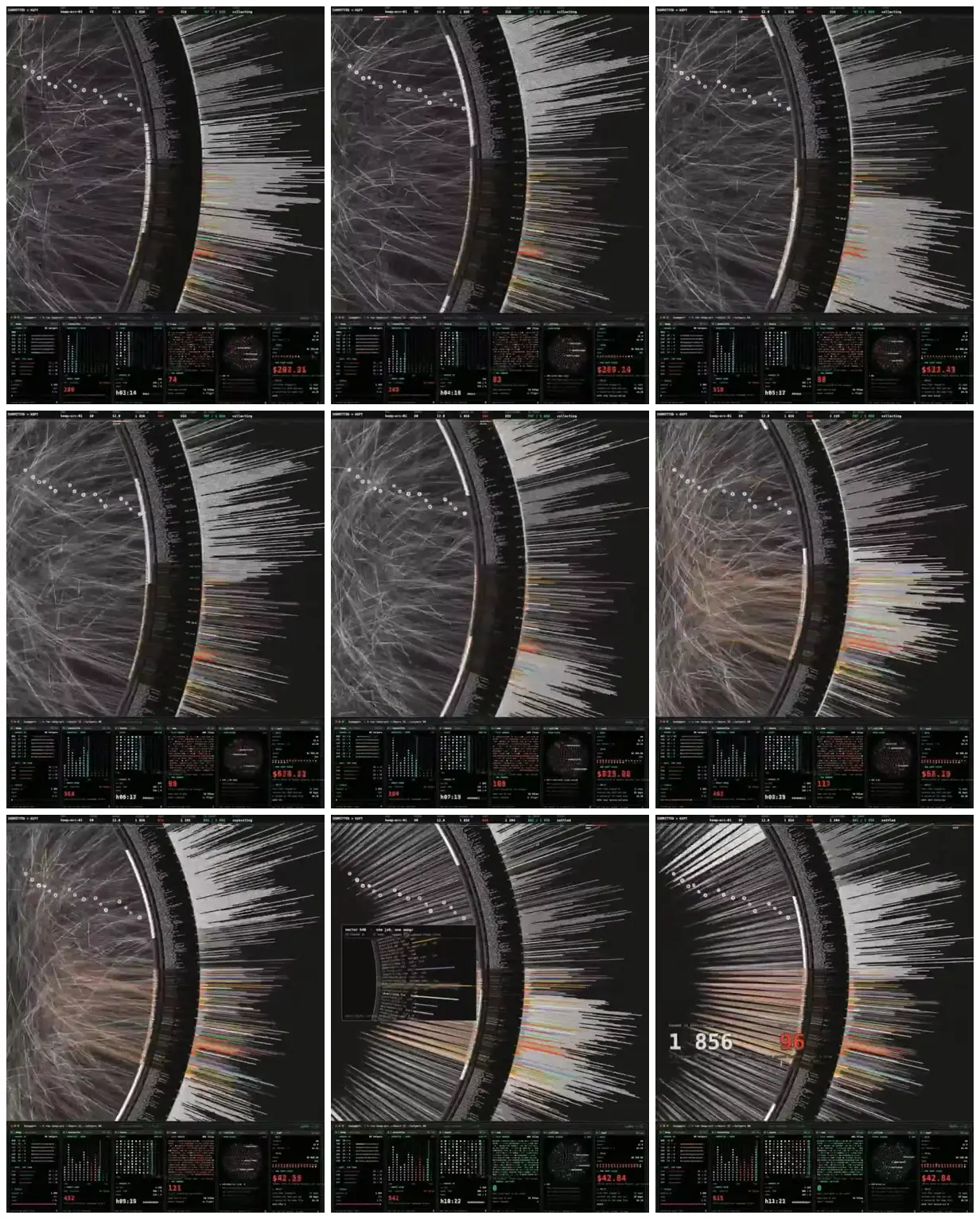
A dark technical visualization combines a web of circular connections, outward-facing bars, and compact metric panels. Later views contrast tangled links with straighter radial arrangements and prominent numerical callouts.
Use a split radial diagram to compare relationships with outputs for another subject, such as supply chains or research collaborations. Place connections inside a thick circular label band and quantitative bars outside it, keeping most marks neutral and reserving color for exceptions. Add a compact metric strip and a few large callouts so the dense diagram has clear reading anchors.
No creator prompt published. Reference wrote this brief. Copy for agent includes the brief, visual reference links, and setup guidance.
Source and credit
X · Oct 3, 2026 · 894 likes · 170k views · 43 comments
Authorship not stated by the source
Look notesby Reference
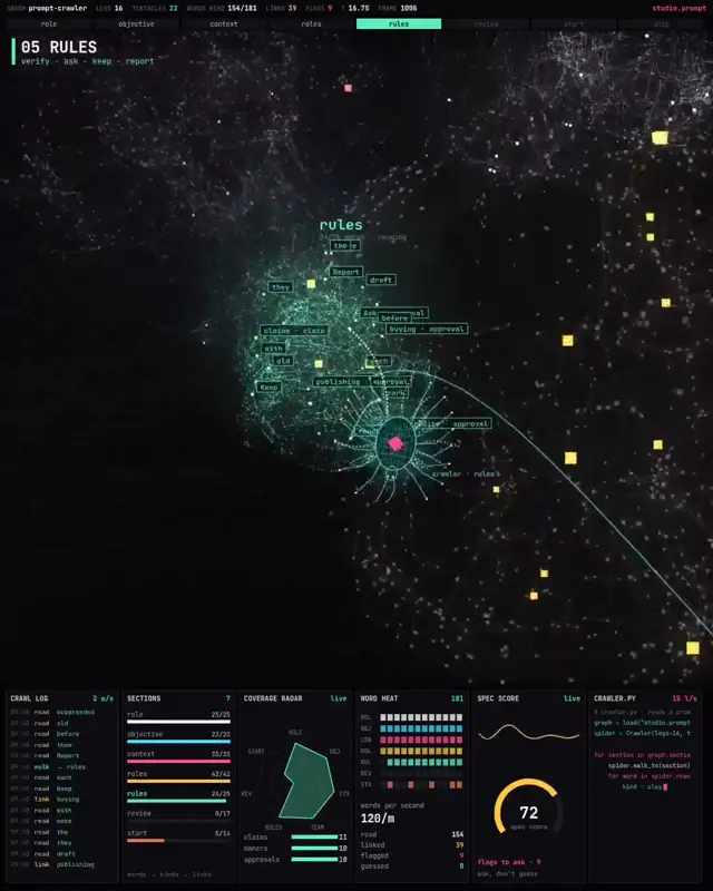
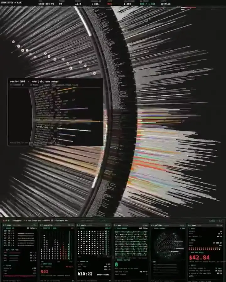
A dense futuristic dashboard pairs a web of connected nodes with code-like information panels and system metrics.
- Color
- Black and charcoal backgrounds, cool gray and white lines, with small teal, green, orange, and red accents.
- Type
- Tiny monospaced interface text and numerals, mostly too small to read.
- Framing
- A curved vertical divider separates the network visualization on the left from stacked text and data panels on the right; compact monitoring panels run along the bottom.
- Structure
- Fine lines and circular nodes form an interconnected network, alongside blocks of horizontal code-like text, colored status indicators, numeric readouts, and small grid-based dashboards.